Subtle Bent Line Illusions

Bent line illusions
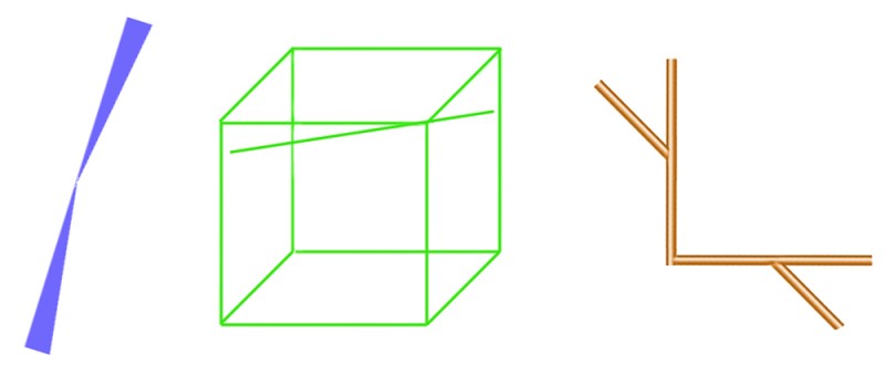
Here are three rather subtle illusions, each showing bent lines. In Bourdon’s illusion, to the left, the straight left hand edge looks bent. In Humphrey’s figure, centre, the straight, loose line touching the corner of the cube looks bent. And in the figure to the right, the straight line interrupted by the corner looks bent. I don’t think we really understand any of these illusions, and they are not very dramatic, so you don’t see them often. When someone does puzzle them out, for sure they’ll be a key to subtle ways the brain works. There’s probably a different explanation for each. For example, both the left and middle figures show a bent line that is the backbone of two triangles meeting at a point, so you might think, hello hello, we’re getting somewhere. But then you notice that the lines bend in different directions in relation to the triangles each illusion.

If you like to tangle with the technicalities, there are learned studies of the Bourdon illusion and the corner figure, though unfortunately, you’ll only get an abstract of the articles on those links, unless you are in a university library where they subscribe to the journals. And you won’t find much on Humphrey’s figure anyway, it’s seriously obscure.

Here’s a bit more on the corner figure  ….
Continue reading

Art and Camouflage

norwegian carving

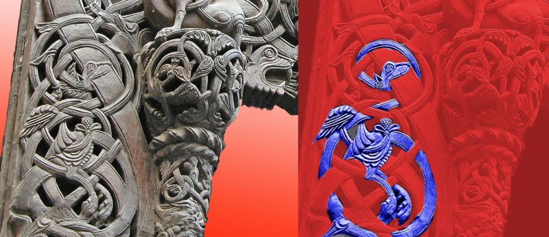
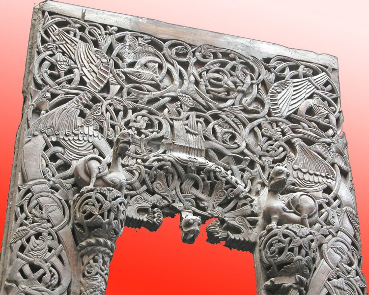
In earlier posts we showed perceptual puzzles in some works of art. Artists, and poets and composers, often seem to use these puzzles, especially ambiguity. (There’s more in Illusions and Aesthetics in the category bar to the right).  Here’s another strategy:  to have a design that’s so complicated that the shapes of anything you might recognise within it are hidden, as if by camouflage. This is an example in carving from an eight hundred year old Norwegian Church doorway. There are fabulous creatures here, but you’ve got to look hard for them.  Here’s a demo to reveal a bird I reckon I can puzzle out. The body’s in the middle, with a wing above it to the left, and two claws hanging down,and then there’s a seriously long serpentine neck, weaving in and out of the plant stems:

A bird concealed in interlace carving

These photos are from a nineteenth century plaster cast in the Victoria and Albert Museum in London.  I’m don’t know if the original church survives, or where in Norway it was.  If anyone knows, please comment.

Interlace camouflage like this was very common in Christian art from fifteen to seven hundred years ago.  Check out the fabulous Irish Book of Kells.  In islamic art representation of creatures was usually not accepted, but arabic inscriptions are often camouflaged in the same way.  The inscriptions in the famous Alhambra in Granada, Spain are so camouflaged they’ve only just been deciphered.  (That’s a news link, at 11/5/09, so I’m not sure how long it be live).

Poggendorff versus Mueller-Lyer

PoggendorffversusMueller-Lyer

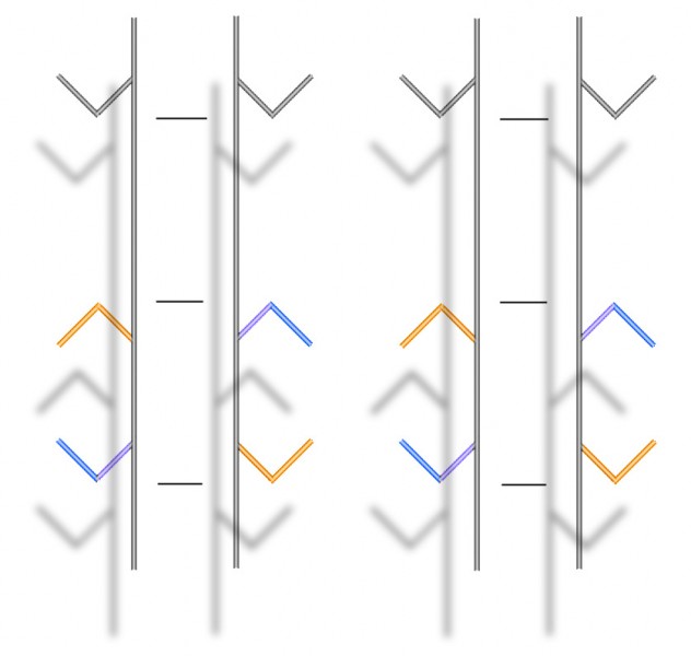
This is a stereo picture-pair, but you can see what’s happening here without having to view the images in 3D if you prefer.  However,  if you’ve not got the knack, and would like to practice on this post, here’s how.  Hold up a pen about in the middle, between the two pictures, and about five inches from your eyes (careful!).  If you now try to focus on the tip of the pen, you’ll notice that the blurry image of the figure has doubled.  Now move the pen-tip away from your eyes, and notice that the two blurry middle images of the figure are beginning to overlap.  Once they overlap (probably when the pen-tip is something like ten inches away from your face), see if you can get them to overlap exactly, and then come into focus.  If that doesn’t work, try this great tutorial on another site. Or try our earlier post about stereo picture pairs.

If you’ve got it, you should see the parallel vertical bars and their attachments floating in front of a surface with their shadows thrown on it. You’ll see the same if you view the image normally, but not with the illusion of 3D.  So what’s going on?

It’s a much stronger version of some paradoxical effects I showed in an earlier post.  The tips of the arrowheads are all objectively exactly the same distance apart, as indicated by the horizontal lines aligned with them in between the vertical bars.  But that’s not how they appear if you look at the arrowheads:  the inward pointing arrows look much further apart than the outward pointing ones.  (That’s the Mueller-Lyer illusion).  But now check out the lower, coloured arrowheads.  The coloured arms that contact the vertical bars are objectively aligned, but appear not to be – the upper arm in each case seems shifted a bit upward, and the lower arm a bit downward.  (That’s the Poggendorff illusion).  For the arms to appear out of alignment like that, you’d imagine the arrowheads must move further apart.  But that’s exactly the opposite of what the Mueller-Lyer illusion is making them seem to do.

Continue reading

Koala and Woven Person

Who's looking at who's severed head


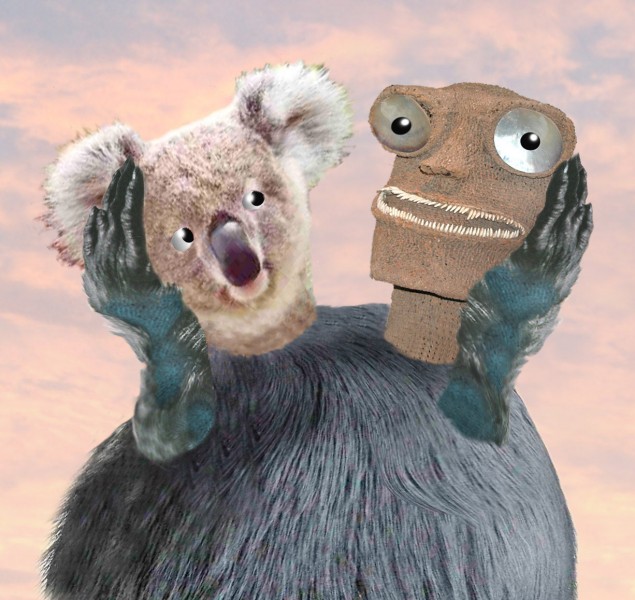
Here’s another ambiguous severed head illusion.  Is Koala thoughtfully holding up the severed head of Woven Person for inspection, or is it the other way round?  You can see it both ways.  For examples of this illusion in earlier posts, check out The Screams after Munch, the Monks, and the Mask/Skull illusion.  (On that link this illusion may be at the top of the page, if so scroll down for the previous versions).

Polarised ice pic

ice blades

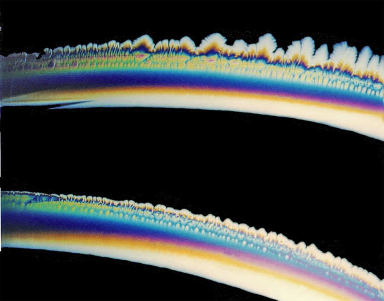
Like our bubble pictures this is not really an illusion, but I am fascinated by natural shapes.  It’s a picture of blades of ice, and what you see here is about three inches across.  The colours come from taking the picture in polarised light, as the crystal blades were forming in a shallow dish of water in a freezer.

Want to try your own pictures? The preparations are not trivial, but there’s nothing a school science section couldn’t handle.

  Continue reading

Big Ben leaning over!

Big Ben

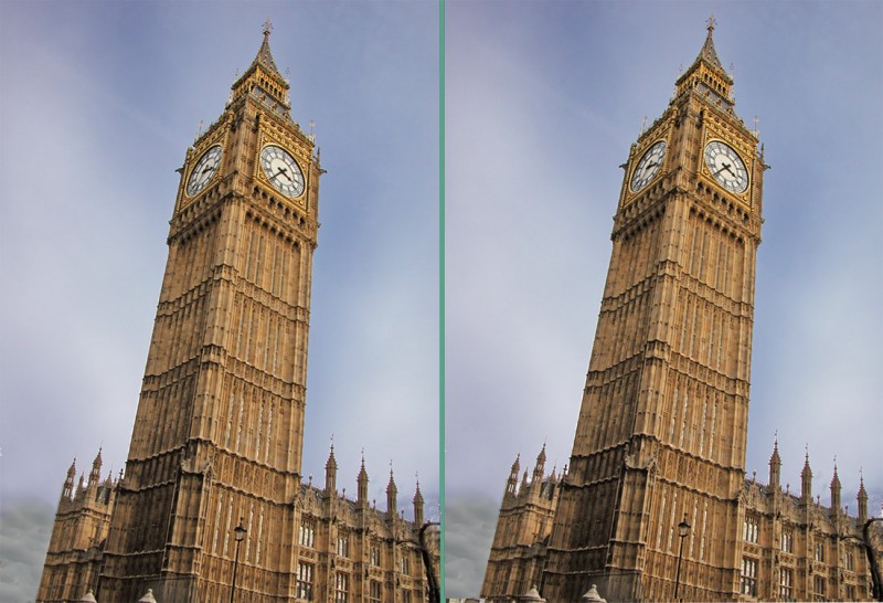
Does Big Ben look like it’s leaning over more in the right hand image than in the left hand one?  It can take a double-take to spot that the two pictures are identical. I find it a fantastically strong illusion.

It’s a demo of a new illusion found by Frederick Kingdom and colleagues (you’ll need to scroll down that link to get to their bit – look out for an even more than usual Leaning Tower of Pisa). Their discovery is a new version of the size-constancy illusion. This is my second demonstration of it – a few posts back I used a picture of a historic streetlamp. But here’s an example that looks stronger to me, with a better known subject.

Update 10 Oct 2011.  Big Ben really is leaning over! But not (yet) as much as it appears to lean in this illusion.

A tessellation pioneer

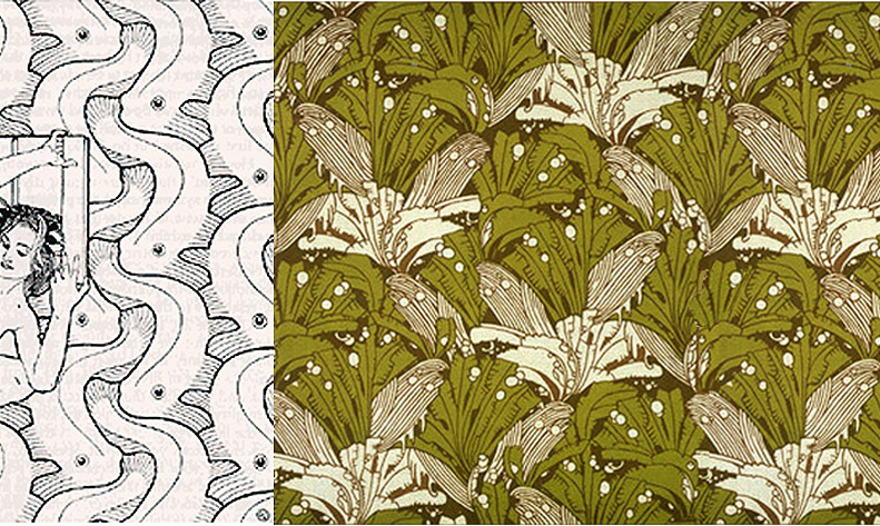
You probably know the tiling patterns of M.C.Escher.  But how about Koloman Moser?  Here are a couple of his designs.

Moser tilings

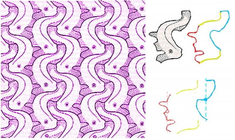
Moser was working in Vienna, Austria, a hundred years ago.  (He died in 1918).  I don’t know where he would have learned to do tessellating designs, that is, designs with motifs that repeat the way jigsaw puzzle pieces fit together, with no gaps or overlaps.  If you have checked out our tessellation tutorial, you’ll know that the secret of these designs is that the edge of each “tile” of the pattern must be able to be snipped into pairs of identical line segments.  Here’s how it works with Moser’s fish design.

Moser design demo

To the right you can see that the fish outline can be divided into three pairs of segments, a yellow pair, a red pair and a blue pair.  In the yellow pair, the top line is just repeated lower down to make the pair, in a move called a translation.  The red and blue pairs are a bit more complicated.  In each pair, the lower line segment is a mirror reflection of the upper segment, but shifted downwards.  That kind of shifted reflection is called a glide reflection.  It’s a fact that any motif whose edges can be snipped into one pair of segments that repeat by translation, connected as here to two parallel pairs whose edges repeat by glide reflection, will tessellate perfectly.  And that’s just one of 28 recipes for motifs that tessellate.

For a more technical account of Moser’s symmetry designs, see:

https://archive.bridgesmathart.org/2019/bridges2019-411.pdf

The author (John M.Sullivan of the Technische Universität Berlin) analyses numerous Moser designs, including the right hand design in the image at the start of the post.  He points out that, in an earlier version of this post, I got the analysis of this fascinatingly complex design wrong.

Bad Day in the Art Museum

Art gallery

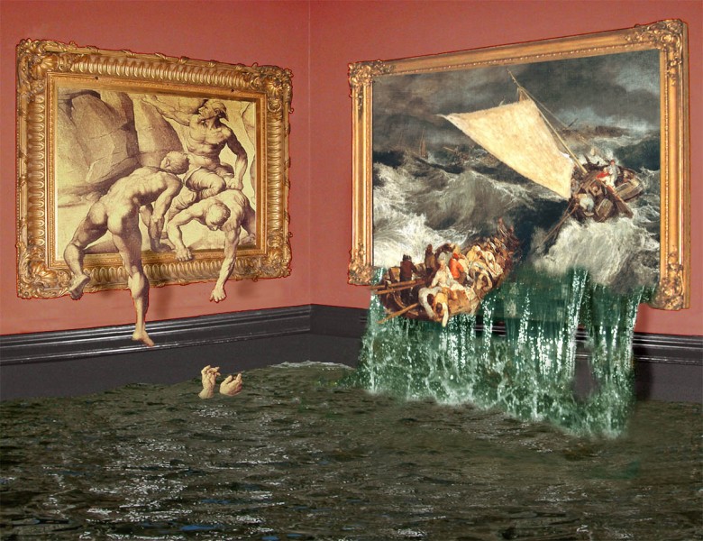
Interesting things can happen when you have pictures within pictures. Not so much, for example, with an everyday photo of an art gallery, if all the pictures are behaving well and staying in their frames. But sometimes it’s not possible to tell when the picture of a picture ends, and the picture of the real world begins. Here’s an example, in which the paintings in an art gallery are definitely not behaving how paintings should.

M.C.Escher did some brilliant pictures in which the boundary between the real world and the graphic world breaks down in the same way. The most famous is his print Drawing Hands of 1948, but you’ll find lots of others. Amongst contemporary artists, Rob Gonsalves has done some really clever paintings, such as Unfinished Puzzle. It’s the kind of issue that interested Picasso and Braque too, in their cubist paintings. In one by Braque you can see a cubist palette hanging on an illusionistic nail.

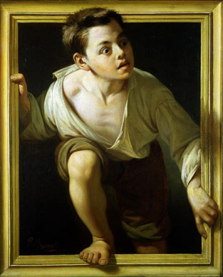
Here’s another famous example, a painting from a bit over a century ago, by Pere Borrell del Caso.  It’s called Escaping Criticism. I guess the artist felt hard done by at the hands of critics, and did this as a demonstration of virtuosity.  (I believe the original painting is in the Banco de Espana Madrid   –  Spain’s national bank).

Escaping criticism by Borrell del Caso

The guys climbing back into a painting in my image are borrowed from a copy of Michelangelo’s lost study for the Battle of Cascino. The shipwreck is from a 200 year old painting by English Romantic painter J.M.W.Turner in the art museum Tate Britain in London, of a bad day in the English Channel.

Position cues from a moving shadow

Does the ball sometimes seem to be bouncing, and moving nearer and further away?  Look again just at the track of the ball and you’ll see that all it ever does is to move diagonally from one corner of the board to the other. The spatial effects, and even the way the ball seems to accelerate at points, are all down to the moving shadow.

When the shadow sticks to the ball, the ball seems to just move across the surface and into the distance. That’s remarkable, because the ball should appear smaller with distance, but in fact the image of the ball here doesn’t change. The shadow cue is so strong it over-rides the problem. As the shadow drops to the foot of the image, the ball appears higher in the space, but nearer to us.

Once again, the effects appear even though the ball does change at all in size, as it should according to the rules of perspective – though some viewers might see an illusion of size-change, compensating for the anomalous lack of real size change.

I’ve tried to base my animation demo pretty closely on one described by Daniel Kersten and colleagues in 1997, in their celebrated original publication of this effect.

Illusions and visual special effects – explanations and tutorials