Truth Lies Hidden


A few weeks back the site got a load of US visitors from a link from a discussion on Reddit.  Someone got caught out illegally downloading at college, and as a punishment had to produce a poster about the evils of pirating.  The poster was to be inspected by the authorities and if approved, prominently displayed.  So the reluctant poster artist put out a query:  how can you do a poster that seems to say one thing, but when you look again says something very different. Whatever your take on piracy, (there is a vigorous exchange on the reddit site), the poster problem is an interesting one.  I mean, any of us might need to do a subversive poster someday.  Someone responded that pixelation might be a way to do it, and linked to our pixelation post.

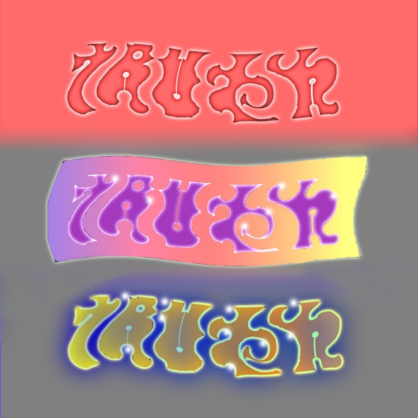
I reckon that would in practice be a really hard way to do it.  Maybe a better way would be by using word combinations that are figure/ground ambiguous, like the Truth/Lies combination shown.  It would still be mighty risky though, if your effort was to be inspected, because it’s hard to tweak the ambiguity just so, leaving the subversive message hidden – but not invisible.  I tried a couple of tweaks above, trying to get a balanced result at top, to push out Truth in the middle, and Lies below.  I haven’t managed to get the recessive message hidden enough yet – not if my freedom depended on it – but maybe you can do better.

Note added at August 3rd 2o11! I’ve come up with a tweaked version of this word pair.  (Scroll down to the bottom of the link).

There are some clever examples of this kind of ambiguity on John Langdon’s site.
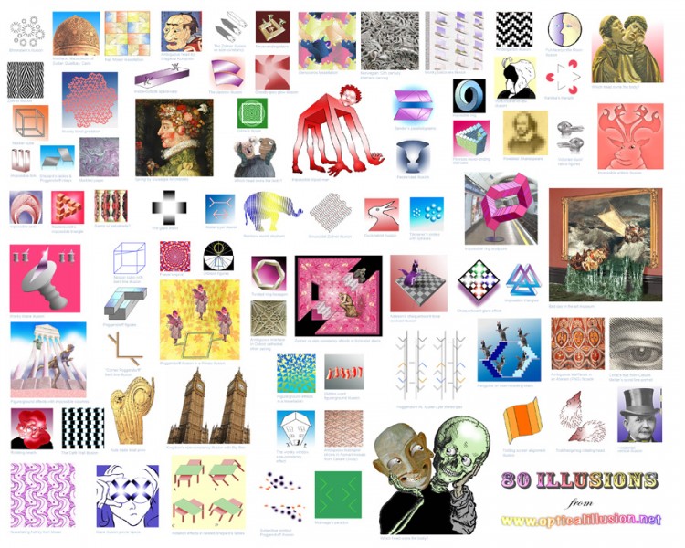
80 Illusions poster – compact version


One of our most popular images seems to be the 80 illusions poster.  For everyone wanting a giant version, there’s been one available 35 x 23 inches, on our selling site at www.cafepress.com/optoct.  I was pleased with the quality of the printing when I got one.  Because of the interest, we’ve now reformatted the layout for a smaller version available on the same Cafepress site, 16 x 20 inches.  Both versions have discreet identification under each illusion, so that they can be followed up on this or other sites.  They include little known or novel versions of many famous illusions – and one or two illusions that we think are new.

Watchful heads

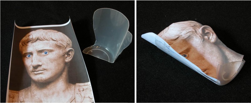
I was in a Picasso show recently and noticed the head of a portrait sculpture apparently turning to follow me as I walked past.  More on the Picasso later, the movie above is my reconstruction of the effect, using the head of the emperor Augustus (I think).  It’s not done by animation.  You can set up a static image of your own head at home, and it will apparently turn to follow you as you walk past, not just with the eyes, but with the whole face.  Just imagine what a comfort that could be for your partner – to have your head always keeping an eye on things whenever you can’t be home yourself.

All you need is to print out a photo of yourself, between a three quarter and a full face view, and then fasten it into a concave shape.  I made my concave shape out of a cheap food container, made of some kind of not too hard polymer, so that I could cut it.  As you can see below, I just added a little convex wing at one edge, so that the shape is not all concave, but a bit serpentine.  When I fixed the trimmed photo in the shape, that makes the face concave, but the ear convex.  I reckon the effect works better overall like that, but you might get better results with a bit of experiment.

The real life version will work best if you view it with only one eye as you pass by, or see it from a distance.  That’s because to see the illusion your brain has to overcome the cues telling it the photo is concave, so that you see the face the way the brain insists all faces ought to be, convex.  But then the perspective transformation of the image as you move past is all wrong for a convex shape, and the face only makes sense if seen as rotating.  The effect is related to the Ames Window, and the hollow face illusion.  There’s also a really good YouTube demo using a dragon head.  (Actually, I’ve only just discovered that, and it’s better than my demo, but don’t tell anyone).

I think Picasso may have been the first person to discover this effect, in 1954.

Continue reading

Competition and the Poggendorff and Muller-Lyer Illusions


I’ve not been posting much because I’ve been struggling with a mammoth revision of my technical site on the Poggendorff illusion.  But now that’s done, here’s a post on another Poggendorff puzzle.

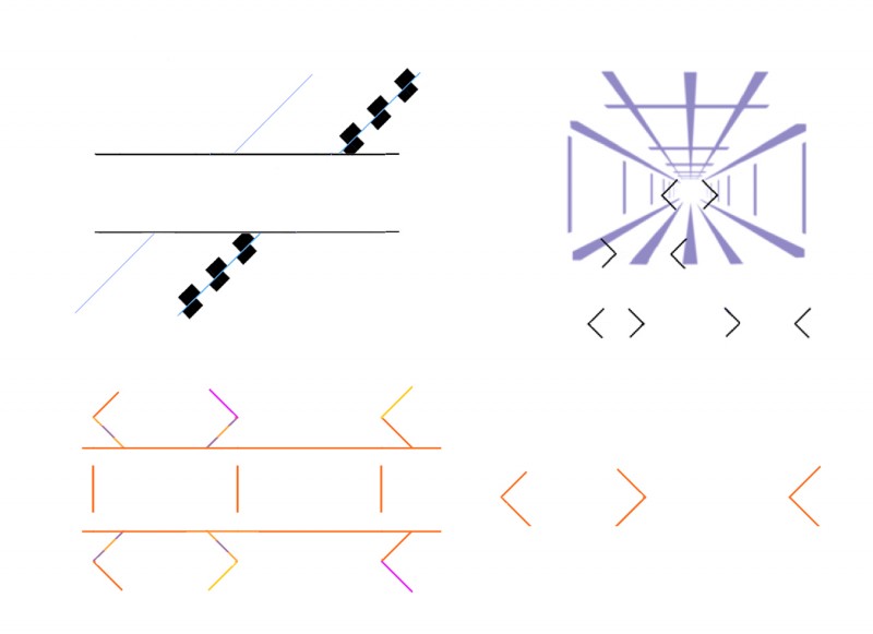
In earlier posts I’ve shown examples of competition between illusions, and included a demo of a paradox when the Poggendorff and Muller-Lyer illusions go head to head.  Bottom left above I’ve shown that last demo again – not so pretty, but I think a clearer demo.  Thanks to the Muller-Lyer illusion the outward pointing arrowheads appear closer together than the inward pointing ones, when objectively the arrow points are identical distances apart (note the reference lines in the middle of the figure).  But at the same time, thanks to the Poggendorff illusion, at the left end of the figure the arms of the same arrowheads, objectively aligned, would have had to move further apart, not nearer, in order to produce the effect of misalignment that we see.  So the two illusions seem to coexist in total opposition to one another, without a qualm. I’ve repeated the arrowheads to the lower right, to show that, at least as I see it, their appearance is just the same as when embedded in the Poggendorff figure.

But then the top figures show that both these illusions can be inhibited, when set in competition with other illusions.  Top left the Poggendorff illusion is normal to the left, but cancelled to the right (or is it even reversed?) when the test arms are illusorily rotated by the addition of some Cafe Wall characteristics. And top right, there’s much less difference (again to my eye) between the illusorily lengthened and shortened elements of the Muller Lyer illusion when we see them in the context of a Ponzo illusion (a scene in apparent depth) than as we see them isolated below the Ponzo scene.  In the Ponzo scene, the size-constancy effect is increasing the size of the smaller Muller-Lyer element.

So why are the Poggendorff and Muller-Lyer illusions sometimes inhibited when set in competition with other illusions, when at other times they co-exist with rivals in glorious paradox?  Any ideas?

David Kemp

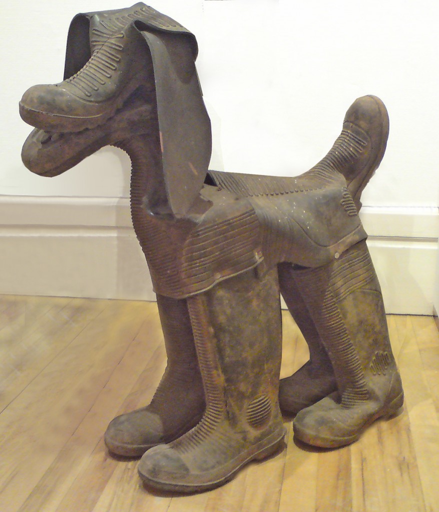
You’re going to have to hurry, but if you can get to the Royal Cornwall Museum in Truro, England, before July 3rd, you can see this brilliant sculpture of a dog by British sculptor David Kemp, in his exhibition The Botallack Hoard.  It’s one of the dogs in his piece The Hounds of Geevor, and if you don’t make the show, you can see them anytime in bronze in the centre of the nearby town of Redruth.  Truro and Redruth are in Cornwall, which if you look at a map of England is the pointy bit in the bottom left hand corner.  David lives pretty much as far down the bottom corner as you can go, and I think he’s one of the very best sculptors anywhere working, amongst other interests, on ambiguous images, on which I’ve posted several times before.  He works with every kind of what some people might call junk, but he discovers in it ideas that I find very funny and very beautiful.  If you’d like more information on David Kemp, see his brilliant website.

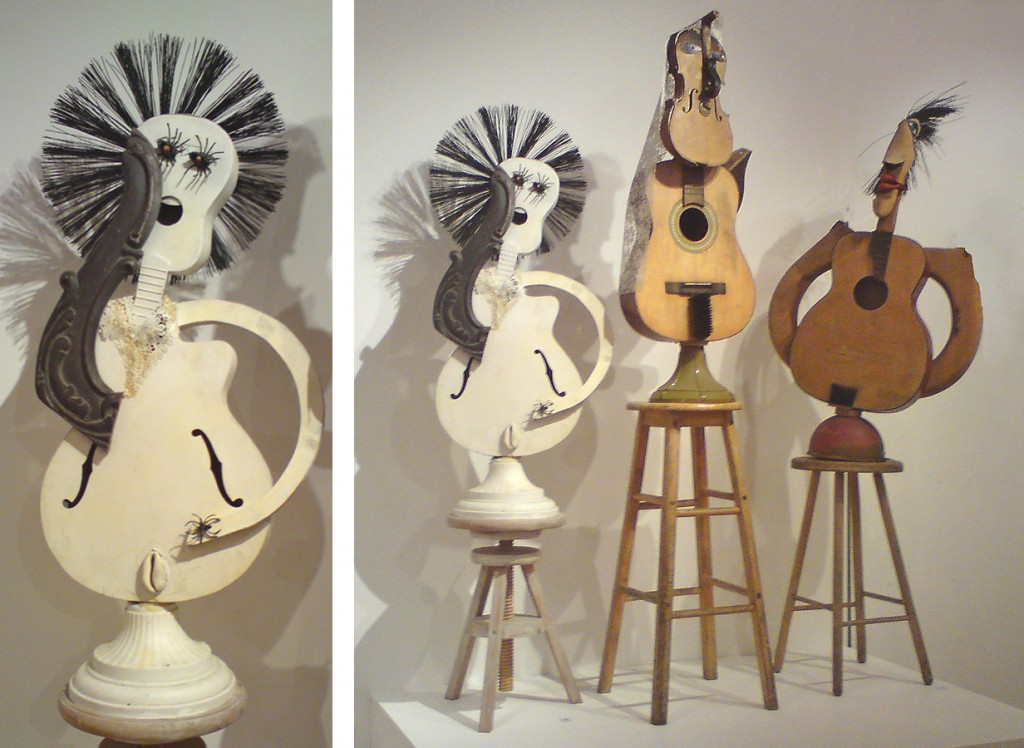
Here’s another of David’s sculptures, of three musicians, along with more detail of one of them.

Perspective Errors and the Best Visual Illusion of the Year Contest


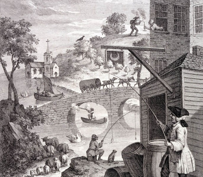
This is a detail from British artist William Hogarth‘s print made in 1754, to demonstrate mistakes in perspective.  For example, the sheep lower left get larger with distance, not smaller, and the woman top right is leaning out of a window offering a light to a man in the distance.

However I’m really showing it because a brilliant new animated demo of perspective anomaly, by Kouchiki Sugihara, has just won the first prize in the international Best Illusion of the Year Contest.  Don’t miss it, the ten best entries are shown, and there is some brilliant new stuff.

Coming back to Hogarth, his print was way before its time.  It was over a hundred years later, late in the nineteenth century, that illusion and puzzle picture books became common.  Then artists took up the challenge, Magritte and Escher for example.

Want to see the whole of Hogarth’s print?

Continue reading

Waiting for Shining Person (a new optical illusion cartoon)

Here is a new animation in our series of animated illusion cartoons, Waiting for Shining Person.  (As with our earlier cartoons, It may run jerkily on first run-through.  It should be fine thereafter.)

Compression for Flash has slightly reduced the effect. If possible, view Waiting for Shining Person as a
Quicktime Movie

These cartoons are meant to work just like a three- or four-frame cartoon in a newspaper – each one presents a situation that ends with a punch-line.  The cast of characters are all illusion figures of different kinds, but each cartoon depends on a particular illusion effect.

So the cartoons are a new art form – but I’m not sure they’re entirely successful.

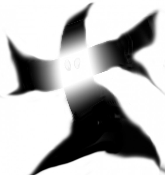
The main illusion to watch out for in the movie is the glare effect, which radiates from the face of the mysterious Shining Person:


The Twisted Stairs (version 2)

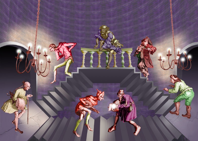
The Twisted Stairs - version 2

I’ve been wanting to do a new version of my earlier post of The Twisted Stairs.  That’s partly because the way I placed the figures in the original posting, they got in a bit the way of seeing the twist in the lateral flights of stairs. I reckon you can see the twist effect better now, as they transform from stairs seen from below (at the top by the balcony), to stairs seen from above (down at floor level). I wanted to see if I could get it right, because this is an impossible stair effect that maestro M.C.Escher never used. Sometimes his staircases as a whole can be seen either as from above or from below, but they don’t twist from one viewpoint to the other half way up. As I mentioned in the earlier post, I reckon that’s because the twist effect depends on fudging the perspective, and Escher didn’t do fudge. His perspective is almost always miraculously lucid.

Another reason for a new version is that I wanted to produce a high resolution version, suitable for giant 35 x 23 inch posters. As ever, you are welcome to use downloads of the image here for any private purposes, but if you wanted to think about buying a framed print, or giant poster, here’s where to take a look.

There are more technical details on the original post. I borrowed the figures for this new version from Durer, Pieter Brueghel the elder, and Hogarth.

Animated Illusion Cartoons – re-posting of Chicken and Leaf

Woops, slight technical glitch with the original post of this, just before Christmas. So this is a re-posting of the third of our animated illusion cartoons, Chicken and Leaf. It may still run jerkily on first run through, should be OK second time around.

These cartoons are meant to work just like movie versions of a three- or four-frame cartoon in a newspaper – each one presents a situation that ends with a punch-line.  The cast of characters are all illusion figures of different kinds, but each cartoon depends on a particular illusion effect.

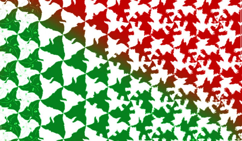
The main illusion effects to watch out for in this movie are tessellations, and especially the final transformation, which transforms across the image at the same time as it transforms locally:

You can also view Chicken and Leaf as a
Quicktime Movie

You can also see our this cartoon along with the previous ones in our Animated Illusion Cartoon category.

I’m fascinated by the effect that the movie ends with – a tessellation that transforms in space and in time. Tessellation (or tiling) wizard M.C.Escher was brilliant at these transforming patterns, as in his Metamorphosis prints, but of course couldn’t do animations.  I’m sure he’d have done the animations if he could, but without a computer they’d have taken years. In my animation there are two sequences of transformations, first where the pattern morphs in sync all over the screen – a number of people have done those – and then the one that morphs across the image as well as in time.  I’m not aware anyone else has done one of those.  Please let me know if so, I’d love to see it – and otherwise, I hope if you’re an animator you’ll be provoked into doing a better one than mine.

Illusions and visual special effects – explanations and tutorials