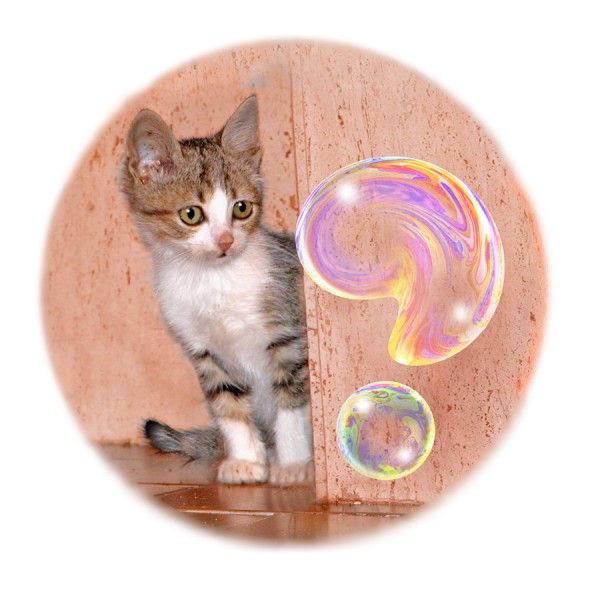
 This isn’t an illusion, more a special effect, but I just like bubble pictures. The question mark soap bubble started out as two photos of real bubbles. In a later post I’ll go into my the ways I use Photoshop to distort and adapt the bubble images. For how I take the bubble photos, and who else is doing it, see my earlier posts on bubble pictures, by just clicking on Soap Bubble Pictures in Categories, to the right.
Leonardo Animated (or the New Leonardo Cartoon)
The illusion of movement when a series of images is animated is one we take for granted nowadays. However, here’s a small world first (I think) as new example. It’s a new Leonardo cartoon. Actually, there is a Leonardo cartoon already, THE Leonardo cartoon, in London’s National Gallery. But that’s not a movie. Art historians use the term cartoon for full size drawings for paintings. But now here’s another Leonardo cartoon, and this one is an animated movie. Maybe a bit short, that’s all.
Leonardo often made anatomical studies from viewpoints in a strict sequence as if moving round the specimen. Some years ago leading Leonardo scholar Martin Kemp pointed out that one famous set of studies, of the shoulder and arm with superficial muscles exposed, contains so many drawings it’s almost cinematic. In fact there are nine views, from three different sheets, which can just about be combined. The drawings are in the British Royal Collection. They have a great website, and here’s one of the Leonardo drawings, showing four arms.
Nine views is just barely enough for a slightly rapid animation.
Leonardo’s observation is so consistent that I only had to adjust overall proportions and contrast a little bit in some cases, in order to combine drawings from different series. It might be possible to make a smoother animation with more adjustment of the images, but I wanted to interfere with them as little as possible.
An effect that in some ways is even better is possible, with just the last two frames in the sequence.
For Leonardo in general, a fun site is the BBC one. The Wikipaedia Leonardo entry is very good too, with stacks of detailed info.
My short movie may be the first made entirely from a sequence of Leonardo’s own drawings, but it’s not the first based on individual drawings. Some brilliant, very professional animations were made from Leonardo drawings, for a show at London’s V&A museum in 2006/7. (I believe the animation was done by Aardman of Bristol). They developed their own sequences of images from individual drawings, of geometric shapes or machines, which they projected as 3D reconstructions, and then rotated and combined by computer. I’ve found only one example still on the WWW, but it’s a beauty, based on his drawings of the regular geometric shapes called regular solids.
Figure/ground Balustrade Illusion
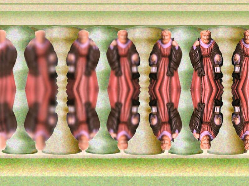
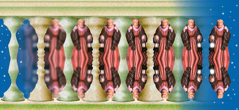
Here’s another figure/ground effect. A saint becomes a balustrade! Almost any vertical figure whose profile is not too wiggly can be used for this illusion. Below is a different version of it. It’s a little more puzzling, because both saint and balusters, when seen as figure at the ends of the picture, have the same starry sky as background. That’s done by making sure that when saint or balusters are seen as background near the ends of the row, they blur into the same starry night sky.
Making illusion images with Photoshop CS3 – layers
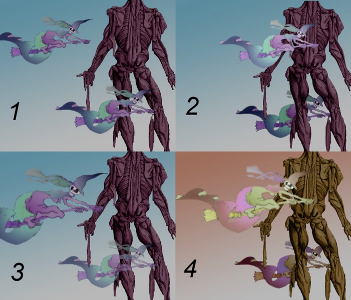
If you’ve just used Photoshop to adjust photos a bit, you may not have needed to use layers. For any more ambitious stuff, they’re essential, and at the heart of what makes it such a powerful package. As a demo I’ll use elements from my Halloween image – not maybe my finest hour, but useful for showing layers. This montage shows the basics of what you can do with them. (According to me! I’m not a real Photoshop wizard, and your comments and corrections would be very welcome).
Think of the montage as four separate images. Within each of the four images, there are five layers, one for each witch, one for the muscleman, one for the sky background, and one blank, truly background layer. You select the layer you want to work in, and changes you make in one layer don’t affect the others.
By working in one layer at a time, you can for example move elements of your picture round the screen (compare the top witch in 1 & 2); change which elements are in front of which (compare the lower witch in relation to the muscleman in 1 & 2); change the size of an element (compare the upper witch in 1 and 3); darken or lighten an element (compare the top witch in 1 and 2 again); make en element more or less transparent (note the lower witch in 3); or play with the overall colour and tonal scheme (I’ve changed all the layers that way in 4).
More Illusion Pictures
Here are some more small optical illusion and visual perception related images you can link to from your own website / profile page.
In case you missed them you can still view the first set of illusion pictures.
Convex/concave spacewarp
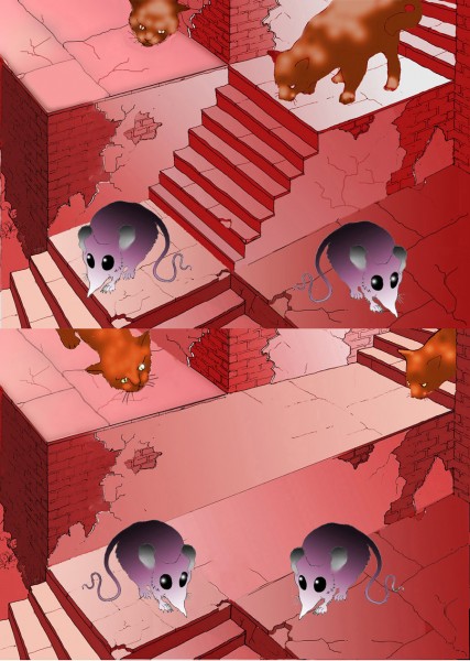
This is about the simplest of all spatial transformations. In the top picture, the mice are at risk from the cats. In the bottom picture, the stairs have vanished, and as the eye travels along the picture from the left, a concave terrace turns into a convex, step shape. There’s now a protective inside/out space-warp between the cats and the mice. I adapted the scene from one I devised for my optical illusion cartoon story. If you wanted to experiment with scenes based on this transformation, the essential scheme is as to the left here. Note that there must be no tonal contrast across the middle line, just in the middle of the image.
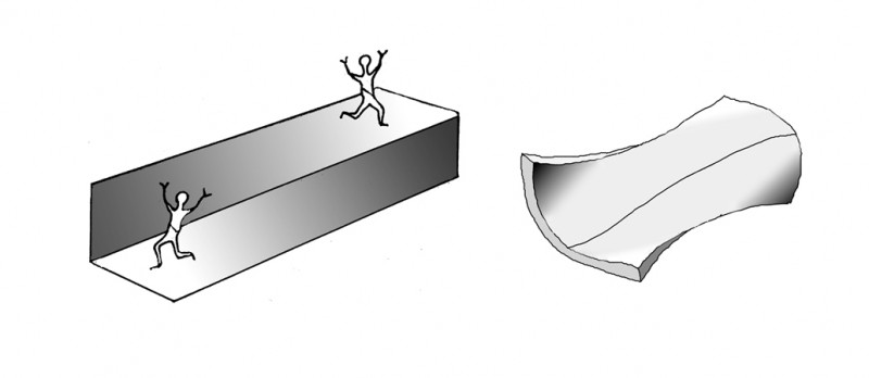 Topologically, I suppose the shape is just a saddle shape, as to the right, so it could exist as a rectangular, 3 dimensional shape, but it would be such an improbable one, and seen from such an unlikely angle, that it looks like an illusion. For a fiendishly clever picture on the theme of inside out transformations, see M.C.Escher’s print Convex/Concave. (Try that title in Google images, or find it on the official Escher website).
Outlines, objects and apertures
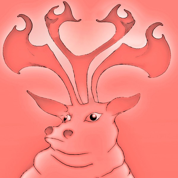
This stag may look OK at first glance (well, you know, sort of…), but hang on, has he got three antlers, as at the top of the picture, or only two, as down by his ears? Following on from the last post, it’s another example of what happens when apertures or gaps in the visual scene – like the segment of starry night in the last post – become objects. But with the stag it’s even weirder, because the middle antler, for example, starts out at the top OK, but by the time it gets down to the stag’s head, it’s become background. Want to know more? Read on!
Halloween magic
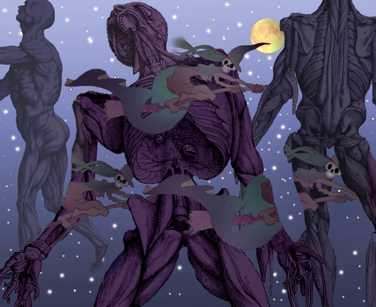
Here’s a scene for Halloween. In our everyday view of the world, the orderly way in which one thing blocks our view of another is something we can depend on to orientate ourselves in the world around us. These witches are breaking the rules. The lower ones appear and disappear at puzzling locations, and the witch lower right even vanishes behind a segment of starry sky. It’s as if the segment of sky had become an object in the visual field, instead of an aperture – an oddly weird effect, for me.
I got the idea from a wonderful painting by Rene Magritte, Carte Blanche. If you go to for that link, you’ll just need to scroll down a couple of pictures – you’re looking for a painting of a lady on a horse in a wood.
Oh, and I borrowed the musclemen from the 450 year old illustrations to the pioneering anatomical studies of Andreas Vesalius.
Improved artworks No 1
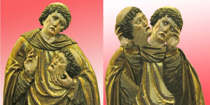
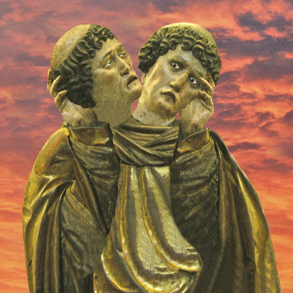
Here’s a historic artwork I reckon I’ve much improved. On the left you see it as has been for the last five hundred years or so, a Spanish (I think) wood carving, of a martyred saint, now in the Petit Palais museum in Paris. On the right I’ve turned it into an ambiguous image, in which it’s not clear which head belongs to the body, and which has been chopped off and is being held up for inspection – I think you’ll agree a far more poignant image. It’s an illusion in the style of the Mask/Skull illusion posted earlier.
Here’s a version of my adaptation with an evening sky:
A New(?) Ever Receding Staircase
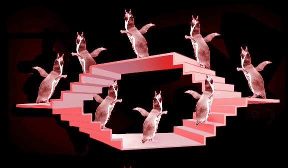
Here’s a new kind of never-ending stair (I think). It’s like the famous never-ending staircase seen from above by M.C.Escher, called Ascending and Descending. However, in this new staircase instead of figures doomed to go downstairs for ever we have penguins destined to walk away from us forever. It’s based on the geometry of the object in my post on paradoxical size-constancy.
Here’s an animated version:
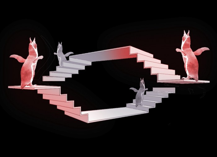
Like Escher’s famous impossible staircase, (and also as with the impossible tribar), the effect depends on our seeing a scene from a viewpoint from which points that would be at different distances from us seem to connect up. Here’s a view in more usual perspective of one configuration that would give rise to the ever receding staircase above. The trick depends not just on getting the alignment just right, but also on suppressing the usual perspective cues. Size diminution with distance is the most important one. The other is aerial perspective, in which contrast flattens out and colours get bluer with distance. I’ve put them both back below.
For more on staircases like Escher’s famous picture Ascending and Descending …..
