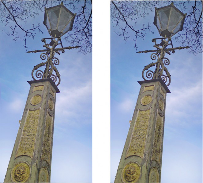
Lamp falling over!

Only joking, but the right hand picture does seem to show this old lamp near me leaning over more than it does in the left hand picture.  But now check out the two pictures.  They’re identical!  It’s an illusion only recently reported by Frederick Kingdom and colleagues in McGill University (scroll down that link for their bit).  It’s yet another demonstration of the strength of the size-constancy effect.  (See my earlier posts on the wonky window and paradoxical size-constancy).  What’s remarkable about the McGill report is that it shows size-constancy coming into play even across the gap between two clearly separate pictures. I guess it means that at an early stage in trying to make sense of the visual scene, the brain just accepts the consistent depth cues in the two pictures as signalling that they are both part of one spatial scheme.

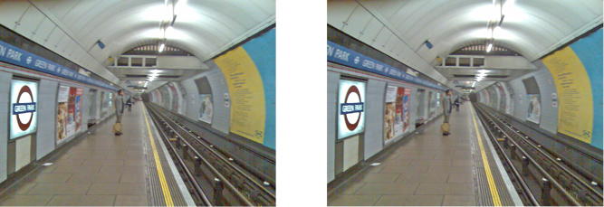
As Kingdom and colleagues demonstrated, the effect also works horizontally.  Here’s a demo:

This time the platform looks pretty much the same in the two pictures (as it is – the pictures are of course once again identical). But rails to the right, seen at a more oblique angle, seem to point a bit more towards vertical in the right hand image than in the left hand one.

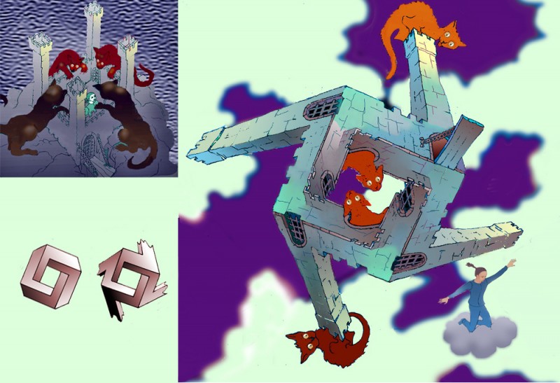
The twisted castle


This is another transformation based on one in my illusion cartoon story.  I did it to see whether I could devise an adventure, set in graphic world, with transformations that are forbidden in our everyday world as the events that take the story forward.  Most of the transformations, like this one, offer an escape route for a character being pursued.  Not very imaginative.  I did also have animation in mind, and working out this particular 3D morph would be no joke.  It’s based on the four sided version of the famous impossible triangle, with added extensions for the towers, as above.  For the classic impossible tribar, see my earlier post on Escher’s Waterfall Explained.  For impossible figures with four sides and more, check out Gershon Elber’s site.   

Tonal contrast


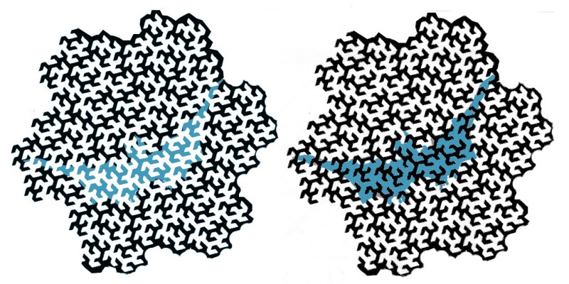
The local tones and colours we see in a scene or image are hugely affected both by the tonal and colour balance of the scene as a whole, and also by the tones and colours immediately adjacent to the patch we are focussed on.  The effects can be subtle.  Here’s a demo of one, called the Munker-White illusion.  The bat (well, it’s a sort of bat shape), in the left hand fractal pattern (it’s a Peano-Gosper curve), looks pale, and the one in the right hand pattern looks dark.  And yet the mid tone components of the bat in the left hand image are in fact exactly the same tone and colour as the mid-toned components of the bat to the right.


Continue reading

3D picture pairs

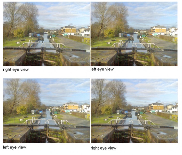
We all know why stereo picture pairs give rise to a vivid illusion of 3D, don’t we?  It’s because they imitate the way that our brains, if we are lucky enough to have normal vision, take advantage of the slight differences in viewpoint from our two eyes.  We grow up hard wired with brain cells that look out for similarities in patches in the field of view of each eye that are just slightly displaced from one another.  So if you rewired the brain, so that the left eye sees what the the right eye should, and vice versa, you’d see all the depth effects reversed, wouldn’t you?  Well, no, in fact, not necessarily.  Look at these picture pairs of a canal lock, near where I live, just north of London in the UK.

If you haven’t yet aquired the knack of viewing stereo picture pairs without a viewer, try this tutorial.  You’ll easily find other guides by searching on “viewing 3d pictures” and similar phrases.

These pairs show a scene with the viewpoint from right and left preserved (lower pair) and reversed (upper pair).  And yet both pairs give (for me) a fairly normal illusion of depth.  One pair works better than the other.  Usually, when viewing stereo picture pairs without a special viewer, the arrangement as in the upper pair above works best.  (More on that below).  So which pair looks better can depend on which technique you have used to view the pictures.  But the fact that both pairs give an illusion of depth at all is remarkable.


Continue reading

The vertical/horizontal illusion


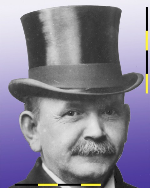
This aimiable looking old guy was Austin Crothers, governor of Maryland USA in the first years of the last century, and a notable scourge of deception and corruption.  His top hat however presents one mysterious deception that even he couldn’t unravel.  It looks to me about as wide as it is high. But now look at the measuring rod, first when vertical, and running the full height of the hat.  When horizontal, at the foot of the picture, we can see that the same line stretches only a touch over two thirds of the way across the width of the hat. The hat is MUCH wider than it is high.  It’s an example of the horizontal/vertical illusion – we tend to overestimate height. Check out pictures of the St. Louis Arch, seen from the front, for example.  It’s just as wide as it’s high, but looks higher.

There’s no agreement on why.  There are lots of speculations, for example that the effect arises from some adjustment to allow for the inequality between the width and height of the visual field in normal binocular viewing.

The discovery of the illusion is attributed to J.J.Oppel in 1855.  It’s usually seen in this simplified version.
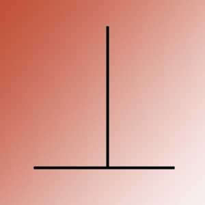
It works the other way up too, and is sometimes called the T illusion.  It’s one of many illusions for which you’ll find a brilliant interactive demo on Michael Bach’s site.

It’s amazing that we’ve made so little decisive progress with simple illusions like this one, after more than a century.  I can’t think of another area of science in which progress has been quite so hard, except of course some areas of maths.  But with these illusions, the explanations proposed in papers from over a century ago are sometimes much the same as those we are still discussing today.

The photo of Crothers is from the Grantham Bain collection in the Library of Congress and can I believe be used without copyright restrictions. 
Improved artworks no.2

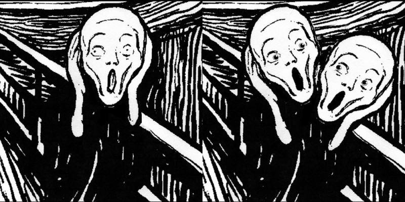
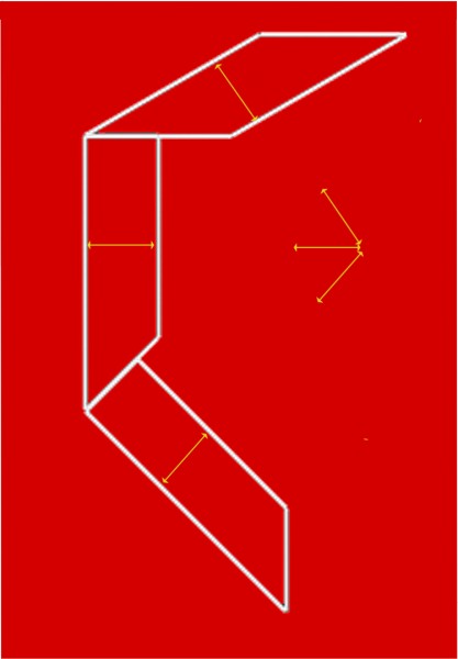
On the right, with apologies to Eduard Munch, I’d like to propose an improvement to his famous picture The Scream.  In my version, the screamer really does have something to scream about:  he’s holding up a duplicate of his own head for inspection.  But which head is the one that’s attached to the body, and which is being held up for inspection?  You can make it work both ways, with the upper head looking down on the lower, handheld one;  or, as if the whole figure was leaning over to the right,  with the lower head looking up at the handheld upper head.  It’s another example of the effect in the Mask/Skull illusion, and in Improved artworks no. 1.  I think I invented it, with a hint from Picasso (see the Mask/skull post).  But I’ll be delighted if you prove me wrong by finding an older version. 

No problem about the title for the improved version, it would have to be The Screams.

Rotating Heads – Santa turns into Ibsen (more or less)


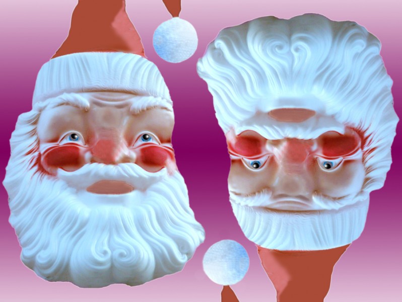
Here’s a rotating head illusion for Christmas.  I’ve been giving talks about Christmas imagery, and sometimes use old fashioned transparencies.  Recently I glanced at my slide of Santa upside down, and there was the face of the great Norwegian playwrite of a century ago, Henrik Ibsen.  It’s an illusion in the tradition of the one I posted earlier, about two characters called Mr. and Mrs. Turner.  (That post includes an animation). There are lots of other pictures of rotating heads by nineteenth century illusion artists.


Kitten with query bubble

This isn’t an illusion, more a special effect, but I just like bubble pictures.  The question mark soap bubble started out as two photos of real bubbles.  In a later post I’ll go into my the ways I use Photoshop to distort and adapt the bubble images.  For how I take the bubble photos, and who else is doing it, see my earlier posts on bubble pictures, by just clicking on Soap Bubble Pictures in Categories, to the right.

Leonardo Animated (or the New Leonardo Cartoon)

The illusion of movement when a series of images is animated is one we take for granted nowadays. However, here’s a small world first (I think) as new example.  It’s a new Leonardo cartoon.  Actually, there is a Leonardo cartoon already, THE Leonardo cartoon, in London’s National Gallery.  But that’s not a movie. Art historians use the term cartoon for full size drawings for paintings.  But now here’s another Leonardo cartoon, and this one is an animated movie. Maybe a bit short, that’s all.

Leonardo often made anatomical studies from viewpoints in a strict sequence as if moving round the specimen. Some years ago leading Leonardo scholar Martin Kemp pointed out that one famous set of studies, of the shoulder and arm with superficial muscles exposed, contains so many drawings it’s almost cinematic. In fact there are nine views, from three different sheets, which can just about be combined. The drawings are in the British Royal Collection. They have a great website, and here’s one of the Leonardo drawings, showing four arms.

Nine views is just barely enough for a slightly rapid animation.

Leonardo’s observation is so consistent that I only had to adjust overall proportions and contrast a little bit in some cases, in order to combine drawings from different series. It might be possible to make a smoother animation with more adjustment of the images, but I wanted to interfere with them as little as possible.

An effect that in some ways is even better is possible, with just the last two frames in the sequence.

For Leonardo in general, a fun site is the BBC one.  The Wikipaedia Leonardo entry is very good too, with stacks of detailed info.

My short movie may be the first made entirely from a sequence of Leonardo’s own drawings, but it’s not the first based on individual drawings.  Some brilliant, very professional animations were made from Leonardo drawings, for a show at London’s V&A museum in 2006/7.  (I believe the animation was done by Aardman of Bristol).  They developed their own sequences of images from individual drawings, of geometric shapes or machines, which they projected as 3D reconstructions, and then rotated and combined by computer.  I’ve found only one example still on the WWW, but it’s a beauty, based on his drawings of the regular geometric shapes called regular solids.

Illusions and visual special effects – explanations and tutorials