In recent versions of these animations, as in the movie above, a grid of thin transparent lines in a mask is passed over a composite graphic image, to give an illusion of movement. In earlier versions, made in France in the the 1920’s and called Ombro cinema or cinema enfantin, the grid of transparent lines was static in a viewing frame, and a strip of the composites was spooled behind it. (There’s a nice demo from the North West Puppet Center in Seattle). Earlier versions still go back to the 1890’s and are described in a very authoritative Wikipedia entry.
A beautiful recent booklet of barrier-grid animations is Colin Ord’s Magic Moving Images. In 2006 a new version of the technique, in which the act of opening a book automatically draws the grid over the image, was patented by Rufus Butler Seder, called Scanimation. He’s also published a number great books for kids using his process.
(By the way, there also used to be an entirely separate early computer animation machine, in the 1960’s, called The Scanimate).
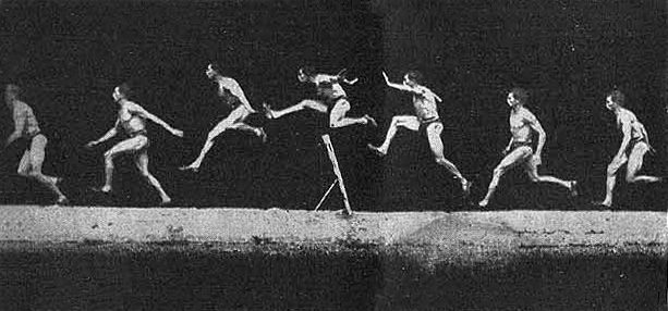
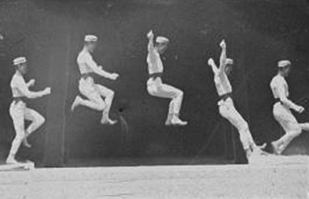
In Seder’s and Ord’s books, the illusion happens in the real world, when you pass a real striped acetate mask over the composite base image. My demo is an animation that faithfully follows the real world process, as if a real striped mask was being passed over the base image. I borrowed the jumping man from this composite photo by nineteenth century movement scientist Etienne Marey.
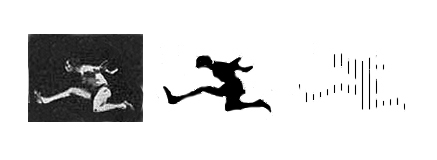
To make a barrier grid animation, you reduce the subject in each ‘frame’ of the original movie into a black silhouette, and then replace the black infill with a hatching of just a few vertical lines.
The hatched silhouettes are then combined into a composite image, like the one in the animation at the head of the post. As the striped mask passes over it, only one frame at a time is revealed. The jumper in the final, striped silhouette (right hand of the three images) above is barely recognisable as a figure. We see the jumper much more clearly in the movie. I find it a bit magical the way the jumper quite gradually appears in the movie as the mask begins to move over the composite image from the left. Our brains can discover figures in patterns of amazingly sparse data, if only they move coherently, as when the human body is represented just by dots at the key rotation points (such as knees and elbows).
Want to have a go at making a barrier grid animation yourself?
In principle, it’s quite simple, but you will need to be quite nifty with a graphics package.
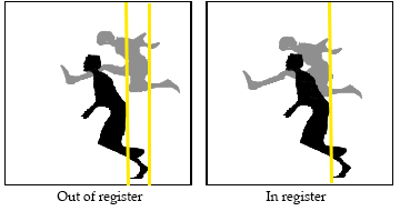
You need to start with a sequence of six or seven frames, of a movement which starts and ends on the same image. If you are using a real movie, (for example of your dog running) you’ll need some software that will export a segment of it as an image sequence. Alternatively, you could use a sequence of still photos of an object with an interesting profile that you rotate between photos. If you isolate successive figures from a Victorian chronophoto, like the one by Marey that I used, you will need to take care that the figure is in the right position within every frame, so that successive frames are “in register”. In my movie, I wanted the position of the jumper to vary in height within each frame, but I wanted him to be centred in respect to the sides of the frame, so that the movie would come out as if the camera was ‘panning’, following the figure as he runs. The best way to do that is to settle on some pivotal point of the figure, and make sure that point is in the same position in successive frames. I chose the jumper’s bum, and I think this image will show what I mean.
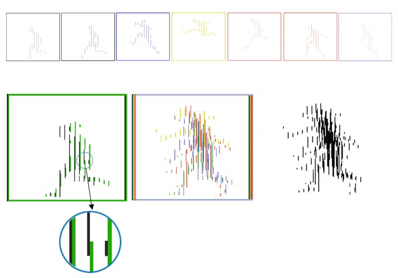
Next you reduce each dark silhouette to a hatched figure, as shown above, one figure back. The number of hatched lines is not critical, and may vary as the width of your figure varies between frames. However, the thickness and spacing of the hatching is absolutely critical, and must match exactly the spacing and thickness of the transparent stripes in your mask. Here’s how you calculate it all.
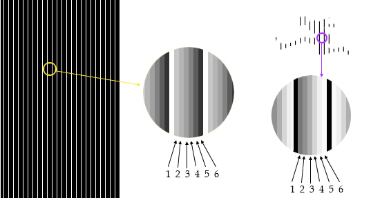
First you count the number of frames in your animation. Next decide on the width of the hatched lines you will have in your silhouette, which must then also be the width of the clear lines in your mask. I set my images up so that I could make these lines just one pixel wide, which made the graphics much easier to create with neat edges. The space between hatched lines in the silhouette, and between clear lines in the mask, must then be: the number of frames, minus one, times the line width. In my animation there were seven frames, so the gap between lines was six times the line width. That meant my lines and clear stripes were located every seventh line spaces apart. I think the demo figure below will show what I mean. (The grey to black shading is added only to demonstrate spacing).
Now you have to make your composite image, which you do by copying and pasting to combine your separate frames into one frame. Remember that you will need to be able to delete the white spaces between lines in each source frame, to leave an image consisting just of black and transparent areas, not black and white areas. Otherwise the white areas in each successive frame you paste into the composite will just obliterate the previous frames. So, start with the first frame. Each successive frame must then be pasted in exactly one line width to the right of the previous frame. I hope the demo figure below will help make that clear. I’ve coloured successive frames differently, but it’s still hard to disentangle individual frames in the colour composite in the middle (and the colouring has slightly upset the line widths). So to the left, bottom row, I’ve just shown the first two frames, to make the spacing more easily visible.
Now all you have to do is either set up your mask to pass across your composite image in an animation, or, for a real world version, print out the mask on transparent acetate. BUT IF PRINTING, BEWARE! Make sure the acetate is one intended for the kind of printer you are using. OTHERWISE THE ACETATE MAY MELT AND WRITE OFF THE FAMILY PRINTER. Not cool.
In case you’d like to try to animate another of Marey’s cronophotos, here’s one that would be suitable.

thanks for this concise summary of an amazing animation technique. For generating your own barrier grid animations, have a look at animbar, a piece of free software available at http://animbar.mnim.org/. Creating your own picket fence animations boils down to a few mouse clicks!