Category Archives: illusions and aesthetics

Native Canadian Ambiguous Art

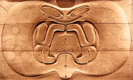
Depending how you see it, this panel either shows two killer whales looking at one another in profile, or a bear looking at you head on – the killer whales’ fins top centre become the bears’ ears.  And then the killer whales’ tails centre bottom become the mouth of a third creature, probably a frog, but the carving was never finished, so only its eyes are carved.

The panel is probably about a hundred years old, and is about five foot wide (1.6 meters or so).  It’s not known why it was never finished, but in the tradition of north west coast Canadian carving, the decoration on the killer whales would have been carved into deeper relief, not just sketched out on the surface.  Nor is it known from just which ethnic group in North West Coast Canada it comes.

However in the mythology of all the groups of that area, such as the Haida and the Kwakuitl, transformations of one creature into another are part of the scheme of things.  That includes transformations by hunting and eating, which were traditionally understood as sacred activities.  So what we see here is not just a visual game, but has spiritual meanings.

For more on that see our earlier post on ambiguous patterns, and other posts in the Illusions and Aesthetics category.

The panel is in the reserve collection of the Manchester Museum.
Cheating with tessellations

Tessellations are patterns whose repeat motifs fit together like jig-saw pieces, with no gaps and no repeats.  For an introduction, see our earlier animation. They can be abstract patterns, but the most intriguing are the ones devised by tessellation maestro M.C.Escher in the middle of the last century, which show representational motifs, such as animals, as tessellating patterns.

Designing abstract patterns that tessellate successfully is just a matter of getting the hang of some rules.  Discovering representational motifs that tessellate is much, much harder.  There are no procedures, or none that I know anyway.  It’s all trial and error, mostly error for me, and really hard!  Escher was brilliant at it.  My efforts are pretty feeble.

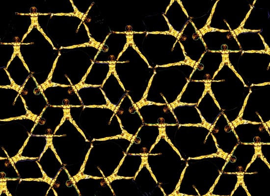
But fortunately, you can at least include representational motifs within your tessellations with a little trickery.  The pattern above, based on Leonardo’s famous Vitruvian Man, is an example.  The secret is to use segments of the outline of the representational motif for part of the outline of the tessellating pattern cell.

You do need to be up to speed with making abstract tessellations, and also pretty expert with Photoshop or an equivalent graphics package.  But if you’ve reached that point, or are just curious, here are stages in the development of the pattern shown above….


Continue reading

Soap Sheets

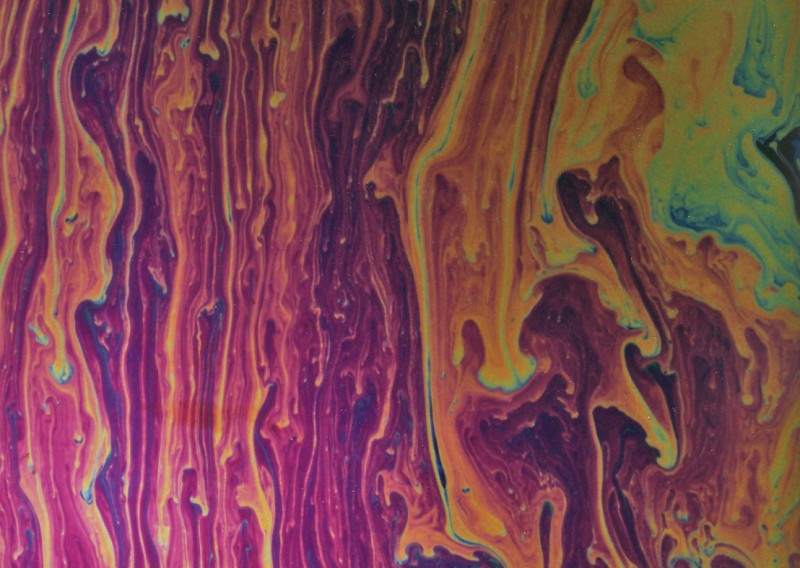
Here’s a new item for our category of soap bubble pictures.  The movie shows a science-centre-style demo, not of a bubble, but of a soap sheet.  It’s a way of showing patterns like the ones that appear on bubbles, but streaming down a huge sheet.  The quality of the movie is not great, so here’s a still photo that shows the effect.

I think this was originally a Victorian demonstration, but I don’t have chapter and verse for that.  It’s a demo you sometimes see in hands-on Science Centres, but often it’s not set up so that you can really see the colours.  For that there has to be a black background to the sheet, and a translucent screen, at an angle of forty five degrees to the sheet, brightly illuminating it.

I’m fascinated by patterns like these.  Just setting patterns in motion, as in many screen savers, doesn’t seem to me to produce effects that are as beautiful.  I don’t think it’s just the colours.  If we could characterise what makes these patterns special, might we then open up a whole new world of visual expression, using computer animation?  Or would we just end up with a small repertoire of pretty effects?

Fancy trying to set up your own soap sheet?  It’s not so hard.

Continue reading

Sleights of Mind – illusions and magic

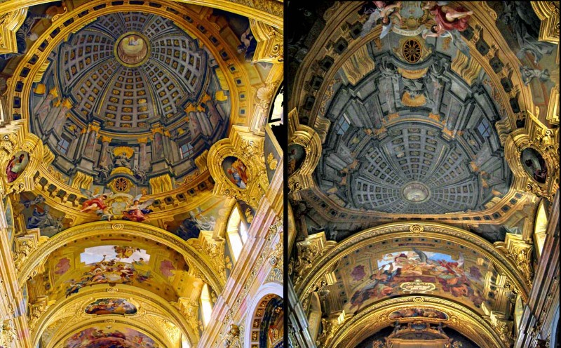
The dome in the left hand picture is an illusion!  It was painted on the ceiling of the Jesuit church in Vienna by Andrea Pozzo a bit over three hundred years ago. Seen from just the viewpoint of the photo on the left, it’s one of the classics of trompe l’oeil painting.  The right hand photo, looking the other way down the nave of the church, shows how Pozzo had to distort his painting of the dome, in order for the perspective illusion to work from a viewpoint near the high altar of the church, as in the left hand photo.   (Copyright might be asserted in these images.  Most of the images on this site are my own or out of copyright, and can freely be used for private, non-commercial purposes, but these are third party photos.  Apologies, I don’t know who took them).

Note added 16/5/17!  I’ve added a post about a ceiling painting in the uk by an artist following where Pozzo led.

I’m posting about the painting in Vienna to draw attention to a fascinating recent book in which Pozzo is featured.  The effect of his paintings, especially in this church and in the Church of Sant’Ignazio in Rome, is almost magically illusionistic, and the book is about what conjuring and magic have to teach us about perception and the brain.  It’s by cognitive scientists Stephen Macknik, Susana Martinez-Conde, with science writer Sandra Blakeslee: Sleights of Mind: what the neuroscience of magic reveals about our brains. The connection between illusions and conjuring has intrigued many researchers, but this is a ground-breaking published study.

Macknik and Martinez-Conde (a married couple, each running a separate research lab) also founded the Best Illusion of the Year Competition, now in it’s seventh year.

Arcimboldo exhibition in Milan, Italy

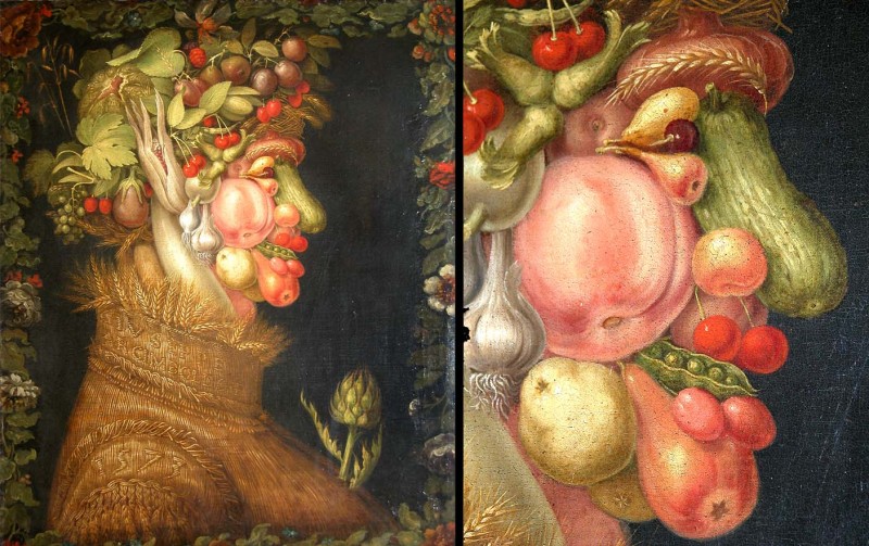
Make whatever sacrifice you have to, but unless you were in Washington last Autumn and caught the National Gallery of Art’s exhibition of the work of Arcimboldo there, seize any chance to travel to Milan, Italy, and see it there from January 27th to May 8th 2011.   It’s coming on at the Palazzo Reale. Arcimboldo was born in Milan, but became an unrivalled magician at ambiguous images, working four hundred years ago, mostly at the dazzling court of the Emperor Rudolph in Prague.  This is his painting of Summer, usually in the Louvre in Paris, and one of a set of paintings of the four seasons.

There’s still a movie about Arcimboldo, available in various formats, to the right on the Washington National Gallery’s website for the show, along with details of a huge sculpture that was in the Washington show, of the painting Winter from the same series of the seasons, by film-maker and sculptor Philip Haas.

We know Arcimboldo didn’t invent this kind of image, if only because of a rather naughty example on a 450 year old dish in the Ashmolean Museum.  But he inspired many of the generations of artists, and later psychologists, working with the ambiguous images that you can see in our Ambiguous Images category.

David Kemp

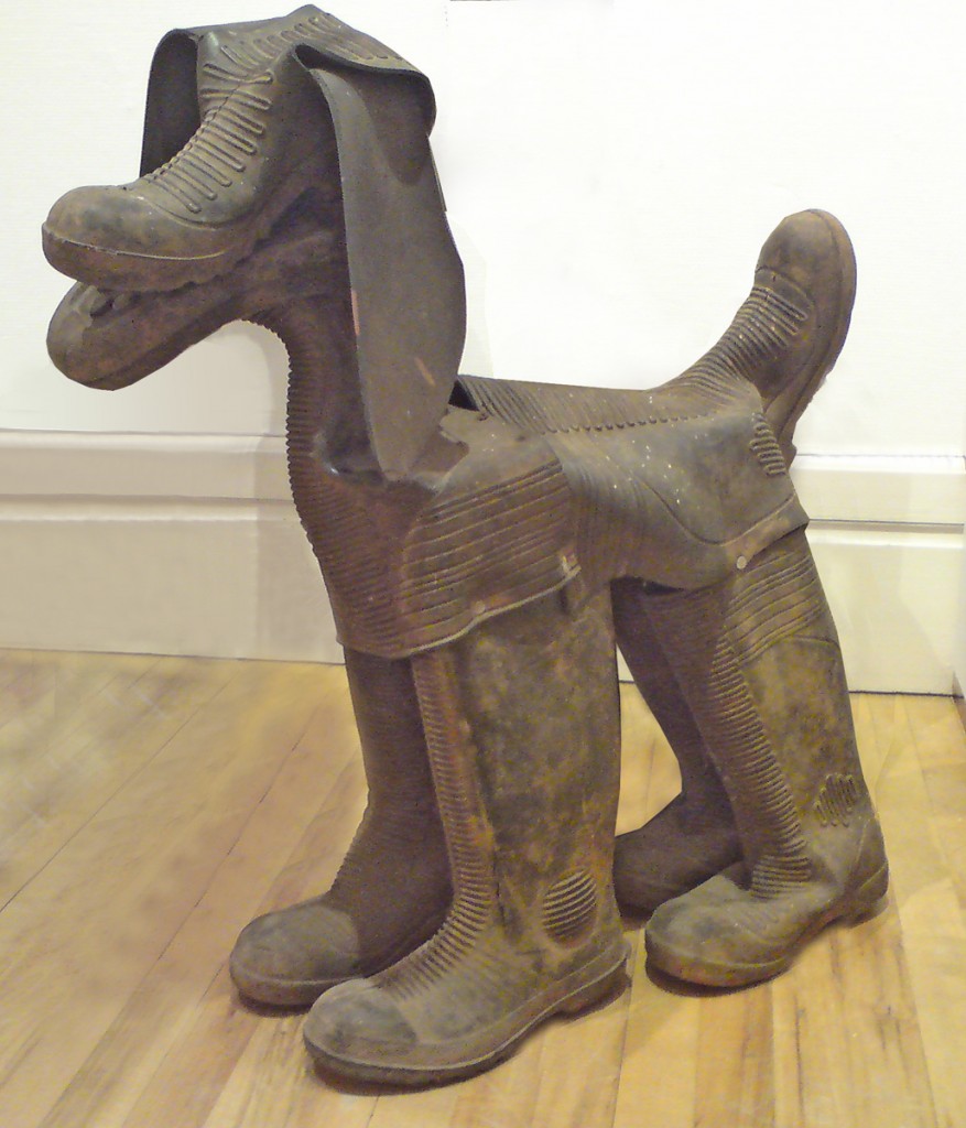
You’re going to have to hurry, but if you can get to the Royal Cornwall Museum in Truro, England, before July 3rd, you can see this brilliant sculpture of a dog by British sculptor David Kemp, in his exhibition The Botallack Hoard.  It’s one of the dogs in his piece The Hounds of Geevor, and if you don’t make the show, you can see them anytime in bronze in the centre of the nearby town of Redruth.  Truro and Redruth are in Cornwall, which if you look at a map of England is the pointy bit in the bottom left hand corner.  David lives pretty much as far down the bottom corner as you can go, and I think he’s one of the very best sculptors anywhere working, amongst other interests, on ambiguous images, on which I’ve posted several times before.  He works with every kind of what some people might call junk, but he discovers in it ideas that I find very funny and very beautiful.  If you’d like more information on David Kemp, see his brilliant website.

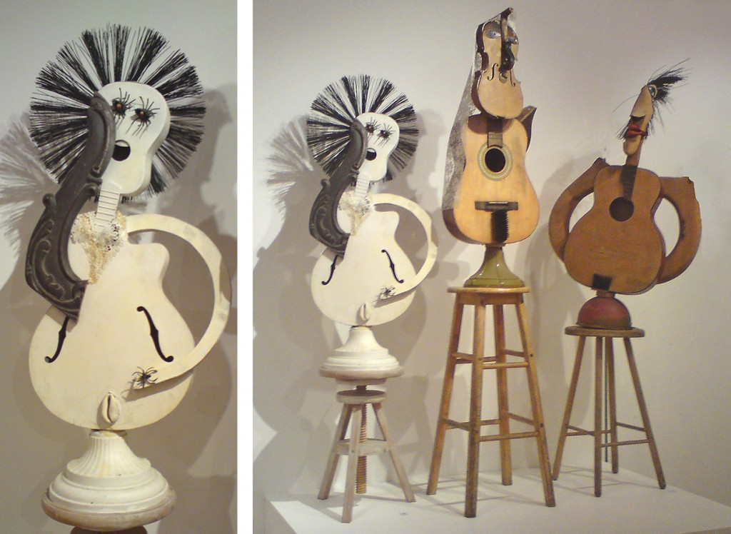
Here’s another of David’s sculptures, of three musicians, along with more detail of one of them.

Perspective Errors and the Best Visual Illusion of the Year Contest


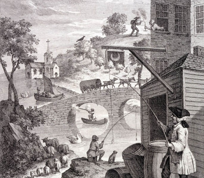
This is a detail from British artist William Hogarth‘s print made in 1754, to demonstrate mistakes in perspective.  For example, the sheep lower left get larger with distance, not smaller, and the woman top right is leaning out of a window offering a light to a man in the distance.

However I’m really showing it because a brilliant new animated demo of perspective anomaly, by Kouchiki Sugihara, has just won the first prize in the international Best Illusion of the Year Contest.  Don’t miss it, the ten best entries are shown, and there is some brilliant new stuff.

Coming back to Hogarth, his print was way before its time.  It was over a hundred years later, late in the nineteenth century, that illusion and puzzle picture books became common.  Then artists took up the challenge, Magritte and Escher for example.

Want to see the whole of Hogarth’s print?

Continue reading

Meet Humbaba

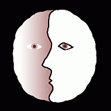
Humbaba

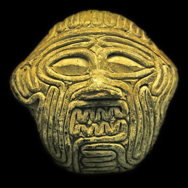
This is one of the oldest ambiguous images I know. It’s a small clay mask from Mesapotamia, (in modern day Iraq), made about 3750 years ago. It’s the face of the giant Humbaba, but as he might have appeared to a soothsayer, looking into the writhing entrails of a sacrificed animal for purposes of divination. If the face of Humbaba appeared in the entrails, in the way we sometimes see a face in clouds, it was a sign of revolution on the way. This evocation of the experience is in the British Museum, and they have a web page about it. (They even know the soothsayer who made it …).

I’ve written in earlier posts about the way that artists often seem to use perceptual puzzles as a starting point for aesthetic and emotional effects in artworks. This is a particularly fascinating example. It’s a work of art, but it’s also a record of emotional effect arising out of a perceptual puzzle, an ambiguous image, in a quite different kind of activity – divination. If I’ve got it right, quite a lot of fortune telling starts with ambiguous visual discoveries like this, when peering into tea-leaves, or crystal balls. I wonder how deep the common roots of aesthetics and shamanistic experiences go.

One route you can trace is through the entrails. You can’t quite be sure in this image, but when you look at the real thing, so you can look round the edges, the face is made up of one continuous entrail, coiling to and fro. If you can get to the British Museum, it’s in a case in their new Mesapotamia gallery, but you may have to hunt around, it’s not big.

Aesthetics and Perception: Kula trade canoes

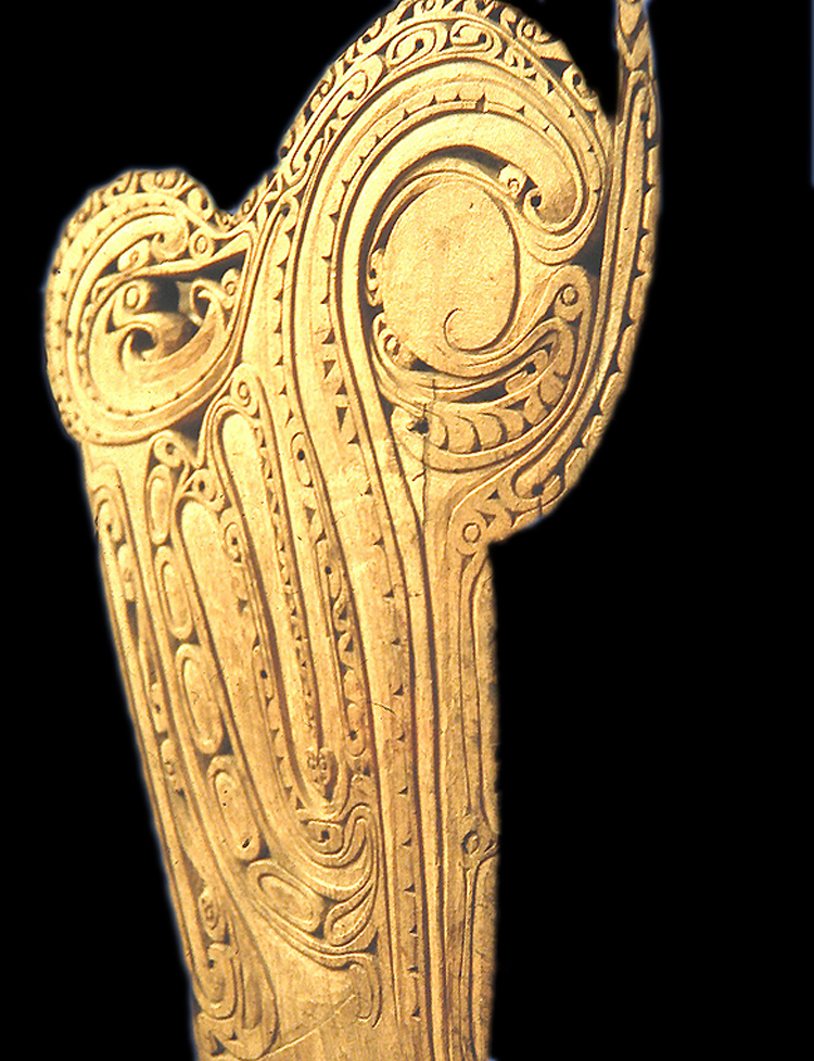
Prow of a Kula trade canoe

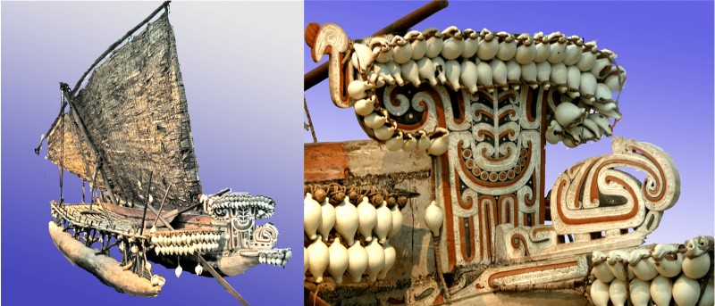
This wonderful ornamental canoe prow represents some fabulous creature, looking to the right.  Prows like this appeared on boats used in a cycle of trade around the Trobriand and nearby Islands in the Western Pacific, called the Kula trade.  The wonderfully ornamented canoes were only a small part of the story of this cycle of trading, but an intriguing one: the idea was to contrive a canoe so visually baffling that as your fleet of canoes approached the beach, it left your trading partners too bemused to compete in bartering. (For a more detailed account, if you fancy a bit of fairly heavyweight anthropology, there’s a fascinating essay by Alfred Gell called The Technology of Enchantment, in a book on art and anthropology from 1992).

The canoe prow is in the museum in Liverpool, UK, but to see a whole canoe go to the museum in Adelaide, Australia. It doesn’t have quite such a splendid, baffling prow, but it does show what these fabulous boats were like.

Kula trade canoe and detail of prow ornament

If you’d like to know out why these canoe prows remind me of paper marbling, read on.

Continue reading