Category Archives: Geometric illusions

Illusions that appear in figures with geometrically regular lines

Shepard’s Tables – what’s up?

This is an animation of Shepard’s Tables, an illusion first published by Roger Shepard as Turning the Tables, (see his wonderful book Mind Sights, 1990, pages 48 and 127-8). The left hand lozenge-shaped table top seems to get longer and thinner as it rotates, but it’s an illusion. It remains identical to the right hand table-top, except for rotation. The table-tops look even more different as the legs appear. The illusion is an example of size-constancy expansion – the illusory expansion of space with apparent distance. The receding edges of the tables are seen as if stretched into depth. Earlier posts on size-constancy showed how objects can appear wider with distance. That shows up with Shepard’s tables too, in the way that the oblique edges of the tables seem to get a bit wider apart with distance. The stretch into depth is more striking.

Recently Lydia Maniatis pointed out a puzzling aspect of the illusion, in her prize-winning entry for the Illusion of the Year Competition. Here’s a version of her figure.

Lydia Maniatis's Shepard's Tables puzzle

All three table tops are identical, but the middle one looks different from the one on the left, though it’s not even rotated. Instead the vertical axis of the figure is shown at an angle to gravitational vertical. That means that the blue edges are no longer aligned with the frontal plane of the image, as to the left, even though they are horizontal on the page, but must be receding into distance. And yet we don’t see the dramatic stretch into depth that appears with oblique edges that recede into distance. Why not?  Try looking at the middle block with your head leaning over to the left, so that the short edges are aligned with your head, and therefore with the vertical axis of your field of view.  Now (for me) the blue edges do stretch into depth, though not as much as in the right hand image viewed normally.

What do you think is going on?  I’ll take a shot at an explanation in a post in a couple of days.

An Ocean Wave Illusion

Moving waves illusion

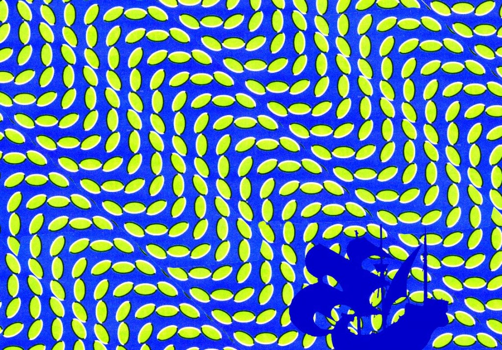
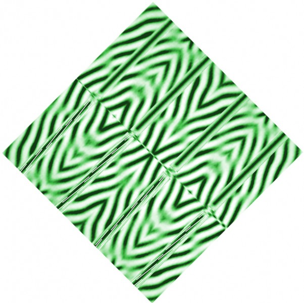
If you can see this illusion, you may be amazed to discover it’s not an animation.  Most people will see waving movement, yet the pattern of lozenges is not really moving at all. But about 5% of people just don’t see this kind of illusion, and if that’s you, it doesn’t mean anything’s wrong. If you do see the movement, it won’t be wherever in the pattern you focus, but in the periphery of your field of view. However, the effect is also very sensitive to size.  I see it vividly with the screen about 15 inches (36 cms) from my eyes, and the image 8 inches (21.5 cms) wide on the screen, but I think you’ll get an even better effect by clicking on the image, if a bigger version then comes up on your system.

It’s a kind of illusion only discovered in the last few years. Lots of discoveries about it have been made by Japanese researcher Akiyoshi Kitaoka, and on his site (amongst scores of other stunning illusions) you’ll find his masterpiece in this line, his famous rotating snakes illusion.  Update 4/9/12!  I just found out that the image I based this picture on is also one of Kitaoka’s.  I just changed it to make the pattern more wavy.

Continue reading

Dotty Poggy? Or Dotty Me?

Dotty variants on the Poggendorff illusion

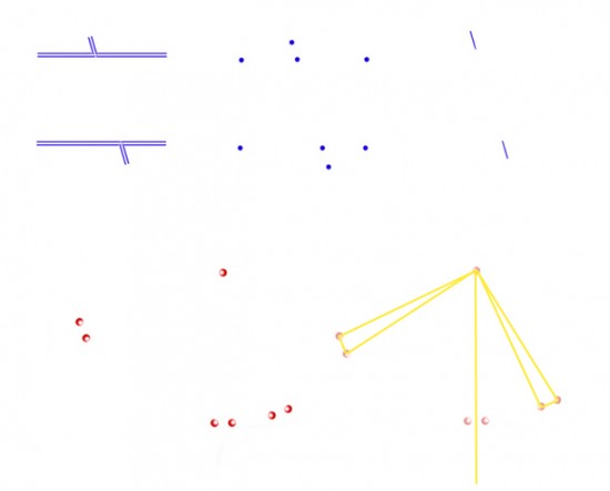
Upper left is the classic Poggendorff figure:  the oblique lines are objectively aligned, but the upper one appears shifted just a bit to the left. There are lots of variants on this illusion. For example, about forty years ago, researcher Stanley Coren showed that the effect persists, weakly, when the configuration is reduced to dots, as at upper middle. And top right is another variant, the Poggendorff-Without-Parallels: the misalignment effect persists, weakly, in two objectively aligned segments even without the long parallel inducing lines. Most researchers have found that this last effect is greatest when the test arms are at an angle of around 22 degrees from vertical. An analogous affect shows up when they are rotated the same amount form horizontal.

To my eye, the Poggendorff-Without-Parallels effect even appears when the little test line segments are reduced just to dots, as shown lower left. Imagine joining up each of the three pairs of dots with the isolated dot, so that we end up with three triangles. If we then drop a vertical line from the isolated dot to the middle pair of dots, it will pass through the mid-point in between them, as diagrammed in yellow to the right.  So the middle triangle of dots has sides of equal length, or is equilateral, as the geometers call it, and that’s just how it looks.  No surprises so far.  But now here’s the interesting bit. The two other triangles of dots, rotated respectively clockwise and anti-clockwise from vertical, remain objectively equilateral, but that’s not how I see them.  For me they now look more like right-angles triangles, as diagrammed with yellow lines to the right.  The effect suggests a shift in apparent position of the right hand pair of dots, (rotated anti-clockwise about 22 degrees from vertical), just about equivalent to the shift we seem to see in the Poggendorff-Without-Parallels, shown above it at top right.  There’s an equivalent shift for me in the pair of dots rotated around 22 degrees from horizontal.

It would be really useful to have comments on whether that works for you, or whether for you the rotated dot arrays still present equilateral triangle arrangements.  Illusions like these often do look different to different observers, and it’s also all to easy, once you have a theory about what’s going on, to see things the way your theory says they should look.

11 June 2012:  This is a revision of the original post.  It included a 3D demo of the dotty effect, but with triangles of dots that turned out not to be truly equilateral….  Woops.

Subtle Bent Line Illusions

Bent line illusions
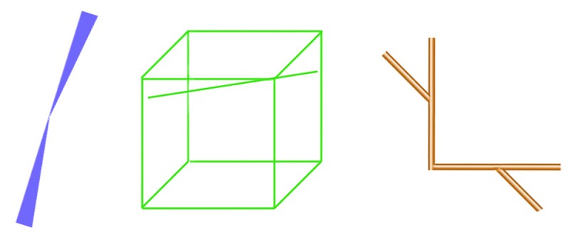
Here are three rather subtle illusions, each showing bent lines. In Bourdon’s illusion, to the left, the straight left hand edge looks bent. In Humphrey’s figure, centre, the straight, loose line touching the corner of the cube looks bent. And in the figure to the right, the straight line interrupted by the corner looks bent. I don’t think we really understand any of these illusions, and they are not very dramatic, so you don’t see them often. When someone does puzzle them out, for sure they’ll be a key to subtle ways the brain works. There’s probably a different explanation for each. For example, both the left and middle figures show a bent line that is the backbone of two triangles meeting at a point, so you might think, hello hello, we’re getting somewhere. But then you notice that the lines bend in different directions in relation to the triangles each illusion.

If you like to tangle with the technicalities, there are learned studies of the Bourdon illusion and the corner figure, though unfortunately, you’ll only get an abstract of the articles on those links, unless you are in a university library where they subscribe to the journals. And you won’t find much on Humphrey’s figure anyway, it’s seriously obscure.

Here’s a bit more on the corner figure  ….

Continue reading

Poggendorff versus Mueller-Lyer

PoggendorffversusMueller-Lyer

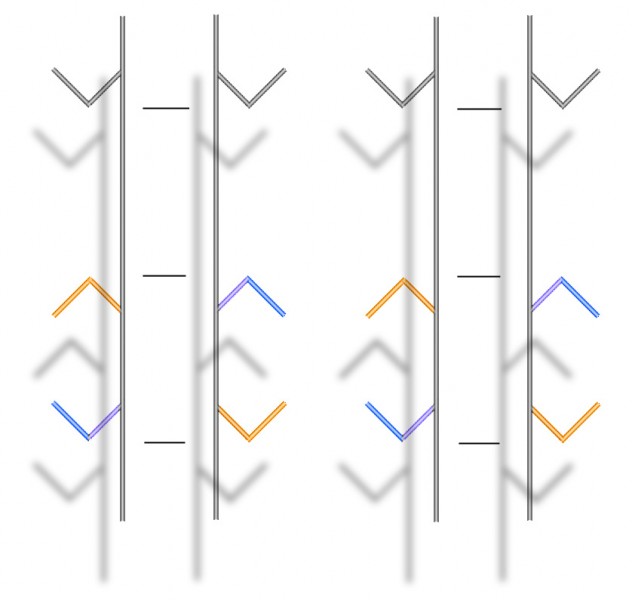
This is a stereo picture-pair, but you can see what’s happening here without having to view the images in 3D if you prefer.  However,  if you’ve not got the knack, and would like to practice on this post, here’s how.  Hold up a pen about in the middle, between the two pictures, and about five inches from your eyes (careful!).  If you now try to focus on the tip of the pen, you’ll notice that the blurry image of the figure has doubled.  Now move the pen-tip away from your eyes, and notice that the two blurry middle images of the figure are beginning to overlap.  Once they overlap (probably when the pen-tip is something like ten inches away from your face), see if you can get them to overlap exactly, and then come into focus.  If that doesn’t work, try this great tutorial on another site. Or try our earlier post about stereo picture pairs.

If you’ve got it, you should see the parallel vertical bars and their attachments floating in front of a surface with their shadows thrown on it. You’ll see the same if you view the image normally, but not with the illusion of 3D.  So what’s going on?

It’s a much stronger version of some paradoxical effects I showed in an earlier post.  The tips of the arrowheads are all objectively exactly the same distance apart, as indicated by the horizontal lines aligned with them in between the vertical bars.  But that’s not how they appear if you look at the arrowheads:  the inward pointing arrows look much further apart than the outward pointing ones.  (That’s the Mueller-Lyer illusion).  But now check out the lower, coloured arrowheads.  The coloured arms that contact the vertical bars are objectively aligned, but appear not to be – the upper arm in each case seems shifted a bit upward, and the lower arm a bit downward.  (That’s the Poggendorff illusion).  For the arms to appear out of alignment like that, you’d imagine the arrowheads must move further apart.  But that’s exactly the opposite of what the Mueller-Lyer illusion is making them seem to do.

Continue reading

Padoxical illusions

morinaga's illusion

This is Morinaga’s paradox – two illusions in one, but two illusions that contradict one another. First note the vertical alignment of the arrow points. Don’t the tips of the inward pointing arrowheads, top and bottom, appear to be located just a little further inwards than the tips of the middle, outward pointing arrowheads? That could only be right if the horizontal space between the tips of the (top and bottom) inward pointing arrowheads was slightly less than the space between the tips of the (middle) outward pointing ones. But that’s not how it looks. The inward pointing arrowheads look further apart than the outward pointing ones.

In reality both judgments, of vertical alignment and of the horizontal gaps, are illusions.  The tips of the arrows are perfectly aligned vertically, and the horizontal gaps between the three sets of arrowheads are all exactly the same. That last effect is a version of the Muller-Lyer illusion.

Continue reading

Zöllner versus the Twisted Cord

This effect is a bit size sensitive.  It works for me with the diamond about 13 cms or 5 inches wide on my screen, and also a bit larger, but not much smaller.  I think resolution will need to be good too.  All being well, It should show one illusion being overcome by another. All the bars are parallel, but they look wonky. In the top set of four, for example, do the middle pair of bars look just a little further apart near the centre line of the image than towards the upper right edge?  The flanking pairs of bars (still just looking at the top set of bars) look to me closer together at the mid-line than at the upper edge. In other words, that upper right set of bars look like they’ve rotated just a touch, opposed to the orientation of the blurry stripes behind them. (That’s the Zöllner illusion). Now check out the lower set of four bars.  For me, they look like they’ve rotated in just the same direction – but that’s odd, because I’ve mirror reflected the stripes behind them, so that the stripes have changed direction. So those lower bars appear to have rotated so that they end up slightly more aligned with the stripes behind them.

How so?  You’ve guessed, it’s to do with those thin white stripes I’ve added to the lower set of bars. They turn the bars into another illusion of orientation, the twisted cord illusion.  The way I’ve done it, that sets the two illusions in competition, and as a result you’d expect the four lower wonky bars to end up looking about just about parallel. That’s about what happens, for example, when the Zöllner illusion goes head to head with the size-constancy illusion.  But instead, the twisted cord can overcome the Zöllner illusion. Now, that’s very interesting ……


Continue reading

Bressanelli and Massironi’s new illusion


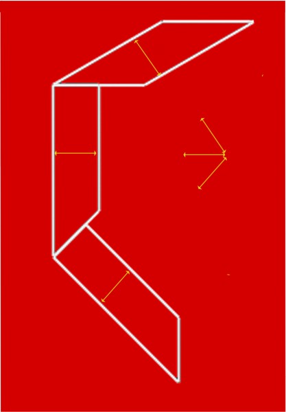
Here’s another illusion only recently reported, by Daniella Bresanelli and Manfredo Massironi of the Universities of Padua and Verona.  Look at the three shapes, and most people seem to see the bottom one as thinnest, judging width at right angles to the long edges, the middle one as a bit fatter, and the top one as widest of all (still judging width at right angles to the long edges).  In fact, they’re all the same width, and the two bottom shapes are also identical, just rotated in relation to one another.

What’s going on?  If you devour technical articles like snacks, see Bressanelli and Massironi’s paper.  Otherwise …


Continue reading

The vertical/horizontal illusion


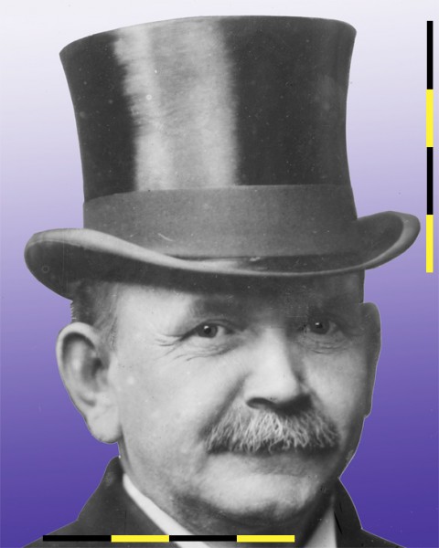
This aimiable looking old guy was Austin Crothers, governor of Maryland USA in the first years of the last century, and a notable scourge of deception and corruption.  His top hat however presents one mysterious deception that even he couldn’t unravel.  It looks to me about as wide as it is high. But now look at the measuring rod, first when vertical, and running the full height of the hat.  When horizontal, at the foot of the picture, we can see that the same line stretches only a touch over two thirds of the way across the width of the hat. The hat is MUCH wider than it is high.  It’s an example of the horizontal/vertical illusion – we tend to overestimate height. Check out pictures of the St. Louis Arch, seen from the front, for example.  It’s just as wide as it’s high, but looks higher.

There’s no agreement on why.  There are lots of speculations, for example that the effect arises from some adjustment to allow for the inequality between the width and height of the visual field in normal binocular viewing.

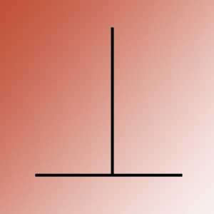
The discovery of the illusion is attributed to J.J.Oppel in 1855.  It’s usually seen in this simplified version.

It works the other way up too, and is sometimes called the T illusion.  It’s one of many illusions for which you’ll find a brilliant interactive demo on Michael Bach’s site.

It’s amazing that we’ve made so little decisive progress with simple illusions like this one, after more than a century.  I can’t think of another area of science in which progress has been quite so hard, except of course some areas of maths.  But with these illusions, the explanations proposed in papers from over a century ago are sometimes much the same as those we are still discussing today.

The photo of Crothers is from the Grantham Bain collection in the Library of Congress and can I believe be used without copyright restrictions.