Category Archives: Geometric illusions

Illusions that appear in figures with geometrically regular lines

Muller-Lyer paradox (amended post)

Here’s a new way of looking at the Muller-Lyer illusion – paradoxically.

In the Muller-Lyer illusion, a line segment ending with outward pointing arrowheads looks shorter than an identical segment ending with inward pointing arrowheads. So in this version, whenever the arrowheads are visible, the left end of the line looks shorter than the (objectively identical) right end.

Here’s the paradox. When the arrowheads appear, the line segments instantly appear different in length, and yet the positions of the little globes marking the ends and centre-point of the line don’t appear to shift at all – which is impossible.

To make the point, in the bottom line, I’ve added an animated shift in the position of the middle globe, of just about the extent needed to produce the difference in apparent lengths of the line segments induced in the top line by the arrowheads.

The paradox is an example of the way that these so-called geometric illusions are not really so geometric.  Draw a figure, and if you change the length of a line, at least one of the line endpoints has to shift as well.  But in perceptual space it doesn’t necessarily follow.  So perceptual space can be pretty weird, or as researchers sometimes call it, non-Euclidean, because it isn’t always bound by the rigid constraints set out by the ancient Greek geometer Euclid.

(I’ve changed this post at 16/5/12.  There was other stuff in the original version, but it got much too complicated).
Magic Ring

Here’s a movie of a brilliant, double spiral novelty illusion ring.  It’s available to buy from Grand Illusions, and on that link you can also see another movie of the illusory effect.  As the ring is rotated, it seems to expand when rotated one way, and contract when rotated the other way.

It just may be a version of the kind of ring described in one of the oldest reports of an illusion to have come down to us – a description by the French commentator Montaigne, written nearly five hundred years ago.  In an essay called An Apology for Raymond Sebond he describes …

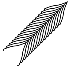
….those rings which are engraved with feathers of the kind described in heraldry as endless feathers – no eye can discern their width, or defend itself from the impression that from one side they appear to enlarge, and on the other to diminish, even when you turn the ring around your finger.  Meanwhile if you measure them they appear to have constant width, without variation …..

Researcher Jacques Ninio quoted that extract in his 2001 book The Science of Illusions (page 15), noting that a design on a ring like the one below looks wider at the top than the bottom, thanks to the Zollner illusion but is objectively the same width all the way along.

All the same, Montaigne’s description of rotating the ring makes me wonder if that’s the whole story.   So I’m on the hunt for surviving mediaeval rings that might decide the issue. And meanwhile, though there are theories about how the Zollner effect arises, no researcher as far as I know has an explanation for the effect shown in the novelty ring available from Grand Illusions (and other suppliers).  I reckon it’s to do with the way that the highlights expand or contract with rotation, but then seem to carry the outline of the object with them.  This is a puzzle which I will be coming back to.

Decor with Attitude

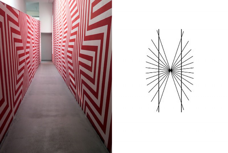
This is an installation called Zig-Zag Corridor by Czech artist Petr Kvicala, in the Dox art centre in Prague, Czech Republic.  He’s an artist who produces dazzling patterned effects.  In this one, beautiful diagonals meander through the patterns, although the linework is entirely made up of a continuous sequence of horizontal and vertical segments.

However, as my friend Alex noticed, when he featured the installation on his site devoted to stunning photos of architecture in a district of Prague, Vrsovice Photo Diary, there’s another effect here as well:  in places the walls seem to bow outwards in the middle, and the right wall doesn’t look flat at all.  That’s because of an illusion that arises whenever long lines intersect or abut an array of parallel or systematically varying obliques, as to the right above.  The apparently bowed long lines are objectively straight.  It’s called the Hering illusion, first scientifically reported by Ewald Hering in 1861. It’s a special case of the more general Zollner illusion, published by the astronomer and mystic Johann Karl Friedrich Zollner a year earlier.

I don’t know whether the artist introduced these effects by accident (and they probably appear more strongly in photos than in the real installation).  But it’s very, very easy for these illusions to sneak unintended into designs – as I let them do, when I failed to realise their contribution to a quite different effect in an earlier post.


The Thiery-Wundt and Muller-Lyer illusions

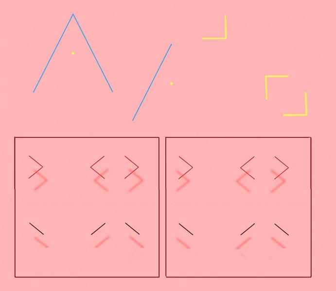
Top left is one of the simplest of all illusions.  The yellow dot is just half way up the vertical height of the triangle, but looks decidedly nearer to the apex. The effect was reported over a century ago, and has been named for its original researchers the “Thiery-Wundt illusion” by recent experimenters Ross Day and Andrew Kimm.  A consensus in recent years has been that we are hard-wired to home in on the “centre of gravity” of the triangle, the point at which three lines bisecting the three angles would meet.  The centre of gravity is a bit lower down than the half-way point of the vertical height of the triangle.  So maybe, the theory goes, we tend to take the centre of gravity as a default central reference point, and so we see the vertical centre point as if shifted a bit towards the apex.  But that can’t be the whole story, researchers Day and Kimm point out, because the effect is still there when the figure is reduced to just one oblique angle side, as centre top in the figure.  In fact, in their experiments, the effect was measured as even stronger that way. So the illusion may look simple, but more than a hundred years after its debut, we’re still basically guessing what’s going on.

Whatever is afoot, it’s probably also involved in the Mueller-Lyer illusion, in which the gap between two inward pointing arrowheads looks larger than an identical gap between two outward pointing ones.  I’ve shown that in 3D in the figure, for viewers who have the knack of so-called “cross-eyed” 3D viewing, without a viewer.  (If that’s new to you, and you want to get the knack, search on Google or try this site – though give it a miss if you have vision problems). But you can see the Mueller-Lyer effect perfectly well in 2D, and for a full discussion of the two illusions, Thiery-Wundt and Mueller-Lyer, if you have access to a research library, see Day and Kimm’s original research paper.  Or for just a bit more ….

Continue reading

Competition and the Poggendorff and Muller-Lyer Illusions


I’ve not been posting much because I’ve been struggling with a mammoth revision of my technical site on the Poggendorff illusion.  But now that’s done, here’s a post on another Poggendorff puzzle.

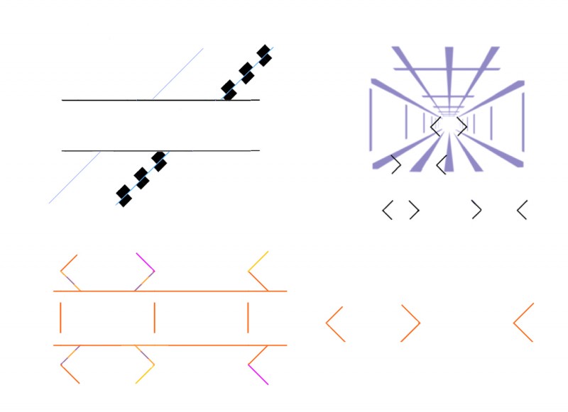
In earlier posts I’ve shown examples of competition between illusions, and included a demo of a paradox when the Poggendorff and Muller-Lyer illusions go head to head.  Bottom left above I’ve shown that last demo again – not so pretty, but I think a clearer demo.  Thanks to the Muller-Lyer illusion the outward pointing arrowheads appear closer together than the inward pointing ones, when objectively the arrow points are identical distances apart (note the reference lines in the middle of the figure).  But at the same time, thanks to the Poggendorff illusion, at the left end of the figure the arms of the same arrowheads, objectively aligned, would have had to move further apart, not nearer, in order to produce the effect of misalignment that we see.  So the two illusions seem to coexist in total opposition to one another, without a qualm. I’ve repeated the arrowheads to the lower right, to show that, at least as I see it, their appearance is just the same as when embedded in the Poggendorff figure.

But then the top figures show that both these illusions can be inhibited, when set in competition with other illusions.  Top left the Poggendorff illusion is normal to the left, but cancelled to the right (or is it even reversed?) when the test arms are illusorily rotated by the addition of some Cafe Wall characteristics. And top right, there’s much less difference (again to my eye) between the illusorily lengthened and shortened elements of the Muller Lyer illusion when we see them in the context of a Ponzo illusion (a scene in apparent depth) than as we see them isolated below the Ponzo scene.  In the Ponzo scene, the size-constancy effect is increasing the size of the smaller Muller-Lyer element.

So why are the Poggendorff and Muller-Lyer illusions sometimes inhibited when set in competition with other illusions, when at other times they co-exist with rivals in glorious paradox?  Any ideas?

The Twisted Stairs (version 2)

The Twisted Stairs - version 2

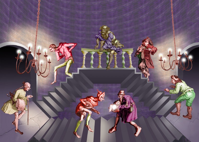
I’ve been wanting to do a new version of my earlier post of The Twisted Stairs.  That’s partly because the way I placed the figures in the original posting, they got in a bit the way of seeing the twist in the lateral flights of stairs. I reckon you can see the twist effect better now, as they transform from stairs seen from below (at the top by the balcony), to stairs seen from above (down at floor level). I wanted to see if I could get it right, because this is an impossible stair effect that maestro M.C.Escher never used. Sometimes his staircases as a whole can be seen either as from above or from below, but they don’t twist from one viewpoint to the other half way up. As I mentioned in the earlier post, I reckon that’s because the twist effect depends on fudging the perspective, and Escher didn’t do fudge. His perspective is almost always miraculously lucid.

Another reason for a new version is that I wanted to produce a high resolution version, suitable for giant 35 x 23 inch posters. As ever, you are welcome to use downloads of the image here for any private purposes, but if you wanted to think about buying a framed print, or giant poster, here’s where to take a look.

There are more technical details on the original post. I borrowed the figures for this new version from Durer, Pieter Brueghel the elder, and Hogarth.

Pinna’s Intertwining Illusion

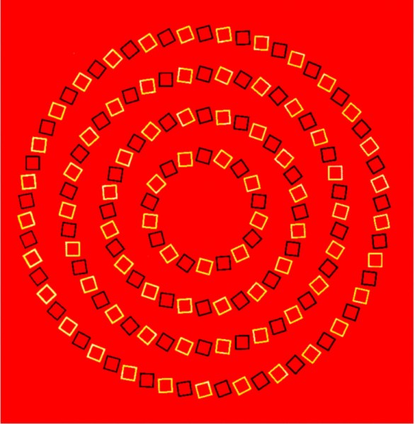
Pinna's intersecting spirals illusion

This is a brilliant illusion discovered by Baingio Pinna of the University of Sassari in Italy.  The circles appear to spiral and intersect, but are in fact an orderly set of concentric circles. The illusion is due to the way the orientation of the squares alternates from circle to circle, and that contrast alternates from square to square within each circle. The illusion is related to the movement illusions of Akiyoshi Kitaoka and to twisted cord illusions.

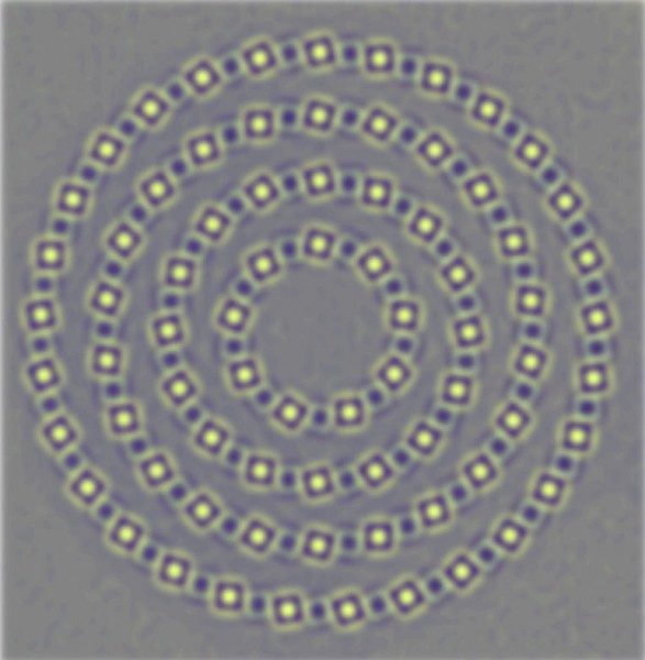
What’s going on is suggested by this next version, with the edges enhanced, plus a bit of blurring.

Filtered version of Pinna's intersecting spirals illusion

This image approximates (with false colour) the data transmitted within the brain once the image has been filtered by cell systems early in the visual pathway, including centre-surround cell assemblies (a bit technical, that link). The role of these is to enhance edges, so that bright edges are now emphasised by dark  fringes and vice versa. Note that between the little stacks of alternating light and dark fringes, along the line of the circles, the dark fringes of bright squares align with the dark edges of adjacent squares and vice versa. The scale and spacing of the squares is just right to get that alignment, and as a result the effect enhances the inward turning, spiralling effect due to the orientation of the squares. The fringes combine to give an effect a little like interfering waves. The illusion seems to be bamboozling processes that are usually superbly effective at filtering out the key information about edges and their orientation in the visual field.

However, showing that centre-surround cell outputs could be enhancing the inward turning character of the lines forming the large circles doesn’t explain why the brain integrates the local effects into the perception that the large circles as a whole are spiralling inwards. I guess that’s because, to a much greater extent than we realise, we infer global configurations from what we see just in the central, foveal area of the field of view. That also seems to be the case with impossible 3 dimensional shapes, as in the impossible tribar.

Subtle misjudgments of horizontal and vertical

The Walker Shank, Tolanski and related figures

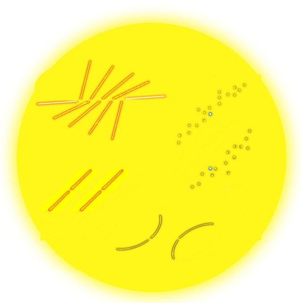
Back in 1987 James Walker and Matthew Shank in the university of Missouri were doing a study of the Bourdon illusion. In some figures they devised for comparisons in their study they noticed a new effect, quite unrelated to their study. The figure upper left is a version of their chance discovery. The centre line is objectively horizontal, but can seem to rise slightly to the right. Walker and Shank tried the effect experimentally, and found it was indeed seen by a majority, but not all of their observers.  (Note for techies:  For a PDF of their article, input 1987 as year, the authors’ names plus Bourdon and contours as keywords on the Psychonomic Society search site).

The effect seems related to the Tolanski illusion, lower left: the gaps in the sloping lines are exactly level with one another, but the right hand one looks a touch higher. Generally, our judgments of horizontal or vertical across empty space between lines with a pronounced slope seem to get just a little rotated in the direction of the slope. The effect is even stronger for me with curved lines (as bottom right) than with straight ones. I’ve even found it in informal experiments with a number of observers as upper right, when vertically positioned target dots appear rotated towards the slope of blurred or broken slanting edges in which they are embedded.

But in my version of the figure, upper left, we can also see the Poggendorff effect at work, (according to me at least). Look at the two outer, nearly horizontal arms. They are exactly aligned, but to my eye the right hand one looks higher than the left hand one. That’s just the result we would get if we deleted the middle three pairs of lines, to end up with opposed obtuse angles, in what is sometimes called an obtuse angle Poggendorff figure.

Do the Tolanski and Pogendorff illusions share a mechanism, or do we see in the top left figure both the rotation of the horizontal line, and the misalignment of the outer arms, arising by chance from different processes in the brain? We can’t yet be sure, but I reckon the same processes are most probably at work, and are to do with projecting orientation and alignment judgments across figures with powerfully competing axial emphasis. The Tolanski and Poggendorff figures present a sort of reciprocal pairing: with Tolanski figures judgments of vertical or horizontal are compromised in a figure with a dominant slant, whereas in classic versions of the Poggendorff illusion judgments of oblique alignment are rotated between vertical or horizontal lines.

Shepard’s tables – What’s up? (post no. 3)

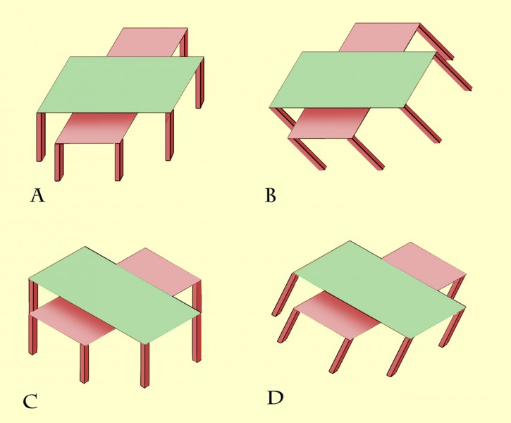
nested Shepard's tables demonstrating size-constancy lateral expansion

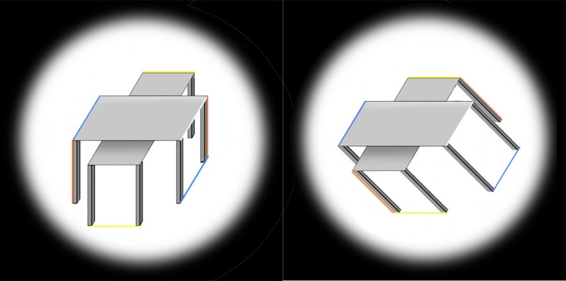
This is a third look at the Shepard’s tables illusion. If you didn’t see the earlier posts, you might like to get up to speed on the illusion by scrolling down two posts to an animated demo. The two pairs of table-tops in these views are absolutely identical, and within each pair the two lozenge shapes are identical except that one is seen short end on, and the other wide side on. However, they don’t look identical. Most dramatically, the lower table in the left hand image looks much longer and thinner than the upper table. But we don’t see that stretch into depth in the identical pair of table-tops in the right hand image. They look quite different, just because the tables are shown tipped over.

The stretch-into-depth of the lower table in the left hand image is a kind of size-constancy effect. But the tables also show a more familiar kind of size constancy effect.  Check out the blue lines in the left hand image (left edge of the upper table and alignment of the bottom of the table legs). Those blue lines are parallel, but to my eye they look as if they get wider apart with distance.

In the left hand image, to my eye, only the blue lines show apparent divergence with distance. The horizontal edges (yellow) and the vertical table legs (red edges) stay parallel for me. But in the right hand picture, just tipping the tables over makes all three pairs of coloured edges appear to diverge with distance. The effect may not be very strong. It’s easier to see in bigger versions of the pictures, so I’ll add those in in what follows, where I want to pose a question: are the differences between the table-tops as seen upright and tipped over only to do with how we see pictures, or are they a clue to how we see more generally?

Continue reading

Shepard’s Tables – what’s up? (post no. 2)

Nested Shepard's Tables

The previous post presented an animation of Shepard’s Tables. If you didn’t see that, you might want to check it out first (scroll down to the previous post) to get the basics of the illusion. This new version of the illusion, with nested tables, follows the pattern: all eight of the lozenge shaped table-tops are identical in shape, but the more that a lozenge is seen with its long edge parallel to the line of sight, the more it looks long and thin as it stretches into the distance. The more it’s seen short edge parallel to the line of sight, the more it looks wide and stumpy.

Describing the illusion that way may explain a puzzling variant of Shepard’s Tables, recently reported by Lydia Maniatis, as mentioned in the previous post. As the problem appears in these nested tables, at B the edges of the table-tops that are horizontal on the screen must be receding into depth, and yet they don’t show the dramatic illusion of a stretch into depth that we see in the edges receding into distance at A. Why not?

Isn’t it a question of perspective? At A the horizontal table edges are represented as if seen head on, parallel to the image plane – the plane at right angles to our line of sight. The table edges that are oblique on the screen at A must therefore be extending into depth in the most extreme way, parallel to the line of sight and at right angles to the image plane. Seen like that, depth effects are maximised. At B, no edges are aligned with the image plane, and all the edges, even the ones that are horizontal on the screen, are receding at 45 degrees to the line of sight. That’s a much less extreme recession into depth. So although the table edges that are objectively horizontal on the screen at B are receding, they don’t show as much illusory stretch into depth as the receding edges in A. 

Lydia Maniatis observation raises a general point that’s really interesting – the way that appearances can depend on what we mean by “up”.

Continue reading