Category Archives: Ambiguous images

Mosaic illusions

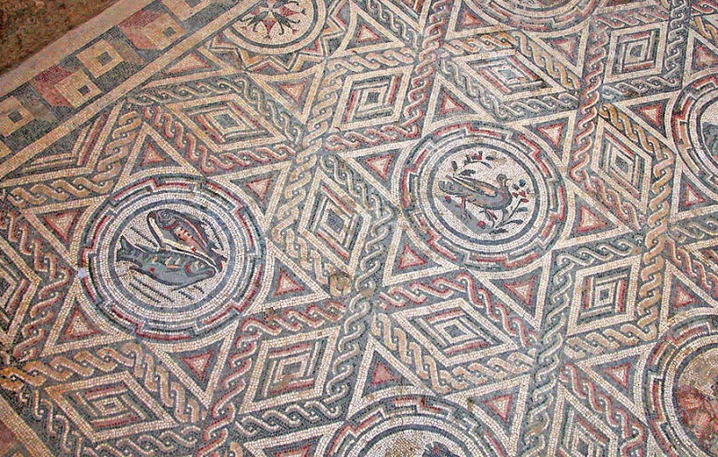
Mosaic floor at Casale


Here’s another example of the way illusion effects have been used in decorative art designs. (For examples in earlier posts, check out the category Illusions and Aesthetics, to the right). This mosaic is one of many from the Villa Romana del Casale, in the middle of Sicily, Southern Italy. Only the floors of this Roman villa are left. They are about 1700 years old, and are the largest expanses of mosaic floor surviving from the ancient classical mediterranean world.

The illusion comes in because different shapes in the design tend to pop out from one moment to the next. For example, in the pictures below I’ve selected out a star and a string of lozenges in the picture on the left, and then a hexagon shape in the picture on the right. Note that the hexagon interlocks with the star beside it with no gaps between them or overlaps, but when we select one, the other kind of vanishes, not only in these demo pictures, but even in the big picture at the start of the post. It’s a figure/ground effect, as in the faces/vase illusion, but without the dramatic light/dark contrast of faces and vase.
Mosaic floor demo
Continue reading

Improved artworks no.2

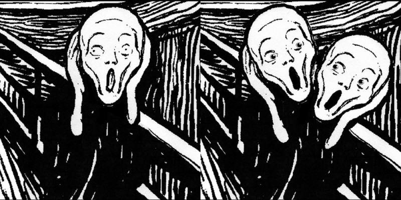
On the right, with apologies to Eduard Munch, I’d like to propose an improvement to his famous picture The Scream.  In my version, the screamer really does have something to scream about:  he’s holding up a duplicate of his own head for inspection.  But which head is the one that’s attached to the body, and which is being held up for inspection?  You can make it work both ways, with the upper head looking down on the lower, handheld one;  or, as if the whole figure was leaning over to the right,  with the lower head looking up at the handheld upper head.  It’s another example of the effect in the Mask/Skull illusion, and in Improved artworks no. 1.  I think I invented it, with a hint from Picasso (see the Mask/skull post).  But I’ll be delighted if you prove me wrong by finding an older version. 

No problem about the title for the improved version, it would have to be The Screams.

Rotating Heads – Santa turns into Ibsen (more or less)


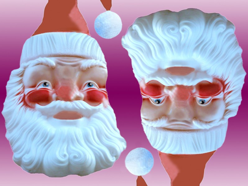
Here’s a rotating head illusion for Christmas.  I’ve been giving talks about Christmas imagery, and sometimes use old fashioned transparencies.  Recently I glanced at my slide of Santa upside down, and there was the face of the great Norwegian playwrite of a century ago, Henrik Ibsen.  It’s an illusion in the tradition of the one I posted earlier, about two characters called Mr. and Mrs. Turner.  (That post includes an animation). There are lots of other pictures of rotating heads by nineteenth century illusion artists.


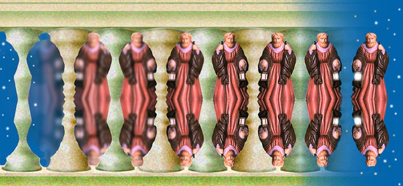
Figure/ground Balustrade Illusion

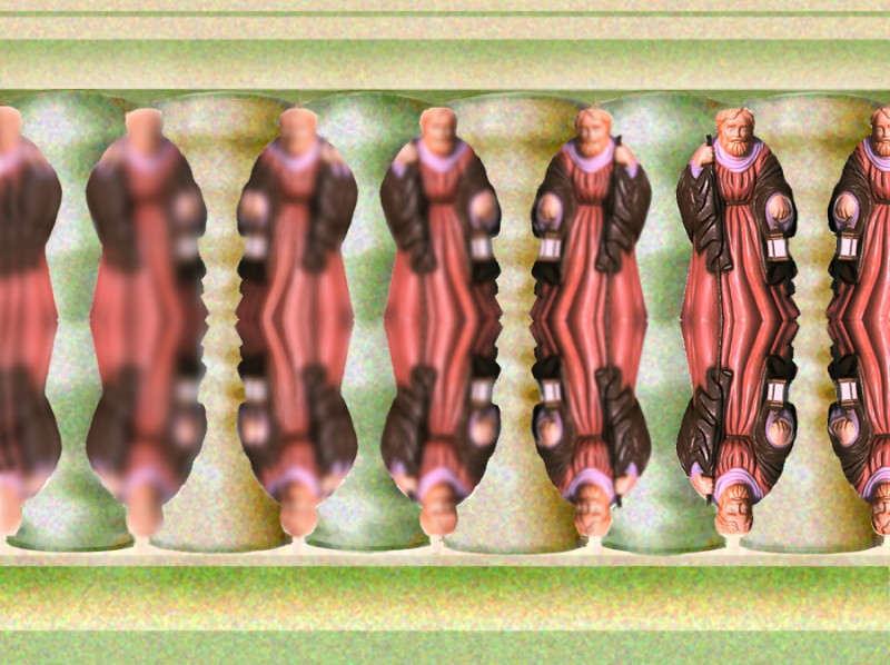
Here’s another figure/ground effect.  A saint becomes a balustrade!  Almost any vertical figure whose profile is not too wiggly can be used for this illusion.  Below is a different version of it.  It’s a little more puzzling, because both saint and balusters, when seen as figure at the ends of the picture, have the same starry sky as background.  That’s done by making sure that when saint or balusters are seen as background near the ends of the row, they blur into the same starry night sky.


Continue reading

Outlines, objects and apertures

Impossible shape illusion


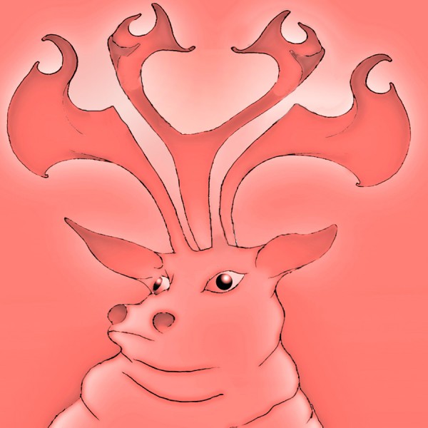
This stag may look OK at first glance (well, you know, sort of…), but hang on, has he got three antlers, as at the top of the picture, or only two, as down by his ears?  Following on from the last post, it’s another example of what happens when apertures or gaps in the visual scene – like the segment of starry night in the last post – become objects. But with the stag it’s even weirder, because the middle antler, for example, starts out at the top OK, but by the time it gets down to the stag’s head, it’s become background.  Want to know more?  Read on!

  Continue reading

Improved artworks No 1


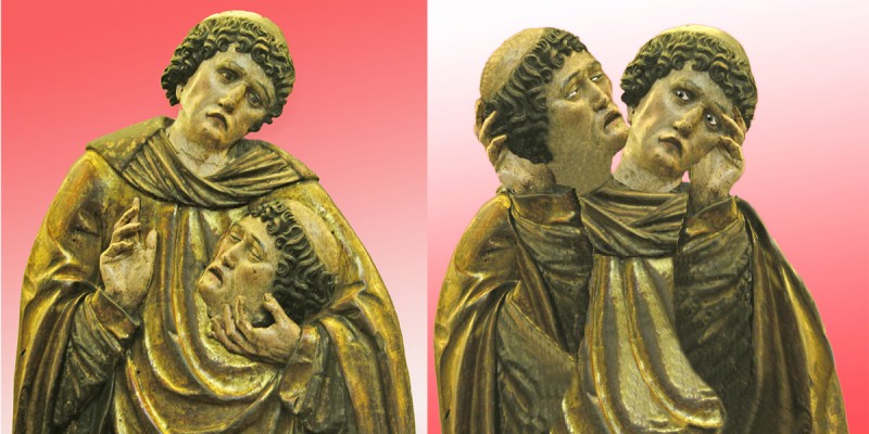
Here’s a historic artwork I reckon I’ve much improved.  On the left you see it as has been for the last five hundred years or so, a Spanish (I think) wood carving, of a martyred saint, now in the Petit Palais museum in Paris. On the right I’ve turned it into an ambiguous image, in which it’s not clear which head belongs to the body, and which has been chopped off and is being held up for inspection – I think you’ll agree a far more poignant image.  It’s an illusion in the style of the Mask/Skull illusion posted earlier.

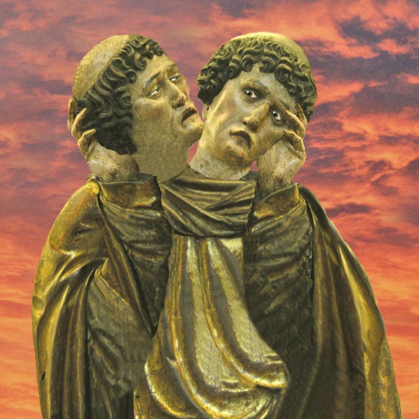
Here’s a version of my adaptation with an evening sky:

Puzzling artistic effects

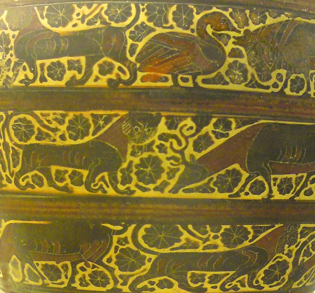
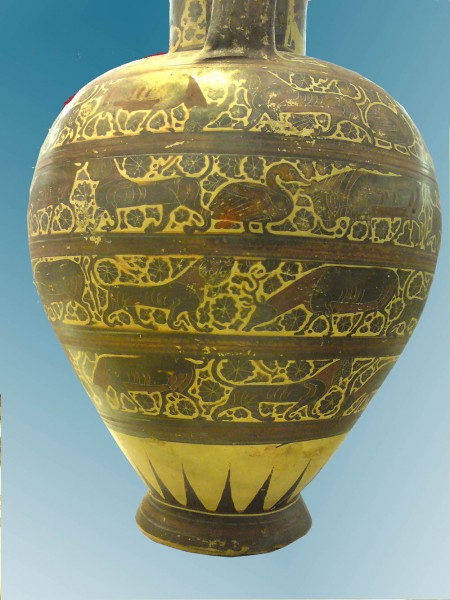
 I wrote in an earlier post about how effective decorative motifs can be if they are ambiguous visually or in some other way a bit of a challenge for perception.  Why that should be is a mystery, but here’s another of my favourite examples, decoration from a pot made in Corinth, Greece, about 595 BCE.

The pot’s in the British Museum and I guess it’s about 70 cms high.  Here’s (nearly) the whole thing.

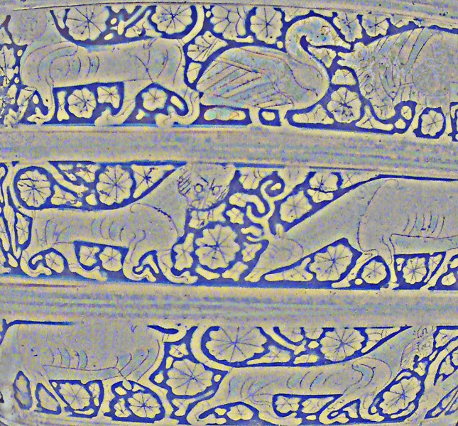
What’s unusual about this decoration is the way the rosettes and other little decorative motifs in between the animals have expanded to fill almost all the space.  In earlier Corinthian decoration, they were much smaller, just little motifs floating in the pale space round the animals.  Over two or three decades, painters made them fill more and more of the space, until they left only an outline round each animal. I reckon that shows up better in a version of the first picture which I’ve played around with, and reversed so that the pale outlines are dark.

What’s perceptually puzzling about that, I reckon, is that the brain can’t quite decide whether, in this reversed version, these are animals with strong, dark outlines on a pale background, or pale animals silhouetted on a dark background.  If you like doing your own paintings, it’s a brilliant effect to play with, and works just as well with modern motifs, human figures, cars, aeroplanes, umbrellas, you name it.

An Ambiguous Skull-Mask Illusion

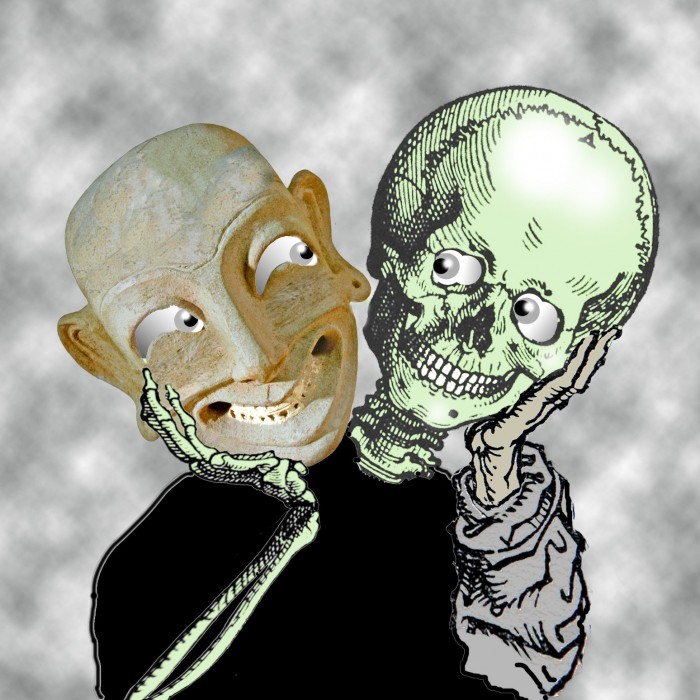
Is this a picture of a mask looking at a skull it’s holding up for inspection, or vice versa?

I got the idea from a print by Picasso, Young man with mask of a bull, faun and profile of a woman. There’s a copy in the Art Gallery of New South Wales in Sydney, and you can see it by calling up,

http://www.artgallery.nsw.gov.au/collection/simple_search

search for Picasso, scroll down the results and you’ll find it!

Ambiguous patterns

I reckon some images look beautiful because they bamboozle the brain processes we normally depend on to make sense of the world.  I don’t know why  that can help make patterns and pictures look beautiful. Nor do I think perceptual puzzlement is the essence of art, or anything like that.  But just from a practical point of view, if you are an artist (or a composer, poet or architect), a motif that’s puzzling can seem to offer a stepping off point for aesthetic effects.

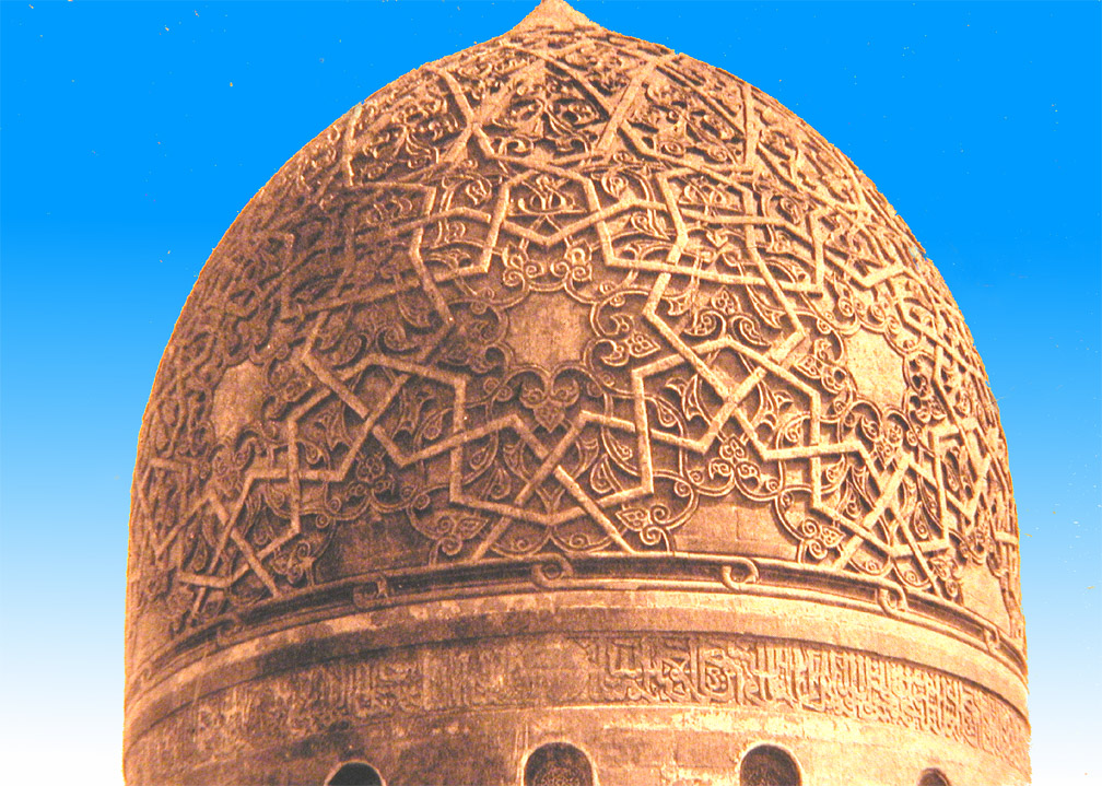
Here are two beautiful examples from architectural decoration, both just about 500 years old.  The first is the dome of the Mausoleum of Sultan Qaitbay in Cairo.

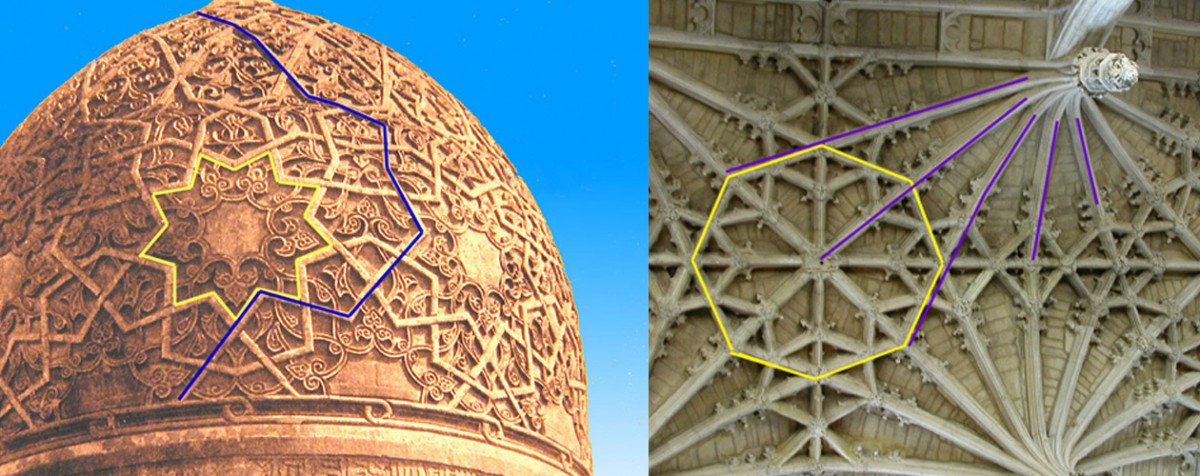
What’s puzzling about this is that a single line segment can be part of the edge of an object, such as a star, and at the same time part of a line that meanders over the whole surface.  Edges don’t behave like that in everyday vision.  Here’s the dome with added lines, left below, to show what I mean. Look at the segment that is labeled with both blue and yellow lines.

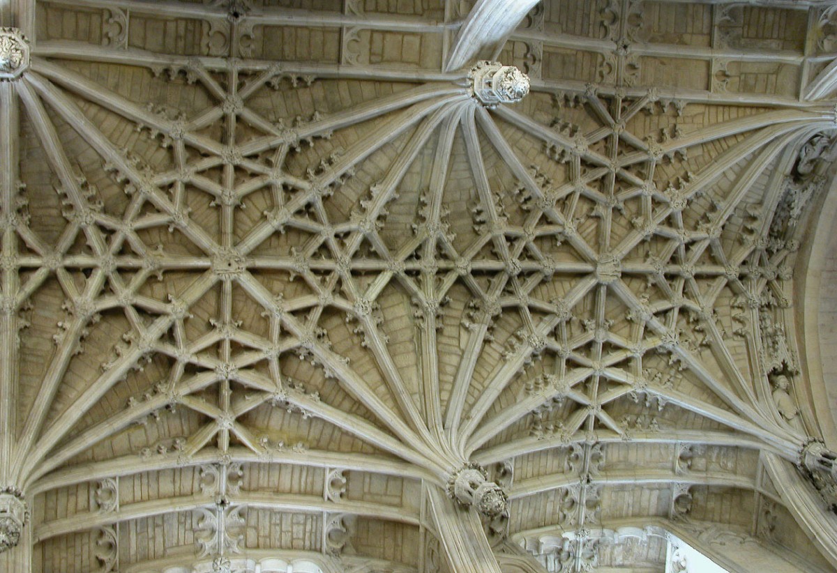
Then note that you can do just the same with the lines that outline the octagons on the ceiling in the picture to the right – every edge is also part of a fan of lines.  That ceiling is in Christchurch Cathedral in Oxford, and we even know who designed it – William Orchard, the Master Mason.  Now we’d call him the architect.  Here’s a picture showing a bit more of the ceiling.

I don’t think it’s just the puzzling features that make these patterns so beautiful.  Interlace patterns like these look like small segments of patterns that go on for ever, and in both Christianity and Islam were a metaphor for perfection and heaven.  And that’s how I reckon artists turn perceptually puzzling effects into something more than amusing images – they choose motifs that are also metaphors for some deeper meaning.

You may be more familiar with interlace as a technology for managing video images.  For interlace as a pattern motif in christian art, see the Wikipedia article on Celtic Knots.  Or try here to find out about interlace patterning in the context of islamic faith.