All posts by david

Eyespots

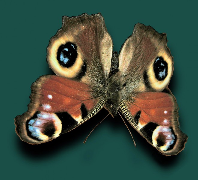
Eyespots on a Peacock Butterfly

Eyespots are fascinating. Nature presents all sorts of camouflage and mimicry, but mostly when prey species look like harmful species, or are camouflaged against background, or imitate leaves, or when seahorses look like seaweed (sea dragons). The imitation then is in 3D, like a waxwork. But eyespots are nature’s only example of patterning that becomes a picture. Eyes in real life tend to be quite rounded and beady or bulging, but butterfly eyespots are flat. Yet they can be amazingly convincing, like the ones at the top of this picture of a peacock butterfly, complete with illusionistic highlights.

And apparently birds really are deceived by the eyes.  A study five years ago by Adrian Vallin and colleagues at Stockholm University demonstrated that butterflies with eyespots covered up really are much more likely to be eaten.  Apparently, the Peacock butterfly tends to rest with wings folded, looking a bit like old leaves, but when threatened suddenly spreads its wings to reveal this alarming mask.  It even makes a noise as well.

But when you look at lots of eyespots it gets more puzzling.  For example, the eyespots that are top in this picture look very realistic, but then the ones lower down are a bit of a mess.  Generally, looking through pictures of lots of eyespots, there’s the same spectrum from very illusionistic to very approximate.  Do they all work in the same way?  And then, the most illusionistic eyespots of all are maybe the ones on the underneath of the wings of the owl butterfly.  But birds only see those when the butterfly has its wings folded, so that only one eyespot is visible.  (Or does the owl butterfly lie on its back with its wings open when it’s depressed?).

So when the birds are frightened by eyespots, are they just responding to a stimulus on the retina that’s a bit like the pattern of stimulus from real eyes, so that even appoximate eyespots will do?  If so, why have some eyespots evolved to be so illusionistic?  Maybe the messy spots, like the ones lower down my photo, are transitional forms.  But if the illusionistic eyespots, complete with highlights, are more effective, can we then say that the birds are being deceived by pictures?  I don’t think there’s another example of a non human unequivocally understanding a picture. Reflections in a mirror, yes.  That was established amongst others by by Frans de Waal of the Yerkes primate research centre in Atlanta. But not pictures. Sure, there’s the the story from ancient Greece, of the contest between the painters Zeuxis and Parrhasius, when the painter Xeuxis painted grapes that were so realistic the birds swooped down to try to eat them? But I don’t believe it. I don’t think animals and birds do understand pictures.

Except maybe of eyespots.

Update January 7th 2010!  Turns out I’m wrong about animals – dogs anyway – and pictures!  Read on for the details.
Continue reading

Meet Humbaba

Humbaba

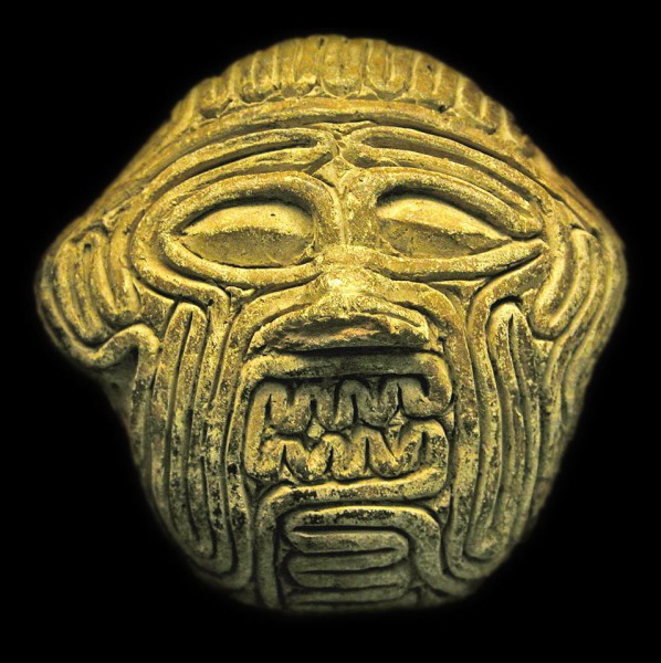
This is one of the oldest ambiguous images I know. It’s a small clay mask from Mesapotamia, (in modern day Iraq), made about 3750 years ago. It’s the face of the giant Humbaba, but as he might have appeared to a soothsayer, looking into the writhing entrails of a sacrificed animal for purposes of divination. If the face of Humbaba appeared in the entrails, in the way we sometimes see a face in clouds, it was a sign of revolution on the way. This evocation of the experience is in the British Museum, and they have a web page about it. (They even know the soothsayer who made it …).

I’ve written in earlier posts about the way that artists often seem to use perceptual puzzles as a starting point for aesthetic and emotional effects in artworks. This is a particularly fascinating example. It’s a work of art, but it’s also a record of emotional effect arising out of a perceptual puzzle, an ambiguous image, in a quite different kind of activity – divination. If I’ve got it right, quite a lot of fortune telling starts with ambiguous visual discoveries like this, when peering into tea-leaves, or crystal balls. I wonder how deep the common roots of aesthetics and shamanistic experiences go.

One route you can trace is through the entrails. You can’t quite be sure in this image, but when you look at the real thing, so you can look round the edges, the face is made up of one continuous entrail, coiling to and fro. If you can get to the British Museum, it’s in a case in their new Mesapotamia gallery, but you may have to hunt around, it’s not big.

Pinna’s Intertwining Illusion

Pinna's intersecting spirals illusion

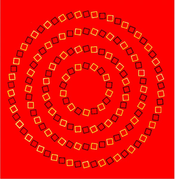
This is a brilliant illusion discovered by Baingio Pinna of the University of Sassari in Italy.  The circles appear to spiral and intersect, but are in fact an orderly set of concentric circles. The illusion is due to the way the orientation of the squares alternates from circle to circle, and that contrast alternates from square to square within each circle. The illusion is related to the movement illusions of Akiyoshi Kitaoka and to twisted cord illusions.

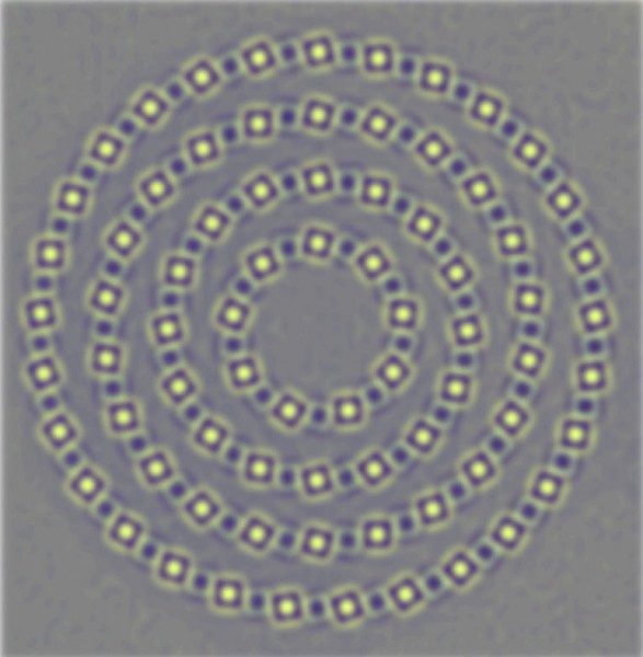
What’s going on is suggested by this next version, with the edges enhanced, plus a bit of blurring.

Filtered version of Pinna's intersecting spirals illusion

This image approximates (with false colour) the data transmitted within the brain once the image has been filtered by cell systems early in the visual pathway, including centre-surround cell assemblies (a bit technical, that link). The role of these is to enhance edges, so that bright edges are now emphasised by dark  fringes and vice versa. Note that between the little stacks of alternating light and dark fringes, along the line of the circles, the dark fringes of bright squares align with the dark edges of adjacent squares and vice versa. The scale and spacing of the squares is just right to get that alignment, and as a result the effect enhances the inward turning, spiralling effect due to the orientation of the squares. The fringes combine to give an effect a little like interfering waves. The illusion seems to be bamboozling processes that are usually superbly effective at filtering out the key information about edges and their orientation in the visual field.

However, showing that centre-surround cell outputs could be enhancing the inward turning character of the lines forming the large circles doesn’t explain why the brain integrates the local effects into the perception that the large circles as a whole are spiralling inwards. I guess that’s because, to a much greater extent than we realise, we infer global configurations from what we see just in the central, foveal area of the field of view. That also seems to be the case with impossible 3 dimensional shapes, as in the impossible tribar.

Subtle misjudgments of horizontal and vertical

The Walker Shank, Tolanski and related figures

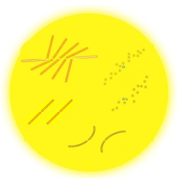
Back in 1987 James Walker and Matthew Shank in the university of Missouri were doing a study of the Bourdon illusion. In some figures they devised for comparisons in their study they noticed a new effect, quite unrelated to their study. The figure upper left is a version of their chance discovery. The centre line is objectively horizontal, but can seem to rise slightly to the right. Walker and Shank tried the effect experimentally, and found it was indeed seen by a majority, but not all of their observers.  (Note for techies:  For a PDF of their article, input 1987 as year, the authors’ names plus Bourdon and contours as keywords on the Psychonomic Society search site).

The effect seems related to the Tolanski illusion, lower left: the gaps in the sloping lines are exactly level with one another, but the right hand one looks a touch higher. Generally, our judgments of horizontal or vertical across empty space between lines with a pronounced slope seem to get just a little rotated in the direction of the slope. The effect is even stronger for me with curved lines (as bottom right) than with straight ones. I’ve even found it in informal experiments with a number of observers as upper right, when vertically positioned target dots appear rotated towards the slope of blurred or broken slanting edges in which they are embedded.

But in my version of the figure, upper left, we can also see the Poggendorff effect at work, (according to me at least). Look at the two outer, nearly horizontal arms. They are exactly aligned, but to my eye the right hand one looks higher than the left hand one. That’s just the result we would get if we deleted the middle three pairs of lines, to end up with opposed obtuse angles, in what is sometimes called an obtuse angle Poggendorff figure.

Do the Tolanski and Pogendorff illusions share a mechanism, or do we see in the top left figure both the rotation of the horizontal line, and the misalignment of the outer arms, arising by chance from different processes in the brain? We can’t yet be sure, but I reckon the same processes are most probably at work, and are to do with projecting orientation and alignment judgments across figures with powerfully competing axial emphasis. The Tolanski and Poggendorff figures present a sort of reciprocal pairing: with Tolanski figures judgments of vertical or horizontal are compromised in a figure with a dominant slant, whereas in classic versions of the Poggendorff illusion judgments of oblique alignment are rotated between vertical or horizontal lines.

Jacques Ninio’s Arches Illusion

A version of Ninio's arches illusion

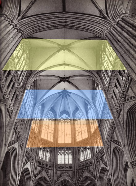
This is a version of an illusion discovered by Jacques Ninio.  Imagine that the coloured rectangles are real translucent plastic sheets, different in colour but identical in size.  They are shown in correct perspective, as they would appear if both were sloping away from us at the same angle.  However, the nearer one appears to slope much more than the further one. Ninio shows the effect with a diagram of arches in his book The Science of Illusions, p. 27 and fig 3-7. He explains it as an example of the way that we sometimes seem to compress visual space with distance, so that for example a flight of stairs seen head on looks steeper the further we are from it. It’s a reminder of the way that visual space is far from geometrically regular. The distortions of space must have evolved because they are advantageous in everyday vision. But in the unusual arrangements presented in some optical illusions objects can appear distorted, as in this illusion and in size-constancy effects. With those, space and objects seem to expand with distance, rather than contract as in this illusion.

Like the effects in many illusions, it is the unlikeliness of this configuration of inclined planes that makes it a challenge for the strategies we normally find reliable in making visual sense of the world.  When planes in our field of view are seen in a more usual configuration, aligned with gravitational vertical, we have no problem in correctly judging their inclination in space, even if the planes are inclined in relation to our field of view. Try this picture of some more imaginary planes, this time in the cathedral of Sees, in France.

Imaginary inclined planes in Sees Cathedral

For another case where the brain struggles with sloping planes, see the post on the wonky dagger and balconies illusions. In those illusions, puzzling sloping planes are shown, but not, as here, at different distances. Instead, the slope in those cases is ambiguous.

Aesthetics and Perception: Kula trade canoes

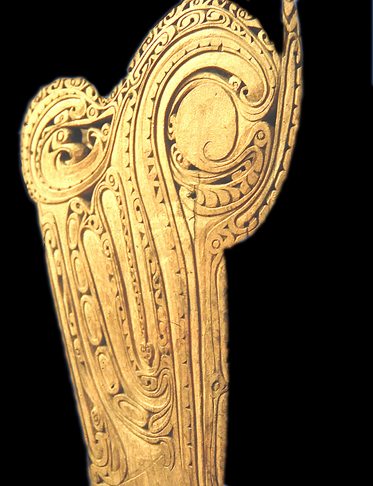
Prow of a Kula trade canoe

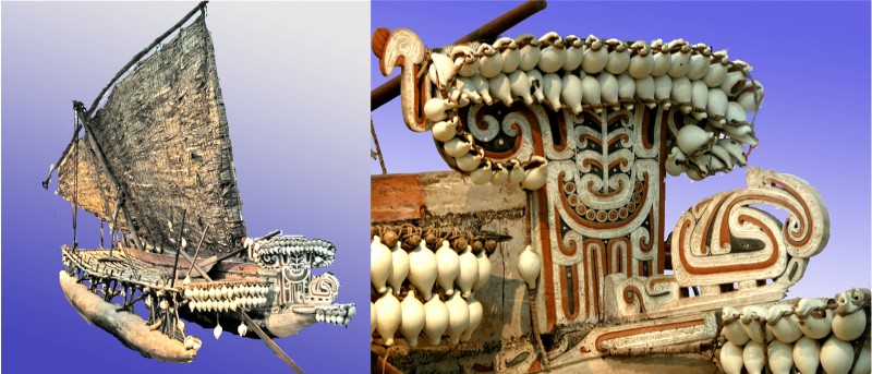
This wonderful ornamental canoe prow represents some fabulous creature, looking to the right.  Prows like this appeared on boats used in a cycle of trade around the Trobriand and nearby Islands in the Western Pacific, called the Kula trade.  The wonderfully ornamented canoes were only a small part of the story of this cycle of trading, but an intriguing one: the idea was to contrive a canoe so visually baffling that as your fleet of canoes approached the beach, it left your trading partners too bemused to compete in bartering. (For a more detailed account, if you fancy a bit of fairly heavyweight anthropology, there’s a fascinating essay by Alfred Gell called The Technology of Enchantment, in a book on art and anthropology from 1992).

The canoe prow is in the museum in Liverpool, UK, but to see a whole canoe go to the museum in Adelaide, Australia. It doesn’t have quite such a splendid, baffling prow, but it does show what these fabulous boats were like.

Kula trade canoe and detail of prow ornament

If you’d like to know out why these canoe prows remind me of paper marbling, read on.

Continue reading

Shepard’s tables – What’s up? (post no. 3)

nested Shepard's tables demonstrating size-constancy lateral expansion

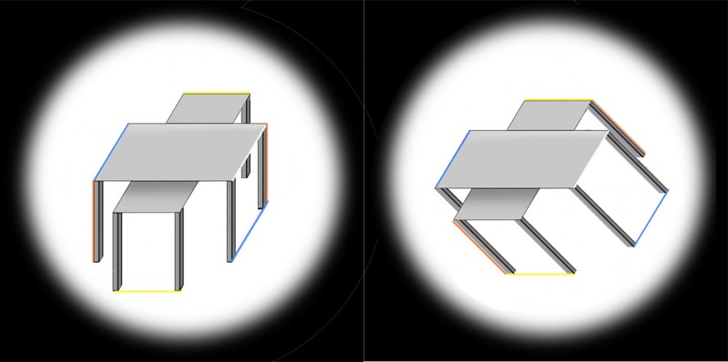
This is a third look at the Shepard’s tables illusion. If you didn’t see the earlier posts, you might like to get up to speed on the illusion by scrolling down two posts to an animated demo. The two pairs of table-tops in these views are absolutely identical, and within each pair the two lozenge shapes are identical except that one is seen short end on, and the other wide side on. However, they don’t look identical. Most dramatically, the lower table in the left hand image looks much longer and thinner than the upper table. But we don’t see that stretch into depth in the identical pair of table-tops in the right hand image. They look quite different, just because the tables are shown tipped over.

The stretch-into-depth of the lower table in the left hand image is a kind of size-constancy effect. But the tables also show a more familiar kind of size constancy effect.  Check out the blue lines in the left hand image (left edge of the upper table and alignment of the bottom of the table legs). Those blue lines are parallel, but to my eye they look as if they get wider apart with distance.

In the left hand image, to my eye, only the blue lines show apparent divergence with distance. The horizontal edges (yellow) and the vertical table legs (red edges) stay parallel for me. But in the right hand picture, just tipping the tables over makes all three pairs of coloured edges appear to diverge with distance. The effect may not be very strong. It’s easier to see in bigger versions of the pictures, so I’ll add those in in what follows, where I want to pose a question: are the differences between the table-tops as seen upright and tipped over only to do with how we see pictures, or are they a clue to how we see more generally?

Continue reading

Shepard’s Tables – what’s up? (post no. 2)

Nested Shepard's Tables

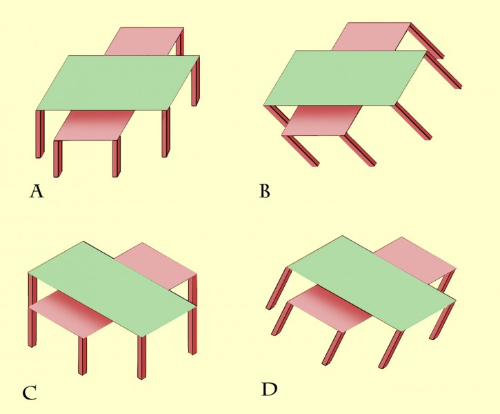
The previous post presented an animation of Shepard’s Tables. If you didn’t see that, you might want to check it out first (scroll down to the previous post) to get the basics of the illusion. This new version of the illusion, with nested tables, follows the pattern: all eight of the lozenge shaped table-tops are identical in shape, but the more that a lozenge is seen with its long edge parallel to the line of sight, the more it looks long and thin as it stretches into the distance. The more it’s seen short edge parallel to the line of sight, the more it looks wide and stumpy.

Describing the illusion that way may explain a puzzling variant of Shepard’s Tables, recently reported by Lydia Maniatis, as mentioned in the previous post. As the problem appears in these nested tables, at B the edges of the table-tops that are horizontal on the screen must be receding into depth, and yet they don’t show the dramatic illusion of a stretch into depth that we see in the edges receding into distance at A. Why not?

Isn’t it a question of perspective? At A the horizontal table edges are represented as if seen head on, parallel to the image plane – the plane at right angles to our line of sight. The table edges that are oblique on the screen at A must therefore be extending into depth in the most extreme way, parallel to the line of sight and at right angles to the image plane. Seen like that, depth effects are maximised. At B, no edges are aligned with the image plane, and all the edges, even the ones that are horizontal on the screen, are receding at 45 degrees to the line of sight. That’s a much less extreme recession into depth. So although the table edges that are objectively horizontal on the screen at B are receding, they don’t show as much illusory stretch into depth as the receding edges in A. 

Lydia Maniatis observation raises a general point that’s really interesting – the way that appearances can depend on what we mean by “up”.

Continue reading

Shepard’s Tables – what’s up?

This is an animation of Shepard’s Tables, an illusion first published by Roger Shepard as Turning the Tables, (see his wonderful book Mind Sights, 1990, pages 48 and 127-8). The left hand lozenge-shaped table top seems to get longer and thinner as it rotates, but it’s an illusion. It remains identical to the right hand table-top, except for rotation. The table-tops look even more different as the legs appear. The illusion is an example of size-constancy expansion – the illusory expansion of space with apparent distance. The receding edges of the tables are seen as if stretched into depth. Earlier posts on size-constancy showed how objects can appear wider with distance. That shows up with Shepard’s tables too, in the way that the oblique edges of the tables seem to get a bit wider apart with distance. The stretch into depth is more striking.

Recently Lydia Maniatis pointed out a puzzling aspect of the illusion, in her prize-winning entry for the Illusion of the Year Competition. Here’s a version of her figure.

Lydia Maniatis's Shepard's Tables puzzle

All three table tops are identical, but the middle one looks different from the one on the left, though it’s not even rotated. Instead the vertical axis of the figure is shown at an angle to gravitational vertical. That means that the blue edges are no longer aligned with the frontal plane of the image, as to the left, even though they are horizontal on the page, but must be receding into distance. And yet we don’t see the dramatic stretch into depth that appears with oblique edges that recede into distance. Why not?  Try looking at the middle block with your head leaning over to the left, so that the short edges are aligned with your head, and therefore with the vertical axis of your field of view.  Now (for me) the blue edges do stretch into depth, though not as much as in the right hand image viewed normally.

What do you think is going on?  I’ll take a shot at an explanation in a post in a couple of days.