All posts by david

Magic Ring

Here’s a movie of a brilliant, double spiral novelty illusion ring.  It’s available to buy from Grand Illusions, and on that link you can also see another movie of the illusory effect.  As the ring is rotated, it seems to expand when rotated one way, and contract when rotated the other way.

It just may be a version of the kind of ring described in one of the oldest reports of an illusion to have come down to us – a description by the French commentator Montaigne, written nearly five hundred years ago.  In an essay called An Apology for Raymond Sebond he describes …

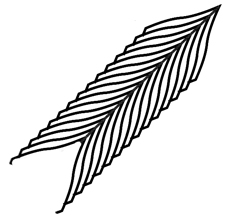
….those rings which are engraved with feathers of the kind described in heraldry as endless feathers – no eye can discern their width, or defend itself from the impression that from one side they appear to enlarge, and on the other to diminish, even when you turn the ring around your finger.  Meanwhile if you measure them they appear to have constant width, without variation …..

Researcher Jacques Ninio quoted that extract in his 2001 book The Science of Illusions (page 15), noting that a design on a ring like the one below looks wider at the top than the bottom, thanks to the Zollner illusion but is objectively the same width all the way along.

All the same, Montaigne’s description of rotating the ring makes me wonder if that’s the whole story.   So I’m on the hunt for surviving mediaeval rings that might decide the issue. And meanwhile, though there are theories about how the Zollner effect arises, no researcher as far as I know has an explanation for the effect shown in the novelty ring available from Grand Illusions (and other suppliers).  I reckon it’s to do with the way that the highlights expand or contract with rotation, but then seem to carry the outline of the object with them.  This is a puzzle which I will be coming back to.
Decor with Attitude

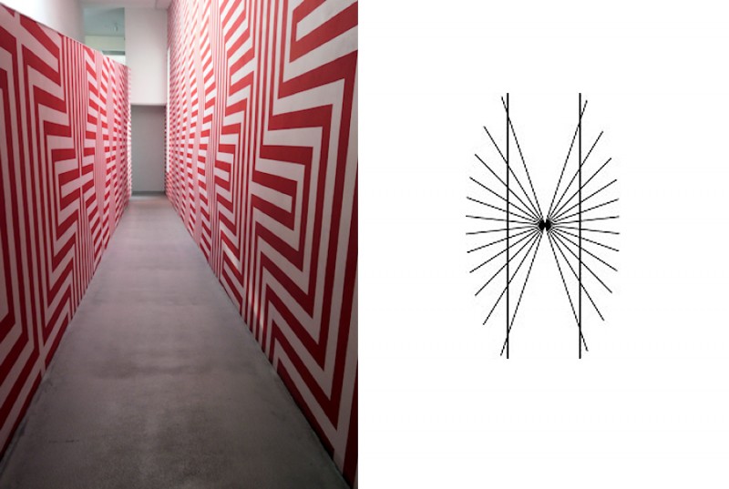
This is an installation called Zig-Zag Corridor by Czech artist Petr Kvicala, in the Dox art centre in Prague, Czech Republic.  He’s an artist who produces dazzling patterned effects.  In this one, beautiful diagonals meander through the patterns, although the linework is entirely made up of a continuous sequence of horizontal and vertical segments.

However, as my friend Alex noticed, when he featured the installation on his site devoted to stunning photos of architecture in a district of Prague, Vrsovice Photo Diary, there’s another effect here as well:  in places the walls seem to bow outwards in the middle, and the right wall doesn’t look flat at all.  That’s because of an illusion that arises whenever long lines intersect or abut an array of parallel or systematically varying obliques, as to the right above.  The apparently bowed long lines are objectively straight.  It’s called the Hering illusion, first scientifically reported by Ewald Hering in 1861. It’s a special case of the more general Zollner illusion, published by the astronomer and mystic Johann Karl Friedrich Zollner a year earlier.

I don’t know whether the artist introduced these effects by accident (and they probably appear more strongly in photos than in the real installation).  But it’s very, very easy for these illusions to sneak unintended into designs – as I let them do, when I failed to realise their contribution to a quite different effect in an earlier post.


Hidden Message


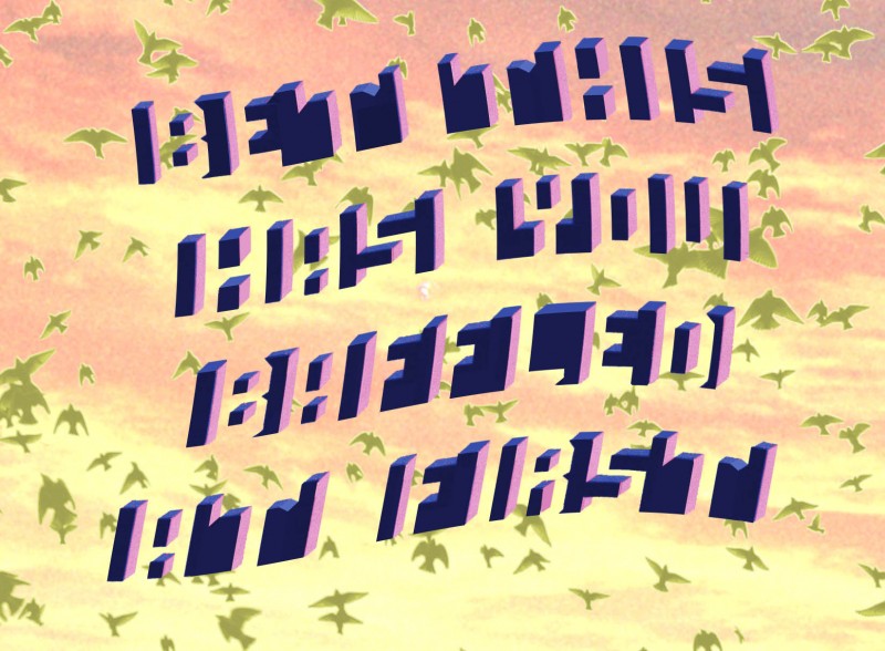
Can you read the message encoded in the image?  A few months back I posted about embedding hidden messages in images. Since then I’ve come across a much better way of doing it, using the lettering in the image above.  Lettering? What lettering?  You may not even have been able to spot the lettering yet. I’m not sure who invented it, but it’s brilliant – I just copied the style of lettering from another demo, on the wonderful website of Michael Bach.  It’s clever because to read the message we have not only to achieve a figure/ground reversal, but also because the distracting objects in the picture are seen as if from above (the default view the brain expects), whilst the hidden lettering is seen from below.  So we have to switch two modes of viewing, figure and ground, and also view from above and view from below.  And then I’ve added scene cues to make it even harder.


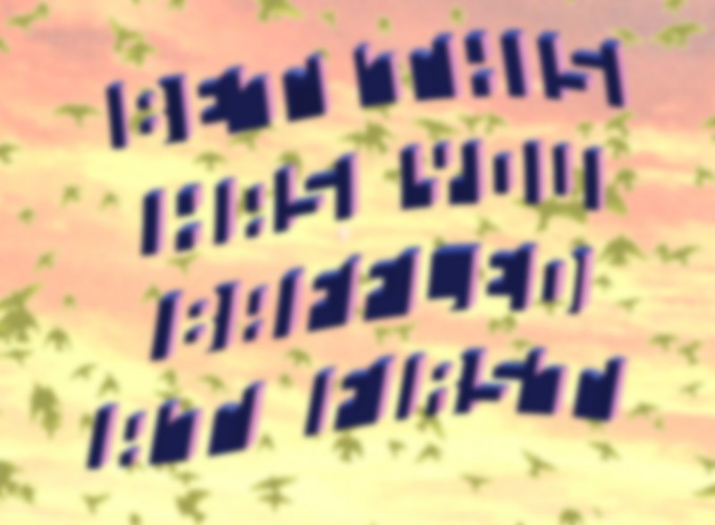
However there is a way of revealing the message easily – just blur the image, as in the version below.  Without all the distracting detail in the sharp edges in the scene, all that’s required is a figure/ground reversal, and recognisable letters become the most salient features in the image for the brain.


In my first post on this question, I showed a straightforward exchange between the words Truth and Lies with reversal of figure and ground.  I wanted to tweak that, to add the additional reversal between letters seen from above and from below.  To see that ….

Continue reading

Judith with the Head of Holofernes – or is it the other way round?

Who owns the body?   Judith does to start with, but then Holofernes does, and finally, it’s ambiguous.

Here’s a new addition to our series of ambiguous improved artworks.  Apologies this time are due to Rubens.  I got the idea for these illusions from a print by Picasso.

For a downloadable still of the end of our animation …

Continue reading

The Thiery-Wundt and Muller-Lyer illusions

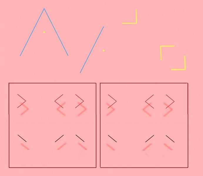
Top left is one of the simplest of all illusions.  The yellow dot is just half way up the vertical height of the triangle, but looks decidedly nearer to the apex. The effect was reported over a century ago, and has been named for its original researchers the “Thiery-Wundt illusion” by recent experimenters Ross Day and Andrew Kimm.  A consensus in recent years has been that we are hard-wired to home in on the “centre of gravity” of the triangle, the point at which three lines bisecting the three angles would meet.  The centre of gravity is a bit lower down than the half-way point of the vertical height of the triangle.  So maybe, the theory goes, we tend to take the centre of gravity as a default central reference point, and so we see the vertical centre point as if shifted a bit towards the apex.  But that can’t be the whole story, researchers Day and Kimm point out, because the effect is still there when the figure is reduced to just one oblique angle side, as centre top in the figure.  In fact, in their experiments, the effect was measured as even stronger that way. So the illusion may look simple, but more than a hundred years after its debut, we’re still basically guessing what’s going on.

Whatever is afoot, it’s probably also involved in the Mueller-Lyer illusion, in which the gap between two inward pointing arrowheads looks larger than an identical gap between two outward pointing ones.  I’ve shown that in 3D in the figure, for viewers who have the knack of so-called “cross-eyed” 3D viewing, without a viewer.  (If that’s new to you, and you want to get the knack, search on Google or try this site – though give it a miss if you have vision problems). But you can see the Mueller-Lyer effect perfectly well in 2D, and for a full discussion of the two illusions, Thiery-Wundt and Mueller-Lyer, if you have access to a research library, see Day and Kimm’s original research paper.  Or for just a bit more ….

Continue reading

Hiroyuki Ito’s new depth illusion

Do you see an effect of depth as if looking into a tunnel in the right hand spinning pattern?  It’s a new depth illusion published by Hiroyuki Ito last year.  It’s not all that strong in my example,  but it’s certainly there to my eye, and it gets stronger if you can increase the size of the animation (or try just looking at the animation from much nearer the screen than usual).  I also find the effect is stronger if I fixate the pattern (still in the right hand image) about half way between the outer edge of the disk and the edge of the central disk.

When you look out of the window of a rapidly moving train, objects near the rail track flash across your field of view in a moment, but landmarks on the horizon trundle past slowly.  In between, there’s a steady gradation, with objects moving across the field of view more and more slowly with distance.  It’s not so hard to animate a texture pattern with similar characteristics, moving across the field of view.  For example, texture elements near the bottom of the image might travel rapidly from left to right, whilst elements higher up the image  track across ever more slowly with increasing height.  An animation like that will give a vivid illusion of depth towards the top of the image.

But nobody realised you can also get an effect of depth with pattern elements rotating around the line of sight.  It might be expected, because normally, when a textured disk rotates, texture near the edge rotates fastest, and texture near the middle slowest, rather as with the usual velocity distribution of moving scene elements. However, when the texture is on a disk, so that elements half way up the disk travel just half as fast as elements near the edge, experience tells us we are simply seeing rotation, and so we see the disk as flat, as to the left above.

Hiroyuki Ito had the idea that if the moving texture on a disk was made to spiral, so that the texture near the edge was going much faster in relation to texture near the centre than it does on a simply rotating disk, we might see an illusion of depth.  And so we do.

Specialists with access to a library subscribing to the journal Perception can consult the full text of Hiroyuki Ito’s article.  It’s a great journal, but unfortunately, without access to that kind of (usually university) library, getting the full text will cost you a crazy amount.  It’s a shame academic journals exclude the tiny number of non-professional readers who’d be interested with that kind of deterrent.  However, I’m not sure I haven’t found a free workaround – if it works, I’ll post.


Soap Sheets

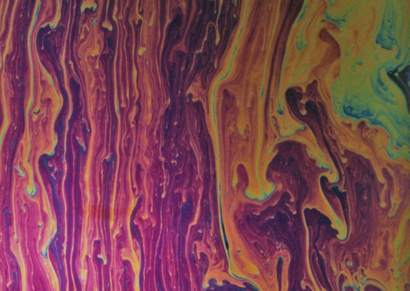
Here’s a new item for our category of soap bubble pictures.  The movie shows a science-centre-style demo, not of a bubble, but of a soap sheet.  It’s a way of showing patterns like the ones that appear on bubbles, but streaming down a huge sheet.  The quality of the movie is not great, so here’s a still photo that shows the effect.

I think this was originally a Victorian demonstration, but I don’t have chapter and verse for that.  It’s a demo you sometimes see in hands-on Science Centres, but often it’s not set up so that you can really see the colours.  For that there has to be a black background to the sheet, and a translucent screen, at an angle of forty five degrees to the sheet, brightly illuminating it.

I’m fascinated by patterns like these.  Just setting patterns in motion, as in many screen savers, doesn’t seem to me to produce effects that are as beautiful.  I don’t think it’s just the colours.  If we could characterise what makes these patterns special, might we then open up a whole new world of visual expression, using computer animation?  Or would we just end up with a small repertoire of pretty effects?

Fancy trying to set up your own soap sheet?  It’s not so hard.

Continue reading

Sleights of Mind – illusions and magic

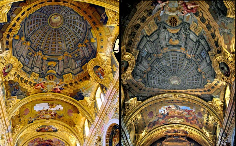
The dome in the left hand picture is an illusion!  It was painted on the ceiling of the Jesuit church in Vienna by Andrea Pozzo a bit over three hundred years ago. Seen from just the viewpoint of the photo on the left, it’s one of the classics of trompe l’oeil painting.  The right hand photo, looking the other way down the nave of the church, shows how Pozzo had to distort his painting of the dome, in order for the perspective illusion to work from a viewpoint near the high altar of the church, as in the left hand photo.   (Copyright might be asserted in these images.  Most of the images on this site are my own or out of copyright, and can freely be used for private, non-commercial purposes, but these are third party photos.  Apologies, I don’t know who took them).

Note added 16/5/17!  I’ve added a post about a ceiling painting in the uk by an artist following where Pozzo led.

I’m posting about the painting in Vienna to draw attention to a fascinating recent book in which Pozzo is featured.  The effect of his paintings, especially in this church and in the Church of Sant’Ignazio in Rome, is almost magically illusionistic, and the book is about what conjuring and magic have to teach us about perception and the brain.  It’s by cognitive scientists Stephen Macknik, Susana Martinez-Conde, with science writer Sandra Blakeslee: Sleights of Mind: what the neuroscience of magic reveals about our brains. The connection between illusions and conjuring has intrigued many researchers, but this is a ground-breaking published study.

Macknik and Martinez-Conde (a married couple, each running a separate research lab) also founded the Best Illusion of the Year Competition, now in it’s seventh year.

Arcimboldo exhibition in Milan, Italy

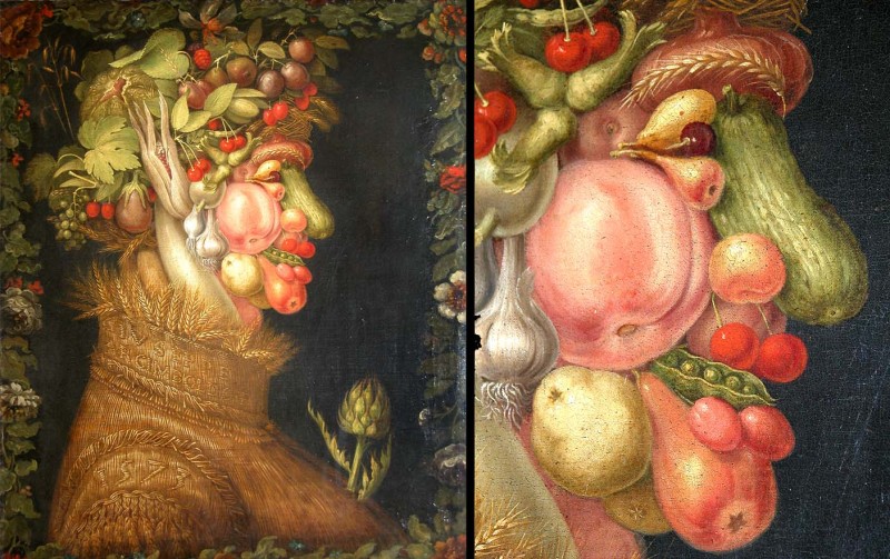
Make whatever sacrifice you have to, but unless you were in Washington last Autumn and caught the National Gallery of Art’s exhibition of the work of Arcimboldo there, seize any chance to travel to Milan, Italy, and see it there from January 27th to May 8th 2011.   It’s coming on at the Palazzo Reale. Arcimboldo was born in Milan, but became an unrivalled magician at ambiguous images, working four hundred years ago, mostly at the dazzling court of the Emperor Rudolph in Prague.  This is his painting of Summer, usually in the Louvre in Paris, and one of a set of paintings of the four seasons.

There’s still a movie about Arcimboldo, available in various formats, to the right on the Washington National Gallery’s website for the show, along with details of a huge sculpture that was in the Washington show, of the painting Winter from the same series of the seasons, by film-maker and sculptor Philip Haas.

We know Arcimboldo didn’t invent this kind of image, if only because of a rather naughty example on a 450 year old dish in the Ashmolean Museum.  But he inspired many of the generations of artists, and later psychologists, working with the ambiguous images that you can see in our Ambiguous Images category.