All posts by david

The Watercolour Illusion

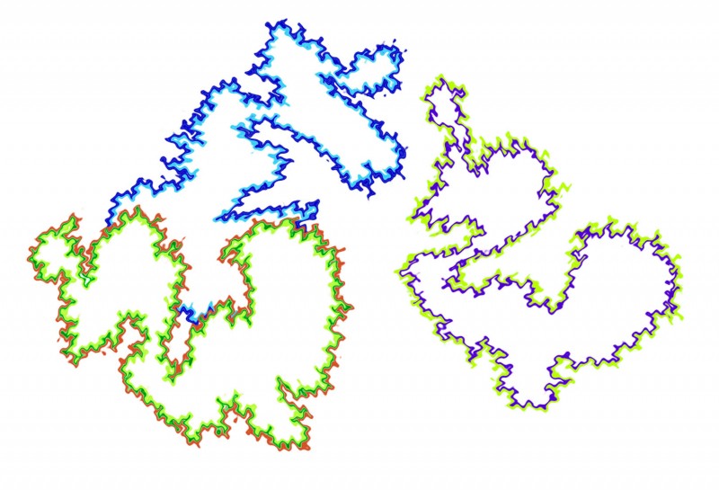
I’m currently giving a hand with an exhibition on the science and art of illusion, called IllusoriaMente, which will be on in Alghero, Sardinia (italy) in the first week in September, in association with the annual European Conference on Visual Perception.  During the preparations I’ve come across this illusion, which I’d heard of but not checked out.  It’s beautiful and extraordinary.  The areas bounded by three wiggly loops in the picture look different colours, as if just tinted with watercolour, but the effect depends on the brain doing the colouring in.  Each boundary is made up of a dark and a lighter strip.  The infilling always takes its cue from the colour of the lighter strip, and always in the direction from the darker strip towards and beyond the lighter strip.  So in this image, the effect is a bit paradoxical.  The colour appears inside the two islands on the left, in comparison with the white background.  Yet to the right the colouring is outside the island, with the island itself looking a brighter shade of white than the overall background.

Two different processes seem to be co-operating, a colouring effect, and a figure/ground effect, enhancing the separation between the surrounded areas and the background.  If you like a bit more technicality, there’s a Scholarpedia article, with references to academic papers, edited by Baingio Pinna, one of the pioneers researching into the effect (and the organsiser of this year’s ECVP conference in Alghero).

Note added at 10/12/12:  check out our slightly more recent post on the watercolour illusion in reverse.
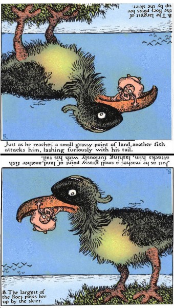
Gustave Verbeek

Gustave Verbeek cartoon

About a hundred years ago one of the most popular newspaper comic-strip artists in America was Gustave Verbeek.  He contrived whole pages of pictures telling cartoon stories, which showed one sequence of scenes when viewed one way up, and the following set when turned upside down.  His best known adventures were those of Lady Lovekins and Old Man Muffaroo, each of them, as in the scenes above, always the inverse of the other.  His stories are so crazy and his drawings so imaginative that it can take a moment to realise one scene really is the exact inverse of the other.   His imagery is surrealist – long before surrealism emerged with artists like Salvador Dali in the establishment art world.

His cartoons have recently been reprinted (not cheap!)

Verbeek was developing an earlier tradition of rotating heads illusions, in which a head has one identity one way up, and another upside down.  See my first earlier post of that, with an animation, and another example with Santa turning into playwrite Henrick Ibsen

Drunken Dionysius

The butterflies appear to circulate in time to the heartbeat of Dionysius (the ancient Greek God of wine), yet they never change position.  The movement is an illusion.  Only the tones and colours are changing, and movement appears as light butterflies on a dark ground change to darker ones on a lighter ground, and as light edges of the butterflies change to dark, and vice versa.  You may also see similarly evoked movement on the chest and stomach of Dionysius, in time with his breathing.

Compression for Flash has rather trashed animation quality. If possible, view Drunken Dionysius as a
Quicktime Movie

Here’s a related illusion, a new version of the Duck/Rabbit illusion.

The yellow central panel appears to move, but remains objectively quite stationary.  The edges don’t move either, all that changes is that black edges switch to white, and vice versa.

These effects are related to those in the Bouncing Brains Illusion, an entry by Thorsten Hansen and colleagues (University of Giessen, Germany) for the Best Visual Illusion of the Year contest 2007.

They are also related to the peripheral drift illusion.  A beautiful new example of that illusion by Kaia Nao (aka wildlife artist Joe Hautman) was one of the final 10 entries in this year’s Best Visual Illusion of the Year contest (the whole contest is not to be missed!).

All these illusions are thought to arise in peripheral vision because of differences in the speed of brain processing of the light and dark edges of the elements in these patterns.  The ones presenting most contrast are processed quickest.  Because the timing differences and their direction across similarly orientated pattern elements are syncronised, they are picked up by movement detectors in peripheral vision, and interpreted as movement of whole blocks of elements. For another example of apparent movement in a completely static image, see our earlier Ocean Wave Illusion.

If you devour scholarly research articles, here’s one on what may be going on in these illusions in more detail.

Hundred-year-plus puzzles

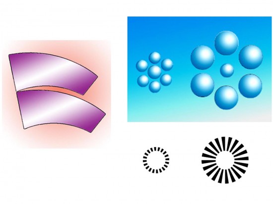
I remember being baffled by the illusion to the left when I was a child.  I think it was the first illusion I saw. The upper and lower blades are identical, but the lower one looks a lot larger. It’s called the  Jastrow illusion, and it’s not surprising I was amazed by it, because it’s as puzzling today as it was when Jastrow first published it, over a hundred years ago. To the right are two versions of a similarly mysterious illusion, known either as Titchener’s Circles, (or sometimes as the Ebbinghaus Illusion).  The central circles are objectively identical in size as seen to left and right, yet they look smaller when surrounded by the bigger circles and larger when surrounded by smaller circles.

Usually both illusions, Jastrow’s and Titchener’s, have been explained as the result of enhancement of contrasts in size. The key aspect of the Jastrow illusion, the theory goes, is the contrast between the long upper edge of the lower blade, and the short lower edge of the upper blade. The brain amplifies the size contrast between these edges, it is suggested, and the size of the whole figures gets adjusted in the process. The same kind of ramping up size contrast is proposed to explain the circles illusion, but this time it’s the contrast between the inner and outer circles. However, Jacques Ninio, from whose personal site I took the lower right figure, has a much more interesting suggestion …..

Continue reading

Back-yard Poggendorff

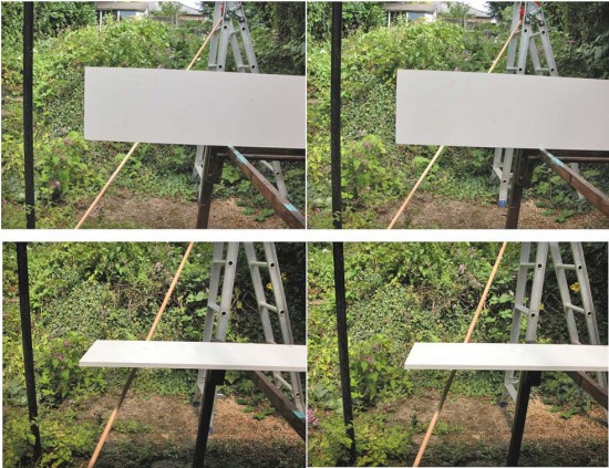
This is another demo to see whether it’s true, as has often been claimed, that the Poggendorff illusion is much weaker when it’s seen in three dimensions.  To my eye, it’s not true:  in this lash-up of bits and pieces in my back yard, the illusion is still strong.  The long rod is straight as it passes behind the plank, but for me it looks just as decidedly misaligned either side of it when seen in 3D as when seen as a 2D photo.

To see the effect in three-dimensions, you’ll have to know how to view stereo picture pairs without a viewer, in what’s called “cross-eyed” mode.  If you don’t yet know that trick, you’ll find a tutorial at

http://spdbv.vital-it.ch/TheMolecularLevel/0Help/StereoView.html

But best to give it a miss if you have any problems with your eyes (apart from just being short sighted or colour blind, like I am) – or if viewing stereo pictures like these turns out to make you feel strange or queezy

Many theorists have suggested that the Poggendorff illusion arises because we try to impose an inappropriate 3D interpretation on a 2D figure, which is the usual form in which the illusion is presented. It’s a very reasonable theory that might work in various ways, but as it happens, I just don’t think it’s true.


When we see the figure presented as a stereo image, as at the head of this post, so the theory goes, the illusion should vanish.

For more detail, see our earlier post on the Poggendorff illusion and depth processing:  http://www.opticalillusion.net/optical-illusions/the-poggendorff-illusion-and-depth-processing/

There’s another 3-D demo towards the end of that, but with the rod behind the plank in a plane parallel to that of the plank – in other words, not receding from us diagonally into the distance, like the rod in my back yard demo.  In this post, I wanted to check that the receding rod made no difference, and to my eye, it doesn’t, and nor does changing the orientation of the plank. The Poggendorff misalignment does look less in the lower pair, but that’s just because the plank that gets in the way in the lower images is at an angle where it looks much thinner.  It’s well-known that the illusion gets stronger as the gap between the rod segments gets wider.

However, all this does not rule out a role for depth processing in the illusion.  Qin Wang and Masanori Idesawa have shown that when the illusion is presented in 3D with the test arms in front of the inducing parallel, illusion vanishes.  That’s a real challenge for the 2D theories.

Muller-Lyer paradox (amended post)

Here’s a new way of looking at the Muller-Lyer illusion – paradoxically.

In the Muller-Lyer illusion, a line segment ending with outward pointing arrowheads looks shorter than an identical segment ending with inward pointing arrowheads. So in this version, whenever the arrowheads are visible, the left end of the line looks shorter than the (objectively identical) right end.

Here’s the paradox. When the arrowheads appear, the line segments instantly appear different in length, and yet the positions of the little globes marking the ends and centre-point of the line don’t appear to shift at all – which is impossible.

To make the point, in the bottom line, I’ve added an animated shift in the position of the middle globe, of just about the extent needed to produce the difference in apparent lengths of the line segments induced in the top line by the arrowheads.

The paradox is an example of the way that these so-called geometric illusions are not really so geometric.  Draw a figure, and if you change the length of a line, at least one of the line endpoints has to shift as well.  But in perceptual space it doesn’t necessarily follow.  So perceptual space can be pretty weird, or as researchers sometimes call it, non-Euclidean, because it isn’t always bound by the rigid constraints set out by the ancient Greek geometer Euclid.

(I’ve changed this post at 16/5/12.  There was other stuff in the original version, but it got much too complicated).

Native Canadian Ambiguous Art

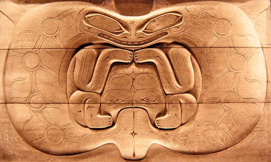
Depending how you see it, this panel either shows two killer whales looking at one another in profile, or a bear looking at you head on – the killer whales’ fins top centre become the bears’ ears.  And then the killer whales’ tails centre bottom become the mouth of a third creature, probably a frog, but the carving was never finished, so only its eyes are carved.

The panel is probably about a hundred years old, and is about five foot wide (1.6 meters or so).  It’s not known why it was never finished, but in the tradition of north west coast Canadian carving, the decoration on the killer whales would have been carved into deeper relief, not just sketched out on the surface.  Nor is it known from just which ethnic group in North West Coast Canada it comes.

However in the mythology of all the groups of that area, such as the Haida and the Kwakuitl, transformations of one creature into another are part of the scheme of things.  That includes transformations by hunting and eating, which were traditionally understood as sacred activities.  So what we see here is not just a visual game, but has spiritual meanings.

For more on that see our earlier post on ambiguous patterns, and other posts in the Illusions and Aesthetics category.

The panel is in the reserve collection of the Manchester Museum.

Cheating with tessellations

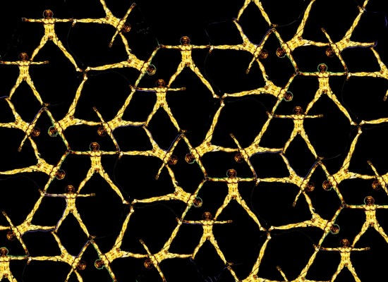
Tessellations are patterns whose repeat motifs fit together like jig-saw pieces, with no gaps and no repeats.  For an introduction, see our earlier animation. They can be abstract patterns, but the most intriguing are the ones devised by tessellation maestro M.C.Escher in the middle of the last century, which show representational motifs, such as animals, as tessellating patterns.

Designing abstract patterns that tessellate successfully is just a matter of getting the hang of some rules.  Discovering representational motifs that tessellate is much, much harder.  There are no procedures, or none that I know anyway.  It’s all trial and error, mostly error for me, and really hard!  Escher was brilliant at it.  My efforts are pretty feeble.

But fortunately, you can at least include representational motifs within your tessellations with a little trickery.  The pattern above, based on Leonardo’s famous Vitruvian Man, is an example.  The secret is to use segments of the outline of the representational motif for part of the outline of the tessellating pattern cell.

You do need to be up to speed with making abstract tessellations, and also pretty expert with Photoshop or an equivalent graphics package.  But if you’ve reached that point, or are just curious, here are stages in the development of the pattern shown above….


Continue reading

Hybrid Portraits

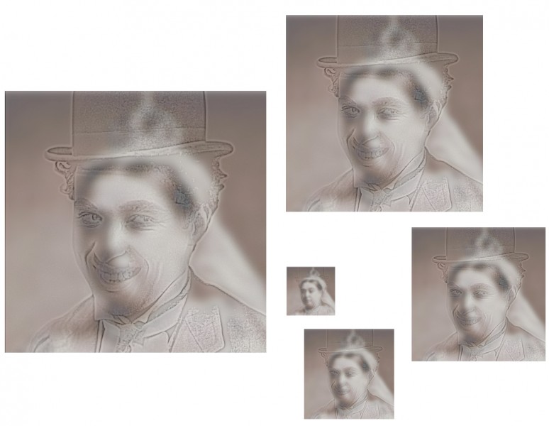
Hybrid portraits superimpose one portrait on top of another, so that one appears with close viewing, and the other emerges with more distant viewing. Or with reduced image size. Or just by taking off your specs, if you are just a little way away and are seriously short-sighted. Whatever works for you, here Charlie Chaplin becomes Queen Victoria. The “top” image is filtered to reduce it so that it resembles an outline drawing, and then made partially transparent (and some viewers might need reading glasses to see it). The ‘back” image is blurred (and may only become apparent when viewed from two or  more meters).

The technique was invented by Aude Oliva, Antonio Torralba and Philippe G. Schyns, and presented in 2006 at the huge annual Siggraph (electronic graphics) conference.  Putting it technically, Charlie here appears with all but his high spatial frequencies filtered out, whilst her late Majesty has had all but her low spatial frequencies filtered away.

But don’t be deterred by the jargon.  If you’d like to try your own hybrid portraits, you can do the filtering very easily if you have a full version of Photoshop to play with, (so long as you’ve got the hang of working with layers).   This is how it works in Photoshop CS2 for Mac.  For the high spatial frequency (outlines) image, with an image file open and the image you want to filter selected, go to filter in the menus at the top of the screen, select other.. (at the very bottom of the list of options) and then high pass.. Then play around! You’ll see how you can transform the image with a slider. For the low spatial frequency (blurry) image, start in a new layer, and once again with the image to filter selected, go to filter again, but this time select blur, and then in the options that open up Gaussian Blur. Once again, then just play around with the slider to explore effects. Then you need to make the top image transparent. Make sure the Layers window is visible (click on layers in the Windows menu at the top of the screen if not). Next make sure the layer holding the top image is selected. Now you can adjust the transparency (they call it opacity) at top right in the layers window.

That’s the easy bit. Once the image pair are more or less presenting the effect OK, adjusting the degree of filtering of the images, their contrast, and then the transparency of the ‘top’ image to find the demon tweak that gives maximum effect will drive you crazy! There is a colossal range of possible combinations.

For some great movies of the effect, try this (MIT) site.

Bubble Beach Penguin

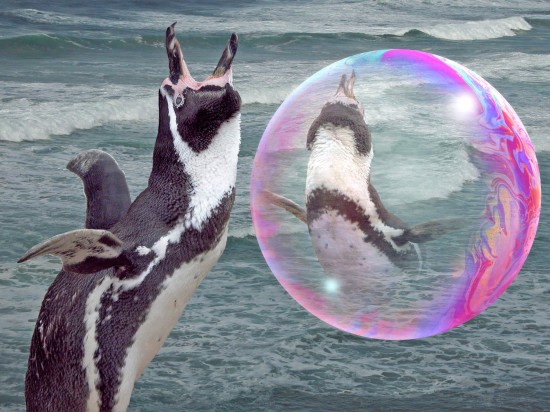
Here’s another picture to add to our category of soap bubble imagery.  For details about how I photograph the bubbles, see entries in the soap bubble category.

I hadn’t noticed before that there are some great movies of bubbles on Youtube, such as this model of Jupiter’s turbulence, or this movie of a bubble bursting. There are some really astonishing still photos of bursting bubbles in this report from the Mail Online site.  They’re by Richard Heeks, who’s currently studying for a literature PhD at Exeter University in the UK.

I was fascinated to see those, because back in October 2008 I posted an image of a bursting bubble as a visual metaphor for the financial crisis then at its height.  But not having Richard Heeks’s stunning skill and patience as a photographer, I faked up (pretty obviously I hope) a graphic of a bubble burst in Photoshop.  Not remotely like the real thing, as it turns out.