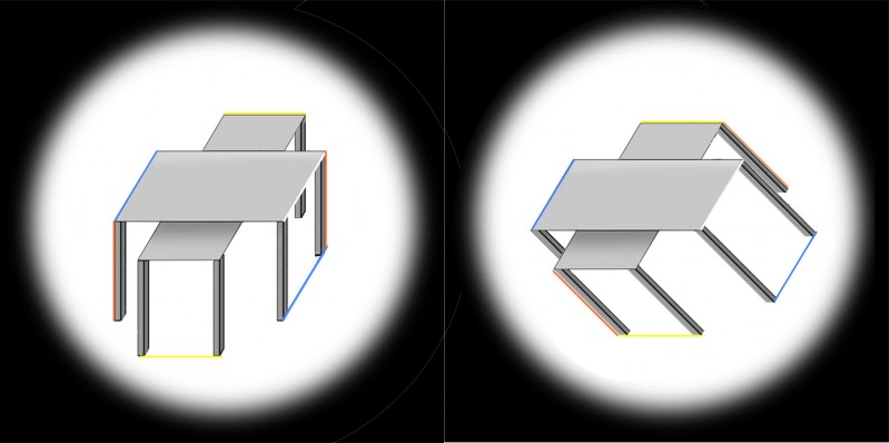
This is a third look at the Shepard’s tables illusion. If you didn’t see the earlier posts, you might like to get up to speed on the illusion by scrolling down two posts to an animated demo. The two pairs of table-tops in these views are absolutely identical, and within each pair the two lozenge shapes are identical except that one is seen short end on, and the other wide side on. However, they don’t look identical. Most dramatically, the lower table in the left hand image looks much longer and thinner than the upper table. But we don’t see that stretch into depth in the identical pair of table-tops in the right hand image. They look quite different, just because the tables are shown tipped over.
The stretch-into-depth of the lower table in the left hand image is a kind of size-constancy effect. But the tables also show a more familiar kind of size constancy effect. Check out the blue lines in the left hand image (left edge of the upper table and alignment of the bottom of the table legs). Those blue lines are parallel, but to my eye they look as if they get wider apart with distance.
In the left hand image, to my eye, only the blue lines show apparent divergence with distance. The horizontal edges (yellow) and the vertical table legs (red edges) stay parallel for me. But in the right hand picture, just tipping the tables over makes all three pairs of coloured edges appear to diverge with distance. The effect may not be very strong. It’s easier to see in bigger versions of the pictures, so I’ll add those in in what follows, where I want to pose a question: are the differences between the table-tops as seen upright and tipped over only to do with how we see pictures, or are they a clue to how we see more generally?
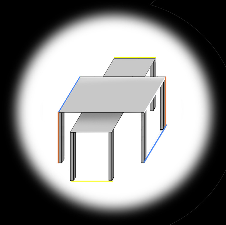
Do you see what I do in these larger pictures? First, with the tables upright, I see vertical and horizontal edges parallel, but oblique (blue) edges showing size-constancy divergence with distance, though objectively they are parallel on the screen.
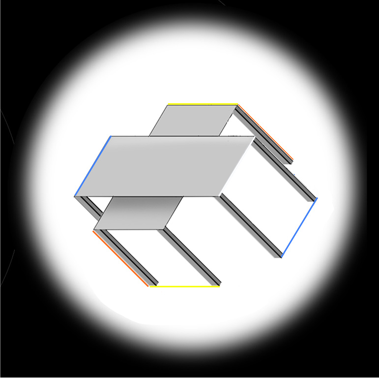
Now try, below, how it looks with the tables tipped over. For me, all three pairs of edges show some size-constancy divergence with distance – though it’s only quite a slight effect in the yellow, (objectively horizontal) lines. (See the previous post for a discussion of this effect, starting from an observation by Lydia Maniatis).
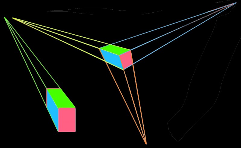
If you see these pictures in the same way, with just one axis of size-constancy expansion with distance when the tables are upright, but three axes when they are tipped over, that is an interesting reversal of two of the most common perspective constructions used in pictures. Check them out below. To the left, vertical and horizontal edges parallel to the image plane remain vertical and horizontal, but oblique edges converge to one vanishing point. To the right, the parallel edges converge to three different vanishing points.
The three-vanishing point scheme, to the right, is pretty much the way a rectangular block would be projected by the lens of the eye onto the retina, or by the lens in a camera onto the image chip. Horizontal edges would only be projected as horizontal, and vertical ones vertical, if the block was seen end on, and then it would not be possible to see the side. So the left hand view, showing the end of the block head on, but with the side visible as well, is a more artificial perspective construction. It is as if the end of the block had been twisted round, until horizontal and vertical edges appear parallel to the image plane. And yet the left hand construction is the one most common in visual art. That appears in these two pictures, by Venetian artist Crivelli from about 1500 on the left, and on the right, from about 1700, by Chinese painter Wang Hui – in that link, click on 2nd thumbnail from right, top row. (These are details from paintings in the London National Gallery and the New York Metropolitan Museum respectively, and if you were downloading wanting to use the images, note that copyright could be asserted).
I find it fascinating that the way I see size-constancy expansion in the Shepard’s Tables images so faithfully follows these two varieties of perspective, reversing a single vanishing point scheme when there are vertical and horizontal edges at right angles and in register with gravitational vertical in the image, and a three point scheme otherwise. Is that because my brain is conditioned by looking at perspective pictures? Or maybe the artificial convention, which we see in these two paintings, is so widespread in art because it reflects a strategy the brain uses in everyday vision: in streets and rooms, we do seem to ignore the convergence of vertical and horizontal edges, when looking more or less straight ahead, rather than looking up or down. I wonder whether it’s a brain strategy that simplifies the enormous problems for the brain of keeping track of rotation of the vertical axes of objects and of body and head orientation in relation to our sense of balance and of gravitational vertical. (See the earlier post on that – the next post as you scroll down).
With that in mind try what happens to size-constancy expansion of parallel edges if you view the picture of the tables tipped over, but with your head leaning over to the left, so that the table legs are aligned just with your vertical head axis – the vertical axis of your field of view. I then see size-constancy expansion different again. It’s there in the blue and yellow edges, but the red table leg edges look pretty much parallel. That’s a kind of in between strategy, when the head axis and vertical axes of objects are aligned, but are rotated in relation to gravitational vertical. It reverses another artistic perspective scheme, a twin vanishing-point scheme, which like the single vanishing-point scheme is a simplification of optical projection.


Sorry for the delay in posting your comment – I’m afraid I don’t read Chinese yet, and this wasn’t easy. It took a professor to translate it! For anyone else who doesn’t read Chinese yet, I the translation I got is “‘although they don’t appear similar, the one on the left and the one on the right are actually the same size”. Which is exactly the point.