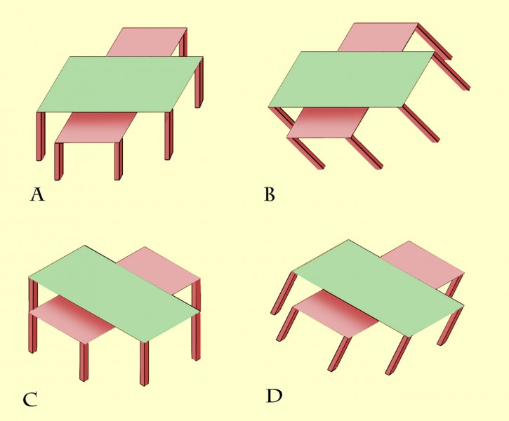
The previous post presented an animation of Shepard’s Tables. If you didn’t see that, you might want to check it out first (scroll down to the previous post) to get the basics of the illusion. This new version of the illusion, with nested tables, follows the pattern: all eight of the lozenge shaped table-tops are identical in shape, but the more that a lozenge is seen with its long edge parallel to the line of sight, the more it looks long and thin as it stretches into the distance. The more it’s seen short edge parallel to the line of sight, the more it looks wide and stumpy.
Describing the illusion that way may explain a puzzling variant of Shepard’s Tables, recently reported by Lydia Maniatis, as mentioned in the previous post. As the problem appears in these nested tables, at B the edges of the table-tops that are horizontal on the screen must be receding into depth, and yet they don’t show the dramatic illusion of a stretch into depth that we see in the edges receding into distance at A. Why not?
Isn’t it a question of perspective? At A the horizontal table edges are represented as if seen head on, parallel to the image plane – the plane at right angles to our line of sight. The table edges that are oblique on the screen at A must therefore be extending into depth in the most extreme way, parallel to the line of sight and at right angles to the image plane. Seen like that, depth effects are maximised. At B, no edges are aligned with the image plane, and all the edges, even the ones that are horizontal on the screen, are receding at 45 degrees to the line of sight. That’s a much less extreme recession into depth. So although the table edges that are objectively horizontal on the screen at B are receding, they don’t show as much illusory stretch into depth as the receding edges in A.
Lydia Maniatis observation raises a general point that’s really interesting – the way that appearances can depend on what we mean by “up”.
First, as we’ve seen, appearances change depending on whether we see the tables as vertical or tipped over in our field of view. Although the pair of table-tops at B is identical in every way to the pair at A, they look quite different. There is much less apparent difference between the upper and lower table-top at B than at A. That’s confirmed with C and D. At C, the table-tops look identical. At D, to my eye the lower table is just a bit longer and thinner than the upper one.
Appearances also depend on whether our field of view is tipped over or not, because our body or head axis is leaning over. For example, try looking at B with your head leaning over to the left, so that the table-legs at B look vertical in your field of view. For me it’s now the upper table that looks longer and thinner, though not so much as does the lower table at A. Don’t appearances also change for you if you view D with your head leaning over to the right? In fact appearances depend on how we orientate a whole zoo of kinds of “up”. For a start there’s gravitational vertical, and then there’s our judgment of the vertical axis of objects in view, which may be leaning over, as at B and D here. Then there’s the axis that our whole body is aligned with, which may also be leaning over. The vertical axis of our visual field can be at yet another angle, if our heads are inclined in relation to our bodies. At A and C all these varieties of up are aligned in a well-behaved way, but appearances change, as at B and D here, as any or all of these vertical axes are rotated.
These changes in appearance with perception of kinds of “up” can be affected by illness, so there’s a big technical literature on the subject. If that’s for you, you could start with this study of how the appearance of relief depends on shading, gravitational and body-orientation cues.

