Subtle misjudgments of horizontal and vertical

The Walker Shank, Tolanski and related figures

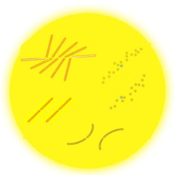
Back in 1987 James Walker and Matthew Shank in the university of Missouri were doing a study of the Bourdon illusion. In some figures they devised for comparisons in their study they noticed a new effect, quite unrelated to their study. The figure upper left is a version of their chance discovery. The centre line is objectively horizontal, but can seem to rise slightly to the right. Walker and Shank tried the effect experimentally, and found it was indeed seen by a majority, but not all of their observers.  (Note for techies:  For a PDF of their article, input 1987 as year, the authors’ names plus Bourdon and contours as keywords on the Psychonomic Society search site).

The effect seems related to the Tolanski illusion, lower left: the gaps in the sloping lines are exactly level with one another, but the right hand one looks a touch higher. Generally, our judgments of horizontal or vertical across empty space between lines with a pronounced slope seem to get just a little rotated in the direction of the slope. The effect is even stronger for me with curved lines (as bottom right) than with straight ones. I’ve even found it in informal experiments with a number of observers as upper right, when vertically positioned target dots appear rotated towards the slope of blurred or broken slanting edges in which they are embedded.

But in my version of the figure, upper left, we can also see the Poggendorff effect at work, (according to me at least). Look at the two outer, nearly horizontal arms. They are exactly aligned, but to my eye the right hand one looks higher than the left hand one. That’s just the result we would get if we deleted the middle three pairs of lines, to end up with opposed obtuse angles, in what is sometimes called an obtuse angle Poggendorff figure.

Do the Tolanski and Pogendorff illusions share a mechanism, or do we see in the top left figure both the rotation of the horizontal line, and the misalignment of the outer arms, arising by chance from different processes in the brain? We can’t yet be sure, but I reckon the same processes are most probably at work, and are to do with projecting orientation and alignment judgments across figures with powerfully competing axial emphasis. The Tolanski and Poggendorff figures present a sort of reciprocal pairing: with Tolanski figures judgments of vertical or horizontal are compromised in a figure with a dominant slant, whereas in classic versions of the Poggendorff illusion judgments of oblique alignment are rotated between vertical or horizontal lines.
Jacques Ninio’s Arches Illusion

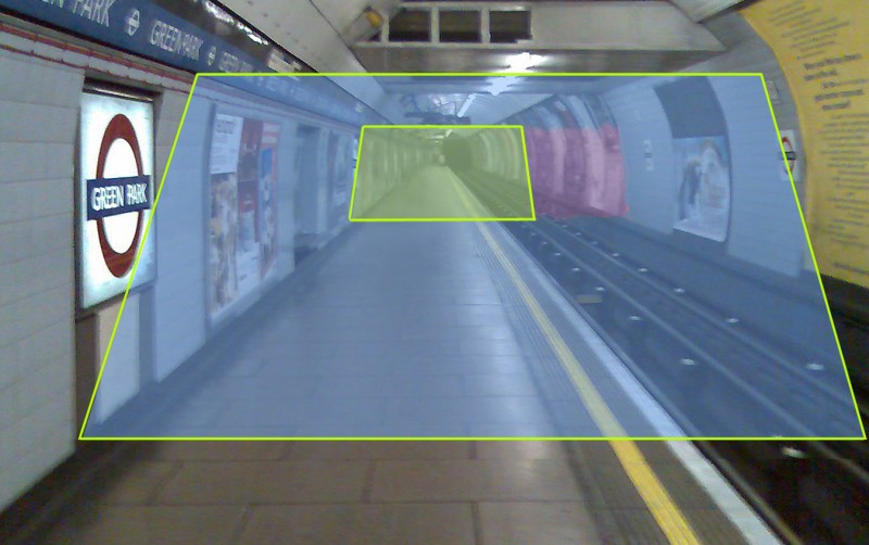
A version of Ninio's arches illusion

This is a version of an illusion discovered by Jacques Ninio.  Imagine that the coloured rectangles are real translucent plastic sheets, different in colour but identical in size.  They are shown in correct perspective, as they would appear if both were sloping away from us at the same angle.  However, the nearer one appears to slope much more than the further one. Ninio shows the effect with a diagram of arches in his book The Science of Illusions, p. 27 and fig 3-7. He explains it as an example of the way that we sometimes seem to compress visual space with distance, so that for example a flight of stairs seen head on looks steeper the further we are from it. It’s a reminder of the way that visual space is far from geometrically regular. The distortions of space must have evolved because they are advantageous in everyday vision. But in the unusual arrangements presented in some optical illusions objects can appear distorted, as in this illusion and in size-constancy effects. With those, space and objects seem to expand with distance, rather than contract as in this illusion.

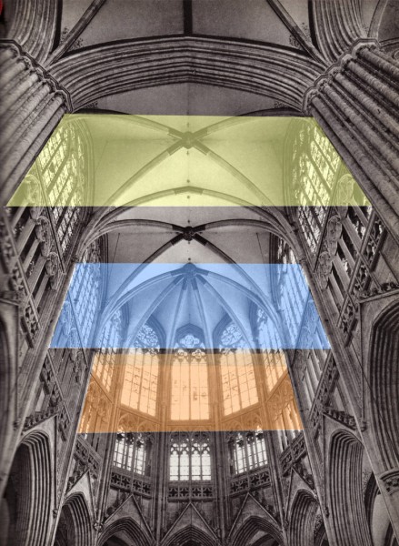
Like the effects in many illusions, it is the unlikeliness of this configuration of inclined planes that makes it a challenge for the strategies we normally find reliable in making visual sense of the world.  When planes in our field of view are seen in a more usual configuration, aligned with gravitational vertical, we have no problem in correctly judging their inclination in space, even if the planes are inclined in relation to our field of view. Try this picture of some more imaginary planes, this time in the cathedral of Sees, in France.

Imaginary inclined planes in Sees Cathedral

For another case where the brain struggles with sloping planes, see the post on the wonky dagger and balconies illusions. In those illusions, puzzling sloping planes are shown, but not, as here, at different distances. Instead, the slope in those cases is ambiguous.

Aesthetics and Perception: Kula trade canoes

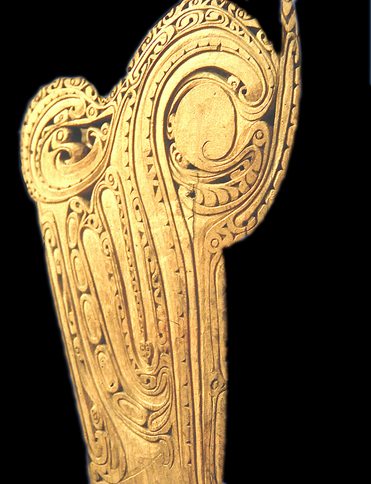
Prow of a Kula trade canoe

This wonderful ornamental canoe prow represents some fabulous creature, looking to the right.  Prows like this appeared on boats used in a cycle of trade around the Trobriand and nearby Islands in the Western Pacific, called the Kula trade.  The wonderfully ornamented canoes were only a small part of the story of this cycle of trading, but an intriguing one: the idea was to contrive a canoe so visually baffling that as your fleet of canoes approached the beach, it left your trading partners too bemused to compete in bartering. (For a more detailed account, if you fancy a bit of fairly heavyweight anthropology, there’s a fascinating essay by Alfred Gell called The Technology of Enchantment, in a book on art and anthropology from 1992).

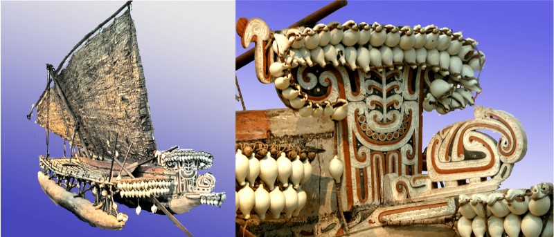
The canoe prow is in the museum in Liverpool, UK, but to see a whole canoe go to the museum in Adelaide, Australia. It doesn’t have quite such a splendid, baffling prow, but it does show what these fabulous boats were like.

Kula trade canoe and detail of prow ornament

If you’d like to know out why these canoe prows remind me of paper marbling, read on.

Continue reading