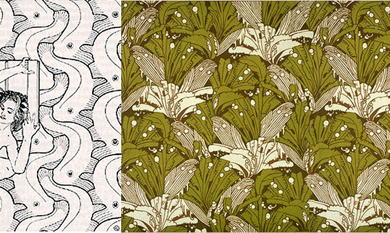
You probably know the tiling patterns of M.C.Escher. But how about Koloman Moser? Here are a couple of his designs.

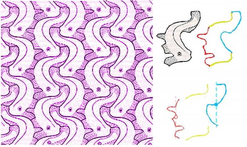
Moser was working in Vienna, Austria, a hundred years ago. (He died in 1918). I don’t know where he would have learned to do tessellating designs, that is, designs with motifs that repeat the way jigsaw puzzle pieces fit together, with no gaps or overlaps. If you have checked out our tessellation tutorial, you’ll know that the secret of these designs is that the edge of each “tile” of the pattern must be able to be snipped into pairs of identical line segments. Here’s how it works with Moser’s fish design.

To the right you can see that the fish outline can be divided into three pairs of segments, a yellow pair, a red pair and a blue pair. In the yellow pair, the top line is just repeated lower down to make the pair, in a move called a translation. The red and blue pairs are a bit more complicated. In each pair, the lower line segment is a mirror reflection of the upper segment, but shifted downwards. That kind of shifted reflection is called a glide reflection. It’s a fact that any motif whose edges can be snipped into one pair of segments that repeat by translation, connected as here to two parallel pairs whose edges repeat by glide reflection, will tessellate perfectly. And that’s just one of 28 recipes for motifs that tessellate.
For a more technical account of Moser’s symmetry designs, see:
https://archive.bridgesmathart.org/2019/bridges2019-411.pdf
The author (John M.Sullivan of the Technische Universität Berlin) analyses numerous Moser designs, including the right hand design in the image at the start of the post. He points out that, in an earlier version of this post, I got the analysis of this fascinatingly complex design wrong.
