Bad Day in the Art Museum

Art gallery

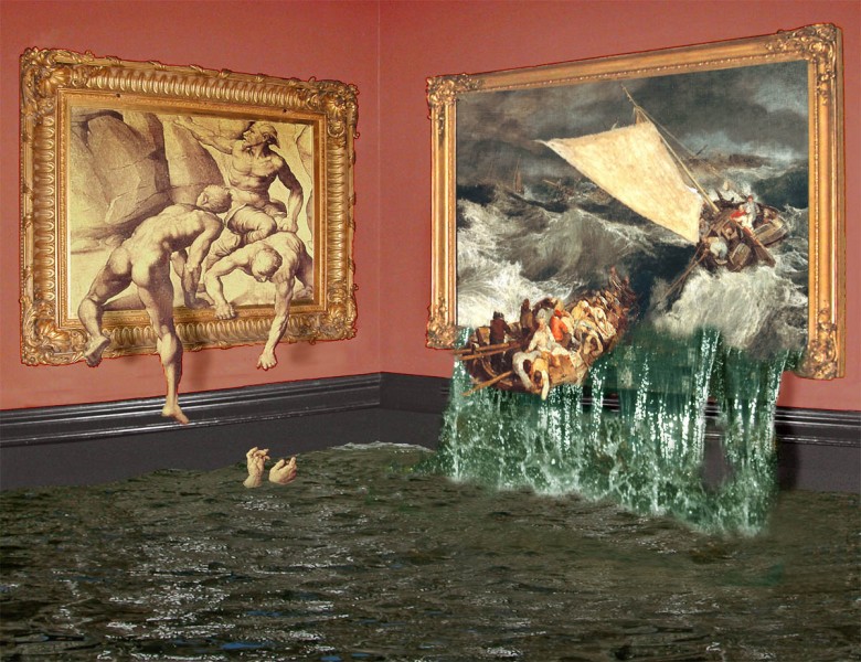
Interesting things can happen when you have pictures within pictures. Not so much, for example, with an everyday photo of an art gallery, if all the pictures are behaving well and staying in their frames. But sometimes it’s not possible to tell when the picture of a picture ends, and the picture of the real world begins. Here’s an example, in which the paintings in an art gallery are definitely not behaving how paintings should.

M.C.Escher did some brilliant pictures in which the boundary between the real world and the graphic world breaks down in the same way. The most famous is his print Drawing Hands of 1948, but you’ll find lots of others. Amongst contemporary artists, Rob Gonsalves has done some really clever paintings, such as Unfinished Puzzle. It’s the kind of issue that interested Picasso and Braque too, in their cubist paintings. In one by Braque you can see a cubist palette hanging on an illusionistic nail.

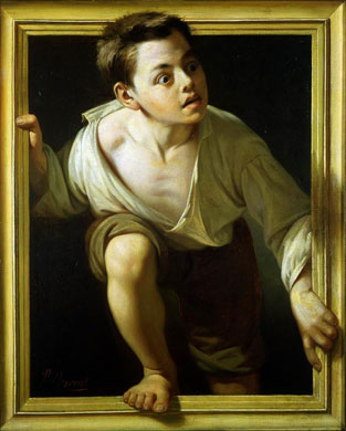
Here’s another famous example, a painting from a bit over a century ago, by Pere Borrell del Caso.  It’s called Escaping Criticism. I guess the artist felt hard done by at the hands of critics, and did this as a demonstration of virtuosity.  (I believe the original painting is in the Banco de Espana Madrid   –  Spain’s national bank).

Escaping criticism by Borrell del Caso

The guys climbing back into a painting in my image are borrowed from a copy of Michelangelo’s lost study for the Battle of Cascino. The shipwreck is from a 200 year old painting by English Romantic painter J.M.W.Turner in the art museum Tate Britain in London, of a bad day in the English Channel.
Position cues from a moving shadow

Does the ball sometimes seem to be bouncing, and moving nearer and further away?  Look again just at the track of the ball and you’ll see that all it ever does is to move diagonally from one corner of the board to the other. The spatial effects, and even the way the ball seems to accelerate at points, are all down to the moving shadow.

When the shadow sticks to the ball, the ball seems to just move across the surface and into the distance. That’s remarkable, because the ball should appear smaller with distance, but in fact the image of the ball here doesn’t change. The shadow cue is so strong it over-rides the problem. As the shadow drops to the foot of the image, the ball appears higher in the space, but nearer to us.

Once again, the effects appear even though the ball does change at all in size, as it should according to the rules of perspective – though some viewers might see an illusion of size-change, compensating for the anomalous lack of real size change.

I’ve tried to base my animation demo pretty closely on one described by Daniel Kersten and colleagues in 1997, in their celebrated original publication of this effect.

A wonky dagger illusion

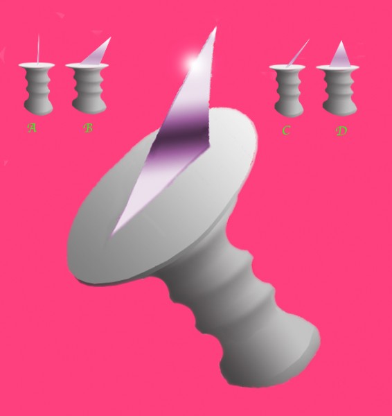
Wonky dagger illusion

There’s something amiss with this dagger, for sure. For a start, the blade’s a bit short. More important, you can’t be sure just from the picture where the blade is pointing. That’s because one and the same perspective view can arise from more than one three-dimensional configuration, out there in the world.  This dagger is particularly hard to interpret.  It could be pointing downwards, with one edge of the blade longer than the other, like the blade in the top left pair of little images, of the dagger seen head on and from the side. Or the edges of the blade could be the same lengths, so we must have a steep perspective view of it leaning sideways, as in the top right hand pair of views. Look at the big image for a few moments, and I think you’ll be able to see it both ways.

Both configurations present exactly the same view in perspective, and both are about equally likely. (Well, maybe equally unlikely with this dagger would be nearer the mark). It’s a variant on an illusion which presents another clash of improbable alternatives – but one that tricks us into going for what may seem the least likely choice.  We could call it the wonky flower box illusion.

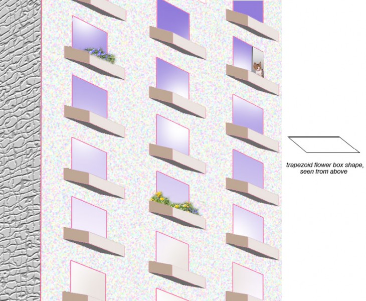
wonky flower box illusion

Do the flower boxes in this scene look like they’re rectangular, if seen from above, but sloping downwards? But what if they stick straight ahead out from wall, like well-behaved flower boxes should, but are trapezoid, seen from above, (as diagrammed to the right)? Trouble is, once again the perspective view will be the same either way. What’s curious is that in this case, most observers opt for the downward sloping view of rectangular boxes, unlikely though that would be in the real world.  Trapezoid plan boxes just seem too unlikely. It’s a version of the preference for right angles that leads us to accept incredible distortions of size in the Ames Room illusion.  If technical stuff is for you, here’s a serious analysis of the window box effect (though with balconies rather than window boxes doing the weird sloping stuff).  And if you just can’t get enough of that sort of thing, here’s a report of the same illusion in a church (also a bit on the technical side).

Padoxical illusions

morinaga's illusion

This is Morinaga’s paradox – two illusions in one, but two illusions that contradict one another. First note the vertical alignment of the arrow points. Don’t the tips of the inward pointing arrowheads, top and bottom, appear to be located just a little further inwards than the tips of the middle, outward pointing arrowheads? That could only be right if the horizontal space between the tips of the (top and bottom) inward pointing arrowheads was slightly less than the space between the tips of the (middle) outward pointing ones. But that’s not how it looks. The inward pointing arrowheads look further apart than the outward pointing ones.

In reality both judgments, of vertical alignment and of the horizontal gaps, are illusions.  The tips of the arrows are perfectly aligned vertically, and the horizontal gaps between the three sets of arrowheads are all exactly the same. That last effect is a version of the Muller-Lyer illusion.

Continue reading

Scrambled space

sqtemp1

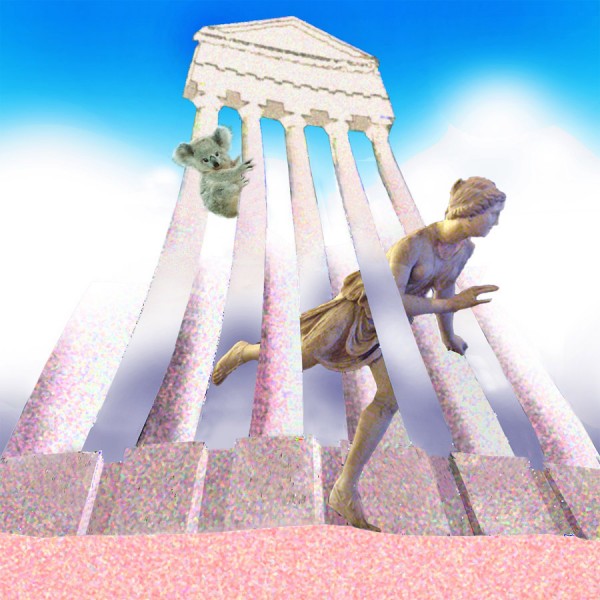
One of surrealist painter Rene Magritte’s cleverest paintings, Carte Blanche, is of a rider in a wood, but all mixed up with the trees. I had a shot at playing with the same effects in the earlier Halloween post.  This time, I’ve tweaked up the complication with an impossible figure/ground reversal half-way up the columns, (in the manner of the impossible fork illusion – see our earlier post Outlines, objects and apertures).

A while back I tried out a similar figure/ground scenewarp in one of the picture pairs for an optical illusion cartoon story, Opticaloctopus.

Pixelated faces

Who’s this?

pixilated celebrity

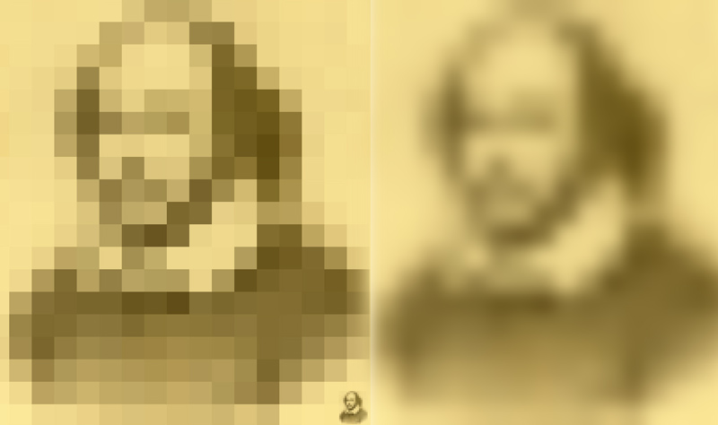
 Yes, it’s Shakespeare!   Back in 1973 researchers Leon Harmon and Bela Julesz produced their famous Lincoln Illusion.  They demonstrated effects when an famous image of a face, such as Abraham Lincoln’s, is pixelated quite coarsely.  We can still recognise it easily if the pixelated version is either blurred (as to the right here – it’s a blurred version of the pixelated image, not of the original), or reduced in size, as if seen from a distance. Just three years after the original Scientific American article that made the effect widely known, Salvador Dali based a picture on the Lincoln image. (Michael Bach’s site shoes the original Lincoln image, the Dali picture and a clever interactive demo).

Note the tiny Shakespeare perched in the very bottom right corner of the left hand, pixelated image above.  It’s just the pixelated image reduced.  If you move away from the screen a few feet, you’ll find that the two large images of Shakespeare come to look more and more alike.  It’s odd how even small details of the face seem to appear.  If you want to try it with faces you know, I think it works best with about seventeen pixels along the longest dimension of the picture.  It does work best with an iconic, image – a photo everyone knows – rather than just a face you know.

So who have we here?

Pixelated celebs

I think you’ll have got those, but otherwise (and for more stuff) …

Continue reading