Halloween magic

Occlusion illusion

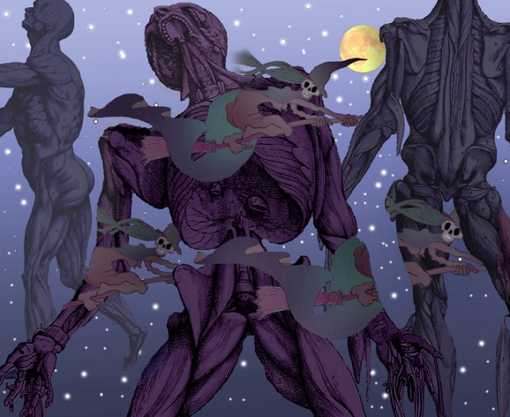
Here’s a scene for Halloween.  In our everyday view of the world, the orderly way in which one thing blocks our view of another is something we can depend on to orientate ourselves in the world around us.  These witches are breaking the rules.  The lower ones appear and disappear at puzzling locations, and the witch lower right even vanishes behind a segment of starry sky.  It’s as if the segment of sky had become an object in the visual field, instead of an aperture – an oddly weird effect, for me.

I got the idea from a wonderful painting by Rene Magritte, Carte Blanche.  If you go to for that link, you’ll just need to scroll down a couple of pictures – you’re looking for a painting of a lady on a horse in a wood.

Oh, and I borrowed the musclemen from the 450 year old illustrations to the pioneering anatomical studies of Andreas Vesalius. 
Improved artworks No 1


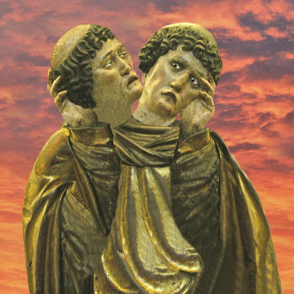
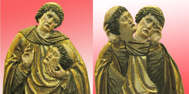
Here’s a historic artwork I reckon I’ve much improved.  On the left you see it as has been for the last five hundred years or so, a Spanish (I think) wood carving, of a martyred saint, now in the Petit Palais museum in Paris. On the right I’ve turned it into an ambiguous image, in which it’s not clear which head belongs to the body, and which has been chopped off and is being held up for inspection – I think you’ll agree a far more poignant image.  It’s an illusion in the style of the Mask/Skull illusion posted earlier.

Here’s a version of my adaptation with an evening sky:

A New(?) Ever Receding Staircase

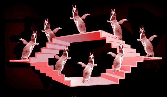
Here’s a new kind of never-ending stair (I think).  It’s like the famous never-ending staircase seen from above by M.C.Escher, called Ascending and Descending.  However, in this new staircase instead of figures doomed to go downstairs for ever we have penguins destined to walk away from us forever.  It’s based on the geometry of the object in my post on paradoxical size-constancy.

New Penguin Stair

Here’s an animated version:

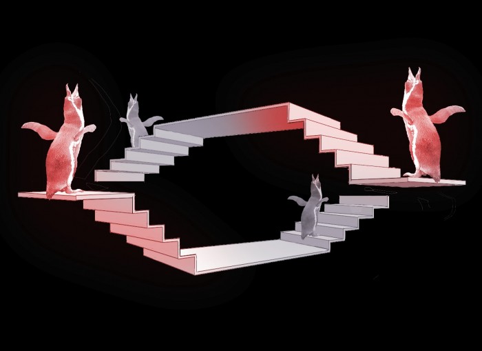
Like Escher’s famous impossible staircase, (and also as with the impossible tribar), the effect depends on our seeing a scene from a viewpoint from which points that would be at different distances from us seem to connect up. Here’s a view in more usual perspective of one configuration that would give rise to the ever receding staircase above. The trick depends not just on getting the alignment just right, but also on suppressing the usual perspective cues.  Size diminution with distance is the most important one.  The other is aerial perspective, in which contrast flattens out and colours get bluer with distance. I’ve put them both back below.


For more on staircases like Escher’s famous picture Ascending and Descending …..

Continue reading

Twisted stairs


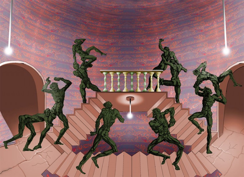
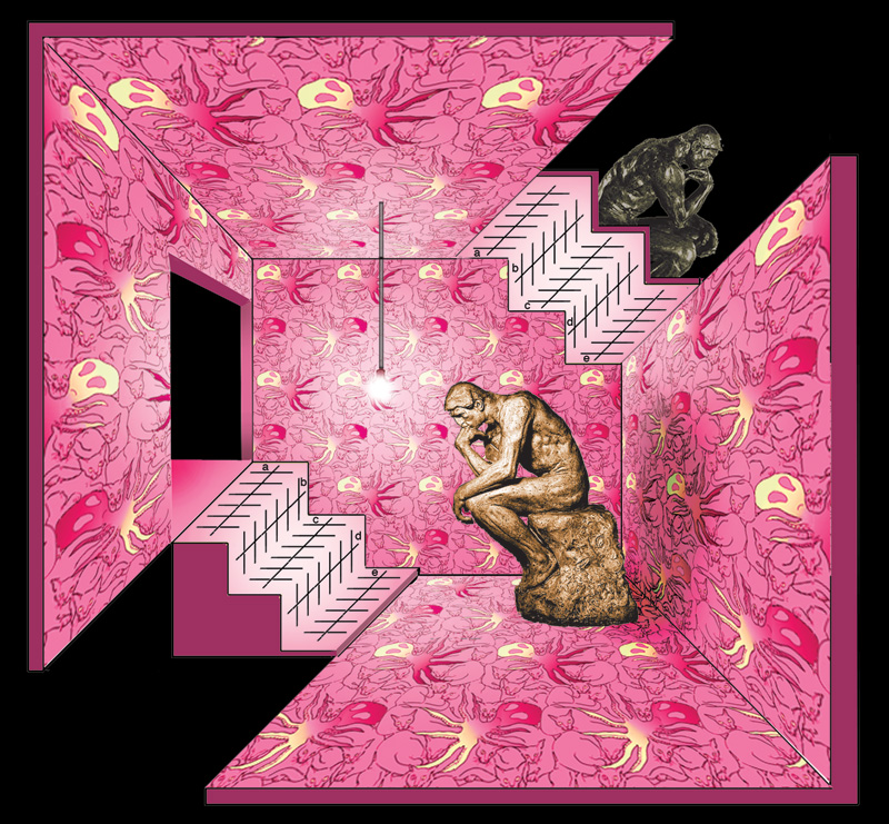
Here are some crazy stairs.  Look at the stairs leading up to the balcony, and at the foot of the stairs you’re looking down on them from above, whilst up by the balcony you’re looking up at them from below. Nothing wrong with that, in a perspective view, but these steps are in a parallel projection, which forbids it. As a result, the side of the steps that’s furthest from us, next to the outer wall down at ground level, has somehow twisted to become the side that’s nearest to the viewer up by the balcony, and vice versa.  There’s a different twist to the stairs at the foot of the image.  On those, if you start, say, on the right, you’ll find that the flat step surfaces have become vertical risers once you’ve passed the half way mark.

Update May 2012! There’s also a later version of this scene.  I wanted to give it another go, because these stairs do have an extra twist to them …..


Continue reading

Puzzling artistic effects

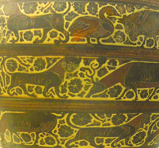
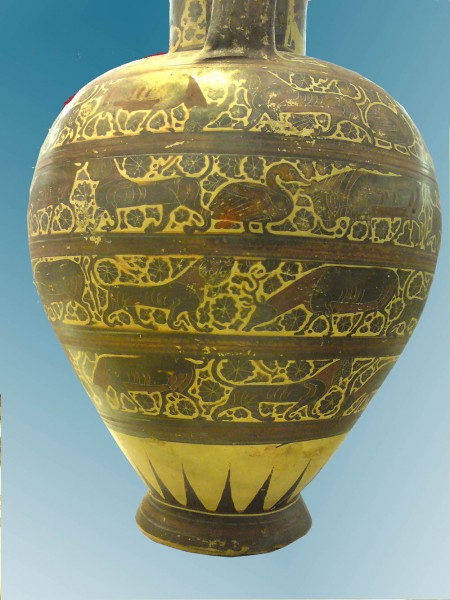
 I wrote in an earlier post about how effective decorative motifs can be if they are ambiguous visually or in some other way a bit of a challenge for perception.  Why that should be is a mystery, but here’s another of my favourite examples, decoration from a pot made in Corinth, Greece, about 595 BCE.

The pot’s in the British Museum and I guess it’s about 70 cms high.  Here’s (nearly) the whole thing.

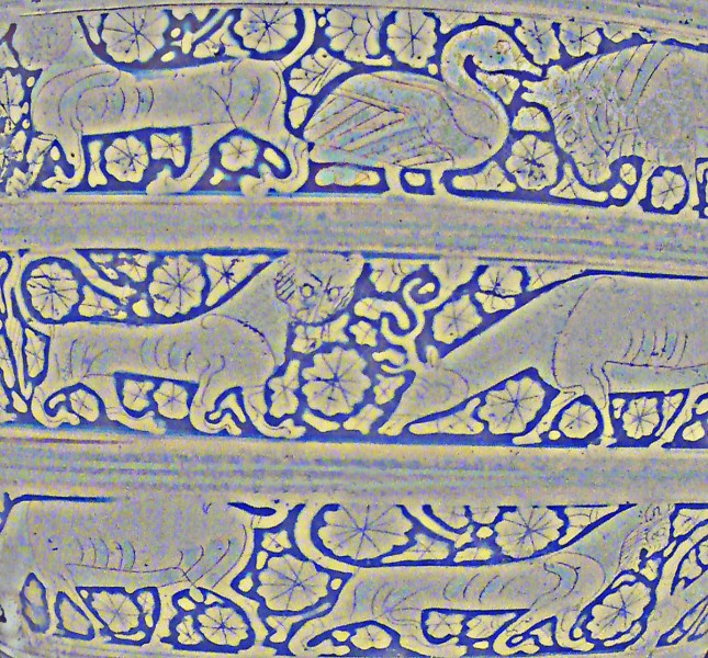
What’s unusual about this decoration is the way the rosettes and other little decorative motifs in between the animals have expanded to fill almost all the space.  In earlier Corinthian decoration, they were much smaller, just little motifs floating in the pale space round the animals.  Over two or three decades, painters made them fill more and more of the space, until they left only an outline round each animal. I reckon that shows up better in a version of the first picture which I’ve played around with, and reversed so that the pale outlines are dark.

What’s perceptually puzzling about that, I reckon, is that the brain can’t quite decide whether, in this reversed version, these are animals with strong, dark outlines on a pale background, or pale animals silhouetted on a dark background.  If you like doing your own paintings, it’s a brilliant effect to play with, and works just as well with modern motifs, human figures, cars, aeroplanes, umbrellas, you name it.

Taking bubble pictures

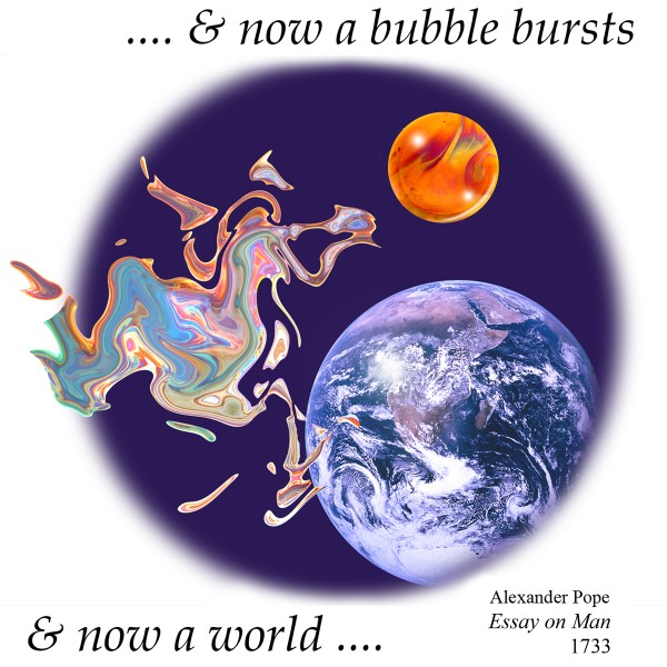
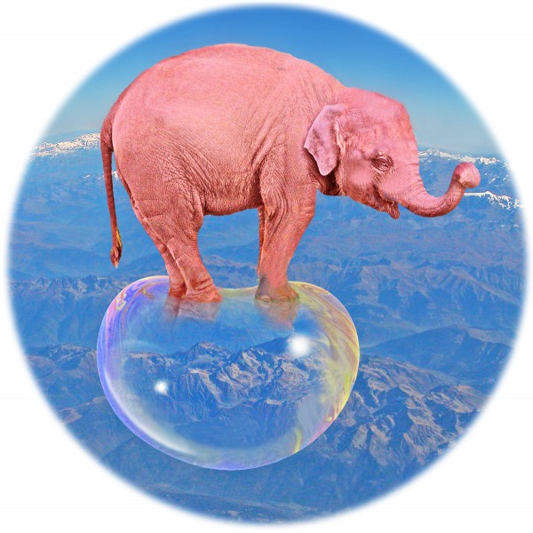
Here’s a picture to introduce a post about how I take photos of soap bubbles. OK, I admit I didn’t snap this one out of an aeroplane window. I also admit that Photoshop had something to do with it, and I’ll get to that in later Photoshop posts. But the bubbles start out as real bubble photos, and if you wonder how, read on below.  (If you’d just like some bubble pictures for your own site, there are two you can link to on our page of link thumbnails, and I’ll be adding many more later.  There’s an earlier post too, with another bubble picture. Or if you need easy presents for someone, why not browse some fun bubble image and illusion stuff to buy.)

Continue reading

Competing illusions


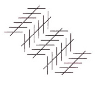
Here’s a rather subtle effect. It’s a competition underway, when the Zollner illusion is seen embedded in a staircase. In the staircase lower left, where two of the long lines are either side of the outside edge of a step (in other words like lines a and b here, on the sides of a convex step), the lines seem to get further apart with distance, as they would in a normal presentation of the Zollner illusion. But wherever on that lower left stair the lines are like b and c here, either side of the inner edge of a step, (so on a concave step), they tend to look much more parallel. In a normal version of the illusion, as below, the equivalent long lines appear to get closer together to the right.

Want to know more?

Continue reading

Making illusion images with Photoshop CS3


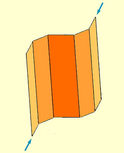
Here’s a paradoxical image to introduce the subject of drawing illusions in Photoshop CS3.  The two arrows are objectively aligned, and if you try to ignore the folding screen shape in between, they look to me not so far off that.  But now look at the short segments of the folding screen that they line up with. Those segments are also aligned, but concentrate on them and they look so far out of alignment to me, I have to keep checking I haven’t got the figure wrong!  It’s a turbo variant of the Poggendorff illusion.

I like to draw my figures in Photoshop CS3, because I’ve already got it, and it’s on many people’s machines if I’m on the move. But it’s not designed primarily for that sort of drawing, especially of geometric shapes, like the ones in the illusion above, so it’s not always ideal. However, I can always find a way of doing what I want, so here is the first of a series of posts, with hints about things I found tricky at first. However, as you’ve surely discovered, there are often lots of ways of doing the same thing in CS3. I’m no Photoshop expert, and if you know a better way, please leave a comment.

Continue reading

The Poggendorff Illusion and depth processing


One of the most obstinately puzzling illusions is Poggendorff’s, in which a slanting line interrupted by a gap no longer looks aligned. For over a century specialists have been unable even to agree whether it arises from 2D properties of the image, or as a result of attempts by the brain to interpret the configuration as 3D. Papers written a hundred years ago treat the problem in very much the same terms as we do today. I’m betting on 2D (I argue for that on another, website devoted to the Poggendorff illusion). It’s not likely my speculations are spot on, and they may well not even be in the right direction. But read on here if you’d like to see demonstrations that show why I don’t think depth processing can be the answer.

Continue reading