Bars and Bands – illusory expansion

When the chevron pattern in the movie is in perspective, so that the bars get thinner and closer together with distance, the bars and the fan of bright bands on them appear to stream past us, as if we were travelling along a tunnel. When the bars are all the same size and equally spaced, so that they don’t show perspective depth cues, the fan of bright bands appears to be expanding. The outer bright bands even look as if they are sliding along the bars.

Thanks to Priscilla Heard for the suggestion that the key to the expansion effect is in the absence of perspective cues. If you’d like more on that ….

Continue reading

Barbers’ Poles and the Aperture Problem

Go back a couple of centuries and there were no chains of shops or malls. In the high street in the UK you would have found the type of shop you were after by looking out for a sign hanging out.  There were signs for pharmacists, tobacconists, pawnbrokers, whatever.  Nowadays there’s just one traditional sign still sometimes to be seen – the barber’s pole, as left in the animation.

The barber’s sign shows a famous illusion.  The cylinder is rotating horizontally around a vertical axis, but the stripes look as if they are rising – which would be impossible, unless you had some long pole sliding through the cylinder.

You can begin to see why in the demo on the right:  focus on the vertical slot and the grating seems to be moving vertically (as in the barber’s pole).  But focus on the horizontal slot and in a moment the grating may seem to move horizontally.  Behind the round hole, for me it tends to look as if moving obliquely.

Want to know more about what’s going on?
Continue reading

AHA!

Rex Whistler heads from AHA!

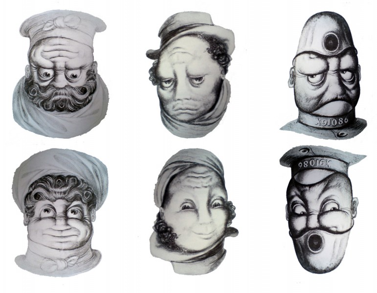
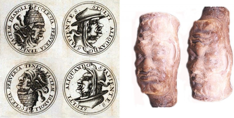
Some of the best of all illusions in the tradition of rotating heads were designed for advertising in the 1930’s by British artist Rex Whistler – you really have to take a second look to convince yourself the lower faces are just rotations of the upper ones. He was sadly killed in action in World War Two, but the heads were collected in a book of 1979, AHA.  He got the idea from some seventeenth century engravings, (reproduced below), which had first appeared in 1671 in a book by polemicist Pierre Berault. The Western, Christian world at that time was riven with hatred between Catholics and Protestants, and these images are an anti catholic salvo, showing a Pope (left pair of roundels below) and a cardinal (right pair of roundels below) transforming into devils with rotation.

I found these details in two editorials about rotating heads for the journal Perception, by perceptual scientist and artist Nick Wade and colleagues.  Check them out for lots more info and images. One is from 2003, the other from 2005, and they are the most authoritative source of information on rotating heads generally.

17th Century and Roman rotating heads

In the 2003 paper Nick Wade also shows one of the oldest rotating heads we know, a second century AD Roman beaker, shown to the right above. It was spotted by Christine Wade in the Hungarian National  Museum in Budapest.  (Photo © Christine Wade)

There are earlier posts on this site about rotating heads, one with Father Christmas turning into playwright Henrik Ibsen, another about a tale of nightmare in a hotel. And if your appetite for this stuff is insatiable, look at the more recent post on cartoonist Gustave Verbeek.

Cockatoo coming through

One of my favourite René Magritte paintings is Carte Blanche. (There seem to be problems linking to an image of that – I guess copyright related – but just put that title into an image search).  I’ve two earlier posts that play on the same effects – an image for Halloween and a classical scene.   I’ve always wondered if the effect would be even stronger and stranger in an animation.  So here it is.

Usually an area of the visual field within an outline, or more or less bounded by an outline, is either an object or an aperture.  (One of my earliest posts on the site is also about that).  We are so good at not getting those mixed up in everyday vision that when they get mixed up in a picture, like the Magritte painting or my examples, the effect is strangely disconcerting.

Thanks to Edweard Muybridge for the loan of the Cockatoo.

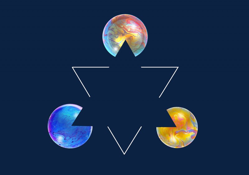
Dark Kanizsa Triangle

Here’s a dark-on-light, bubble version of The Kanizsa triangle.  The triangle is usually shown in white against black circles and lines, and can even look slightly brighter than background, though its edges are only indicated by the gaps in the lines and by the segments missing from the circles.   The brain adds the edges and fills in the triangle, as the most probable explanation for what’s missing.  The effect was created by Gaetano Kanizsa, as a demonstration of subjective contours, which in turn were first explored a bit over a century ago, as examples of Gestalt theory.  Bit of a link for enthusiasts that – ditto the following links – but if technical stuff is for you, there’s a great historical survey of the theory.  The theory as then developed is not now accepted, and just how the brain reconstructs the triangle is still debated.

Like many geometric illusions, and like the watercolour illusion (see recent post), the Kanizsa triangle also appears when reversed out as a black shape against bright lines and segments.  So here I’ve recruited some soap bubbles as a background to the effect.

As with other pictures on the site, unless an image is externally sourced, and we indicate that copyright may be asserted, you are welcome to download this images and use it for any private, non-commercial purposes.  But if you might like to buy a professionally produced print, check out our Cafepress site.

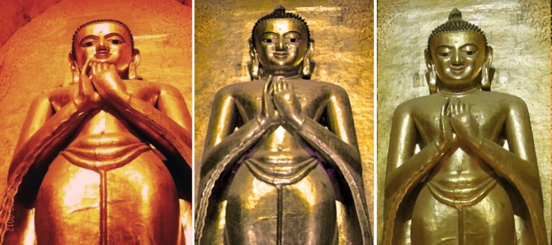
Stern, Smiling and Radiant Buddha

In this wonderful image of the Buddha from Bagan, Myanmar, facial expression changes from stern through smiling to radiant as the figure is viewed from increasing distance.  According to my friend Eddy Keon, the highest status members of the temple audience, along with temple officials, would have stood closest to the Buddha and therefore have experienced him at his sternest, whilst his radiance increased with the poverty of the viewer, banished to the back of the crowd.

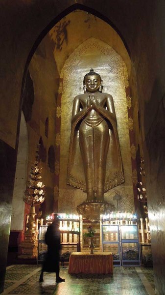
The figure is the Kassapa Buddha, one of four Buddhas in the Ananda Temple, Bagan, Myanmar.  The city was the capital of the ancient Pagan kingdom, built, along with the temple and this figure of the Buddha, eight hundred years ago.

 The left hand and centre photos are from the brilliant travel blog of Forrestwalker.  The right hand image was taken by Eddy Keon.  His photo is so beautiful, here’s the whole thing.  Eddy hopes to use his pictures to support a hill village school in Myanmar.


Poggendorff Switch

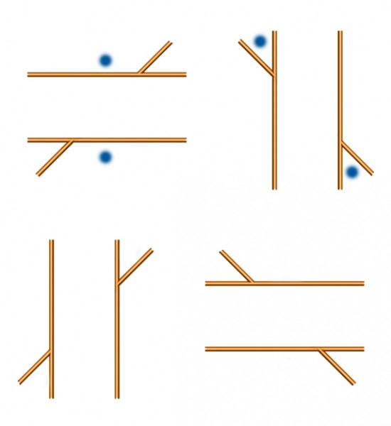
If the way I see this animation is how most people do, the strength of the Poggendorff illusion can depend on our patterns of fixation when looking at it.  Adding distracting dots to the figure can attract the eye either obliquely along the parallels or at right angles across them.  To my eye, when the oblique track between the acute angles in the figure is labelled with flashing blobs, the strength of the illusion is reduced.  When the track at right angles across the parallels is labelled, effect is maximised.  The effect doesn’t change instantly for me, but settles down after each track has flashed two or three times.  I get the same effect if I switch fixations every second or so between equivalent blobs in still Poggendorff figures. The effect is strongest, as below, when the blobs are in the acute angles when the parallels are vertical, and across parallels when the parallels are horizontal.  So in the figure below, the illusion is not far off equal strength for me in the bottom pair of figures, but looks maybe a bit stronger at top left, and has almost vanished at top right.

If you’d like more on this, plus some additional demos, check out my site devoted to the Poggendorff illusion.

The Watercolour Illusion in Reverse

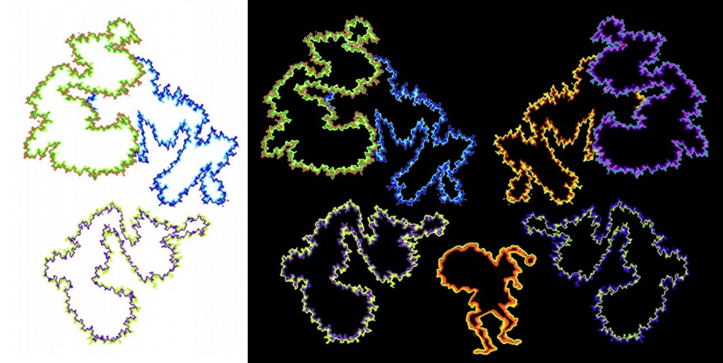
Here’s something I’ve not seen tried yet elsewhere:  a look at how the watercolour illusion (see three posts back) appears when reversed out, black to white.

Update 16/12/12:  My mistake! Here’s a report of an earlier study that does include reversal of the illusion.  It’s by Aula Dostoevsky and Ken Knolbauch.

In the original effect, as seen to left, islands with two-tone outlines seem tinted with the colour of the inner tone, if lighter than the outer, and otherwise appear (as in the lower figure) whiter than the background.

Sure enough, as seen centre, the effect is still there, but a bit weaker, when exactly the same two-tone outlines are placed on black.  The upper interiors, which seemed tinted on white, appear (to my eye) blacker than the black background.  The lower interior, which looked whiter than background on white, now appears tinted.  In other words, on white the haze spreads from the paler outline, when the darker outline encloses it, whereas on black, the haze spreads from the darker outline, and when enclosed by a paler outline.

Consistent with that, to my eye, on the right when the colours of the two-tone outlines are reversed on black, the interior that appeared tinted in the centre lower figure appears blacker than background.  The upper figures, with interiors blacker than background in the centre, look tinted to the right.

The effect is strongest for me in the three lower figures, looking across the whole image.  (Ignoring the Santa figure, added for seasonal effect).  For me the effect also works best slightly larger, so click on the figure to see a larger version.
Barrier-Grid (or Picket-Fence) Animation

In recent versions of these animations, as in the movie above, a grid of thin transparent lines in a mask is passed over a composite graphic image, to give an illusion of movement.  In earlier versions, made in France in the the 1920’s and called Ombro cinema or cinema enfantin, the grid of transparent lines was static in a viewing frame, and a strip of the composites was spooled behind it.  (There’s a nice demo from the North West Puppet Center in Seattle).  Earlier versions still go back to the 1890’s and are described in a very authoritative Wikipedia entry.

A beautiful recent booklet of barrier-grid animations is Colin Ord’s Magic Moving Images.  In 2006 a new  version of the technique, in which the act of opening a book automatically draws the grid over the image, was patented by Rufus Butler Seder, called Scanimation. He’s also published a number great books for kids using his process.

(By the way, there also used to be an entirely separate early computer animation machine, in the 1960’s, called The Scanimate).

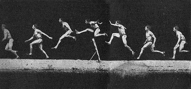
In Seder’s and Ord’s books, the illusion happens in the real world, when you pass a real striped acetate mask over the composite base image. My demo is an animation that faithfully follows the real world process, as if a real striped mask was being passed over the base image.  I borrowed the jumping man from this composite photo by nineteenth century movement scientist Etienne Marey.

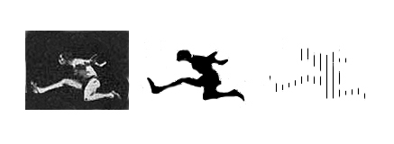
To make a barrier grid animation, you reduce the subject in each ‘frame’ of the original movie into a black silhouette, and then replace the black infill with a hatching of just a few vertical lines.

The hatched silhouettes are then combined into a composite image, like the one in the animation at the head of the post.  As the striped mask passes over it, only one frame at a time is revealed.  The jumper in the final, striped silhouette (right hand of the three images) above is barely recognisable as a figure. We see the jumper much more clearly in the movie. I find it a bit magical the way the jumper quite gradually appears in the movie as the mask begins to move over the composite image from the left. Our brains can discover figures in patterns of amazingly sparse data, if only they move coherently, as when the human body is represented just by dots at the key rotation points (such as knees and elbows).

Want to have a go at making a barrier grid animation yourself?

Continue reading

Illusions and visual special effects – explanations and tutorials