Who’s this?
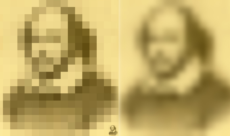
Yes, it’s Shakespeare! Back in 1973 researchers Leon Harmon and Bela Julesz produced their famous Lincoln Illusion. They demonstrated effects when an famous image of a face, such as Abraham Lincoln’s, is pixelated quite coarsely. We can still recognise it easily if the pixelated version is either blurred (as to the right here – it’s a blurred version of the pixelated image, not of the original), or reduced in size, as if seen from a distance. Just three years after the original Scientific American article that made the effect widely known, Salvador Dali based a picture on the Lincoln image. (Michael Bach’s site shoes the original Lincoln image, the Dali picture and a clever interactive demo).
Note the tiny Shakespeare perched in the very bottom right corner of the left hand, pixelated image above. It’s just the pixelated image reduced. If you move away from the screen a few feet, you’ll find that the two large images of Shakespeare come to look more and more alike. It’s odd how even small details of the face seem to appear. If you want to try it with faces you know, I think it works best with about seventeen pixels along the longest dimension of the picture. It does work best with an iconic, image – a photo everyone knows – rather than just a face you know.
So who have we here?
I think you’ll have got those, but otherwise (and for more stuff) …
Of course, it’s Mona Lisa to the left, and Mao to the right. And note again, the blurred images are not of the originals, but of the pixelated originals. And yet from a distance, it’s almost as if we can retrieve some of the fine detail in the blurred versions.
There’s much debate around just what these demos tell us about how we see faces. (Here’s a link for one technical discussion, if that’s for you). Artist Chuck Close has also done some fascinating, huge paintings, that show just at what point a coarsely patterned image can suddenly resolve into a recognisable face, as we move away from it. (There are stacks of images of his brilliant paintings on Google images).
Here’s a more general point. It’s notable how our brains seem depend particularly on pattern that we filter from images at two dramatically contrasting levels. One is a very fine scale level, which helps us find edges. The other is a very coarse grain level, which reveals the broad masses of light and shade in an image. What is fascinating to me is that the contrast between fine and broad scale filtering is reflected in the artistic traditions of line, outline drawings on the one hand, and rough sketches on the other.
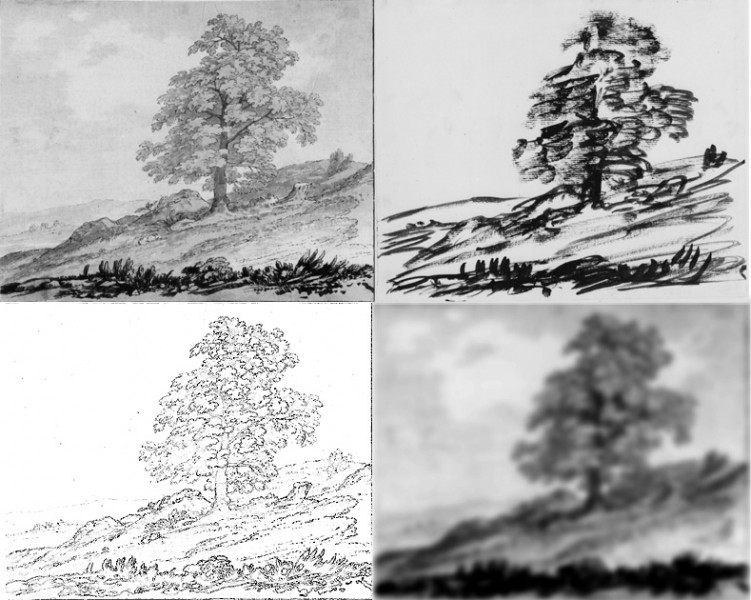
Fascinatingly (I think) an english artist some 250 years ago demonstrated all this, whilst seeking artistically pleasing effects. Alexander Cozens was looking for a way of producing general compositions for attractive landscape paintings. He hit on what he called his blot method. He noted that if you start a picture by working from a very rough scribble of blocks of light and shade, you can easily then imagine landscape detail to finish off the picture. Here’s one of his demos.
Cozen’s originals are the two top ones, on the right his “blot” drawing, and on the left the finished drawing made from it. To twenty first century eyes, the right hand drawing looks pretty much just like any old rough sketch. That’s only because of artistic developments since Cozens’s time. In his day concentrating on just rough masses of light and shade was innovative. Later on, it became a standard procedure, and the last hour of light in the day became known as the painters’ hour, because at dusk fine detail begins to vanish. I was taught as a kid to paint watercolour by a sweet old lady, Phyllis Loft, who taught me to look at what I was about to paint through almost closed eyes, to reduce what I saw to light and dark masses.
In the bottom pair of images I’ve crudely filtered just Cozens’s finished drawing, to the left above, to reduce it to a line drawing on the left (leaving only what are called the fine spatial frequencies in the image), and to a blurry image on the right, (a low spatial frequency image). Move away from the screen and Cozens’s blot image (above right) begins to resemble more and more my blurry one.


Захватывающе