All posts by david

The Oxford Compendium of Visual Illusions

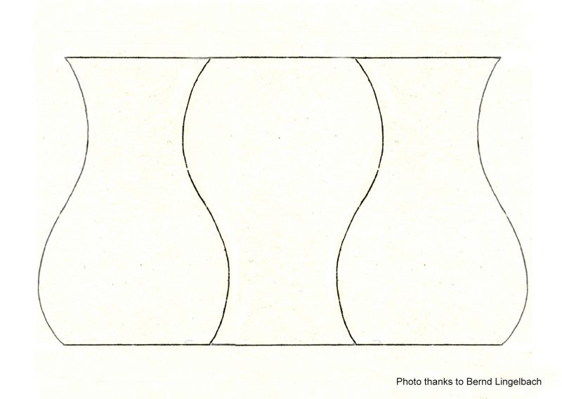
I’ve copied this beautiful demo (with small changes) from one by Stuart Anstis, who is one of the world’s leading and most prolific researchers into illusions.  His website includes a page of great movies, including this one.  Whilst the yellow circles are visible, we tend to focus locally on the pairs of spheres, each pair orbiting a central point.  But without the circles, loosely fixate the central blob, and though the movement of the spheres remains just the same, they appear to re-group into a more global view, of two pulsating, intersecting circles of spheres.

I came across Stuart’s movie amongst the many web pages of figures and demonstrations that accompany a once-in-a-generation, landmark publication, the Oxford Compendium of Visual Illusions.  (It’s not cheap – check the price before ordering!).  But that’s because it’s HUGE, with some 800 pages.  Almost all the leading researchers in the field worldwide have contributed, with essays on the history of visual illusions, up-to-the-minute, detailed discussions of a comprehensive range of illusions and effects, and philosophical essays on whether the word illusion is really the right term to describe them.


Johann Joseph Who?

This may not look a dramatic illusion by contemporary standards: the top and bottom lines are each divided into three equal segments, but the middle segment appears longer than the flanking segments in the top line, and vice versa below. Yet it’s a really remarkable figure. It’s one of sixteen in a pioneering paper of 1855, the first ever study of illusions of this geometric kind.  Even more remarkably, as an illusion it remains to this day wholly unexplained, as baffling as it is simple.

The paper was by a Frankfurt schoolmaster called Johann Joseph  Oppel.  In it he named his illusions as geometric-optical illusions, to distinguish them from illusions observed in the natural environment such as the Moon illusion. Oppel seems to have observed the misjudgments that these new geometric illusions give rise to in math lessons, when his pupils were drawing or judging figures on the blackboard.  I suspect he was probably an unforgettable but demanding teacher.  He was for sure a real one-off – a tirelessly curious observer, leading the way into acoustical and language research, as well as geometric illusions, with fearless independence.

Four of us, Nicholas Wade, Dejan Todorovic, Bernd Lingelbach, and I, have just collaborated on the first ever translation of Oppel’s 1855 paper into English, with a commentary, freely available in the online journal iPerception.
Continue reading

Trompe (or Trump?) l’oeil

In the era of Trump it’s got harder to tell reality from illusion, but here’s a ceiling from about 300 hundred years ago that shows a real magician in the illusion line at work.  The inside of the dome  – everything inside the gold circle – looks as if it extends upwards, but it is just painting on a flat canvas.  It’s an example of so-called trompe l’oeil, French for deceive the eye.  I don’t know why we use a French term – it was never a French speciality.

Some time back I posted about the brilliant trompe-l’oeil by Andrea Pozzo on the ceiling of a church in Vienna, painted a little over three hundred years ago. The photos here show a ceiling in the UK painted thirty years later, by an artist following where Pozzo led the way.  It’s in the main entrance hall of a mansion called Moor Park, in the West London suburb of Ruislip, painted in the 1730s. The mansion is now a posh golf club, so it’s not usually open to non-members, but it’s visitable by arrangement, http://www.moorparkgc.co.uk/

The painting of the hallway was done by a trio of Italian specialists in architectural decoration – Giacomo Amiconi, Gaetano Brunetti and Francesco Sleter.   I’m not sure whether Brunetti or Sleter painted the illusory dome.  They’re not well known.  Painting this kind of thing was quite lucrative, but didn’t make you a star in the art world of the time.

Like the dome painted by Pozzo, the illusion in Moor Park is amazingly successful – but only from one viewpoint.  As you can see in the lower photo, from everywhere else the dome looks wonky.

For ECVP 2016
 The “witch ring” Illusion: experimental stimuli

This is a post to show animations to accompany a poster, which I and my colleague Priscilla Heard presented at ECVP 2016.  The poster reported experiments related to the witch ring illusion.  The movies below show illusory effects of sideways movement in streaming patterns of dots.

This first movie shows how the static track along which a single file of dots are travelling appears to move sideways when the single track is embedded in a fan-shaped pattern of tracks.


Continue reading

William Wollaston’s Gaze Illusion

The eyes in each pair of pictures don’t change at all, and yet in one picture in each pair they seem to look directly at us, whilst in the other they have rotated downwards. (featured: a Sportive Lemur; & a young man by German 16th century sculptor Michel Erhart in the Victoria and Albert Museum, London).

William Wollaston published this illusion nearly 200 years ago. He claimed that our brains seem set up to judge the direction in which the eyes are looking in relation to the face from the position of the pupils in relation to the whites of the eyes, but that direction of gaze depends on head orientation. You can read his original paper in the Philosophical Transactions of the Royal Society online. But here’s an animation of the original illustrations:

The original drawings were done for Wollaston by the leading portrait painter of his day, Sir Thomas Lawrence.  They are now in the Royal Society in London, and there’s a movie about them you can watch on Youtube.

A variant on the “Witch Ring” Illusion


Here’s another version of the illusion I’ve been working on with my colleague Priscilla Heard.  The bright V shaped zones imposed on the faces look like they are expanding or contracting sideways, especially near the sharp end of the Vs at the bottom.  It can be hard to see that it’s an illusion, because the faces really are expanding.  But to the right an isolated bright zone shows that objectively the V tracks are quite static.  You may still see a bit of illusory lateral expansion even in this isolated set of tracks, but note that the top right corner of the track is quite static in relation to the corner of the movie.

It’s a version of the Witch Ring Illusion.   I posted about that back in 2011, noting a plan to take a look at it.  This year Priscilla and I published a paper about it in the journal Perception.

Best Illusion of the Year Competition

Here’s a copy with slight variations of a stunning new animation of the Ebbinghaus Illusion, by Christopher Blair, Gideon Caplovitz and Ryan E.B. Mruczek.  Their version won the Best Illusion of the Year Competition in 2014, a few weeks ago.  It’s a brilliant competition whose lead organiser is Susanna Martinez-Conde, and is accumulating a fascinating illusion resource as the ten finalists are added each year.

In the movie, as the figure moves up and down the screen, all the circles seem to change size.  Yet objectively only the outer ring of circles do so:  the central circle remains exactly the same size throughout.  It’s so vivid it’s hard to believe, but I’ve just added some yellow rails as a track for the central circle.  You can see that the circle always just fits the rails – and they don’t change size.

For more info and links on the Ebbinghaus illusion (aka Titchener Circles) see our earlier post on the traditional, static version.

Digital Kaleidoscopes – post no. 1

Everyone loves a kaleidoscope, particularly the ones with a lens at the end, so that as you look through them whilst sweeping the kaleidoscope around, the view becomes a dazzling starburst pattern.  (I find Nova Magic Marble kaleidoscopes are inexpensive ones for kids that work pretty well).   However, real-world kaleidoscopes can only tile the visual field with a limited repertoire of geometric shapes – typically triangles. Digitally we can tile with any shape that will tessellate – that is, fill the plane by repetition without gaps or overlaps. As with real-world kaleidoscopes with a lens at the end, each tile can enclose a streaming segment of a visual scene, if you are handy with graphics and 2D animation packages.  If that all sounds a bit puzzling, I think the movie will make it clearer.

But then there’s a surprise!  Illusions of movement may appear, dependent on figure/ground effects.

Continue reading

Roger Shepard’s Arc de Triomphe revisited

Arc de Triomphe illusion

In 1990 the psychologist and artist Roger Shepard published a cartoon version of this effect, captioned “I stand corrected”, in his book Mindsights (page 91).  I wanted to try a photo processed version of it and here’s my second attempt.  When I tried before, back in 2008, I somehow couldn’t get my mind round what Shepard had done, and produced an even more twisted version.

M.C.Escher’s lithograph Belvedere from 1958 is famous variant on the theme.  Subsequent investigators have presented animated 3D versions of it that help explain the effect.

My new version is based on a late nineteenth century Photochrom postcard.  They were made by a beautiful process that added colour lithographically to black and white photos.  You can see the original in a collection of gorgeous period cards of views from all over the world in the USA Library of Congress.

Mamluk Interlace

MamlukPair

I’m fascinated by the way that spectacular aesthetic effects often seem to involve bamboozling our everyday strategies for making visual sense of the world.  This is a beautiful example, a detail of interlace decoration on a 14th century (Western dates) Mamluk Period door in the Louvre from the Al-Maridani mosque in Cairo.  (I’ve shown other examples of a role for bamboozled perception in aesthetics in an earlier post, and in the Illusions and Aesthetics category to the right).

As you can begin to see in the image, where I’ve combined the interlace pattern on the door with a schematic analysis of its reflection, the interlace we see in the door is a segment of a rosette pattern that repeats across a wider field.  But that’s not obvious at all when you just see the door.  The artist has not emphasised the lines of the design, but rather the infills – stars and other little geometric tiles.  We’re distracted from grasping the overall geometry by all the assertive, enclosed shapes, with their heavy outlines.  And the overall shapes that do jump out for me are the beautiful curves that run from top to bottom of the image, which also distract attention from the hexagonal geometry of the pattern.  For more analysis of the pattern and the fabrication of the doors, see below, but first, here’s the whole door.

Mamluk Door

Continue reading